Bliss began during my time as a student at London’s Royal College of Art. It was pretty much at the start of my more determined studies focusing on typographic design. Being in London you can’t ignore the presence of Edward Johnston’s Underground letter and the subsequent Gill Sans. Gill and Johnston knew each other well. Gill had worked with Johnston on the Underground letter and his own Gill Sans can be seen as an extension of these ideas.
In addition to the Underground letter and Gill Sans, I also looked at Frutiger, Syntax and the Transport letter used across the British road network. Elements, ideas and observations from all these found their way into the structure and shaping of Bliss.

My first attempt at the design of type was with Disturbance (later reworked and released as FF Disturbance in 1993, and subsequently revisited as Redisturbed in 2010).
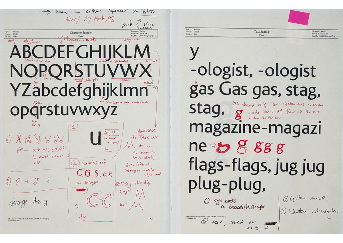
This initial foray didn’t offer any insight into how one should approach the design of type, so I launched into Bliss in 1991 in a suitably chaotic manner, but with a lot of enthusiasm. All I had to hand was Walter Tracy’s ‘Letters of Credit’ (still regarded as a core work in type design). The early development was all over the place (some of the early drawings and process can be seen at Studiotype).
I thought that you had to make formal drawings and measure stems – as this kind of thing was seen in production drawings. I learnt quickly that the eye is the ultimate guide.
Bliss went through many development stages as ideas solidified. Core ideas were always there, but hidden under the urge to fiddle with details instead of focusing on the overall impression. It’s a problem a lot of type designers face when they start off – there’s a strong urge to get all your ideas into one typeface, and race too quickly to get details done instead of spending time getting the whole idea working first. You need to focus on the macro before the micro.
The underlying principle for Bliss was Edward Johnston’s ‘Essential forms’. My initial ideas expressed an overly calligraphic feel, which was worrying – I prefer type to be type and not too calligraphic in impression. This look was increasingly played down as the typeface developed. Quirky features were removed in the aim to find a typeface that could function across a wide range of uses with just enough interest to set it apart from other types available at that time. I see little point in spending time developing a typeface that essentially already exists.
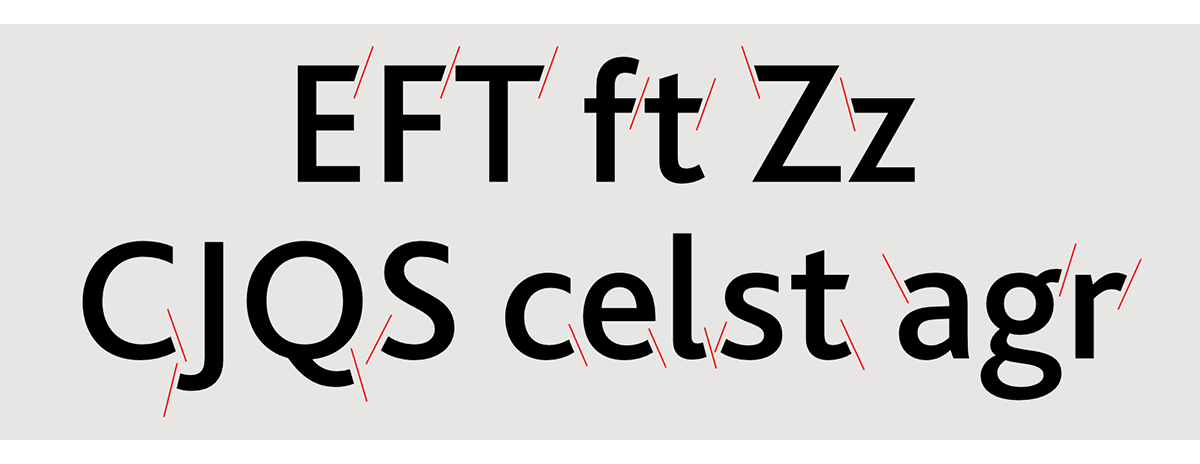
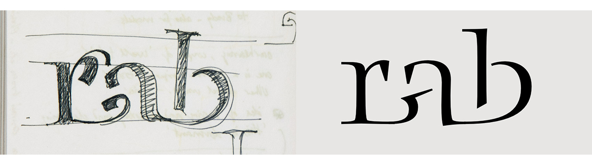
One core detail that remains in Bliss is the oblique terminal cuts. These have a reason and rhythm to their placing. A typeface has to have a degree of logic and repetitive consistency across its set, to tie the whole together as one. Horizontal strokes bear an oblique angle on the higher arms; curved letters show this angle on the lower stroke. These are natural placings that allude to the ductus of the pen. The placing of these cuts doesn’t unbalance a letter but aids its stability and flow. If the cuts are reversed or placed differently, the letters appear unbalanced. The details and structures within Bliss are all geared to creating a natural and harmonious impression.
The original development was carried out in FontStudio in 1991. It was finally ready to release in 1996. Various developments have been made to Bliss over the years – In 1998 the Euro symbol was added; an ExtraLight weight was commissioned and added in 2001; additional diacritics were included for Central and East European languages. The whole of Bliss was reworked and extended for OpenType technology in 2004. Cyrillic was commissioned and added along with Greek in 2006 to make the Bliss Pro fonts.
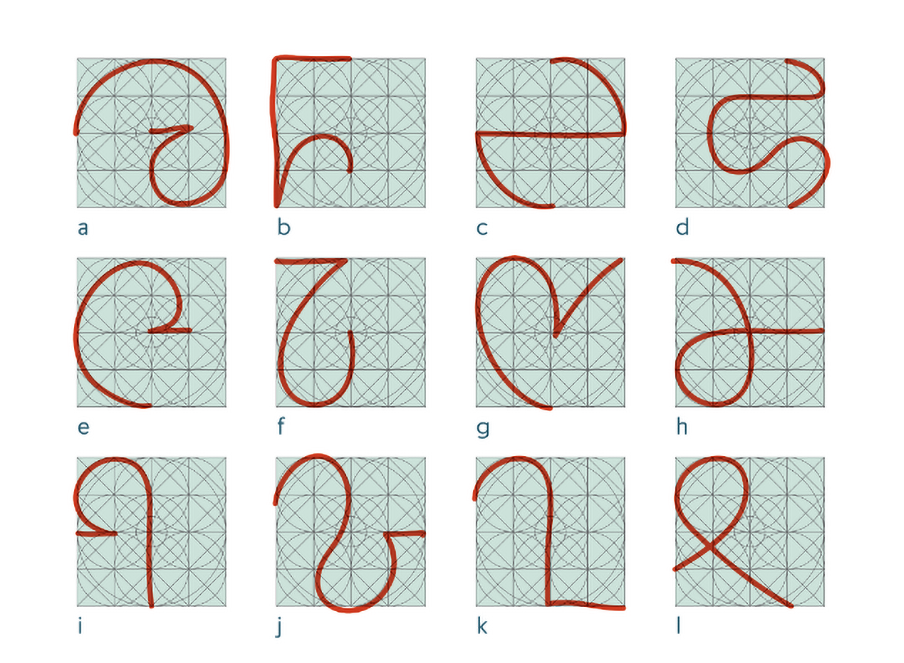
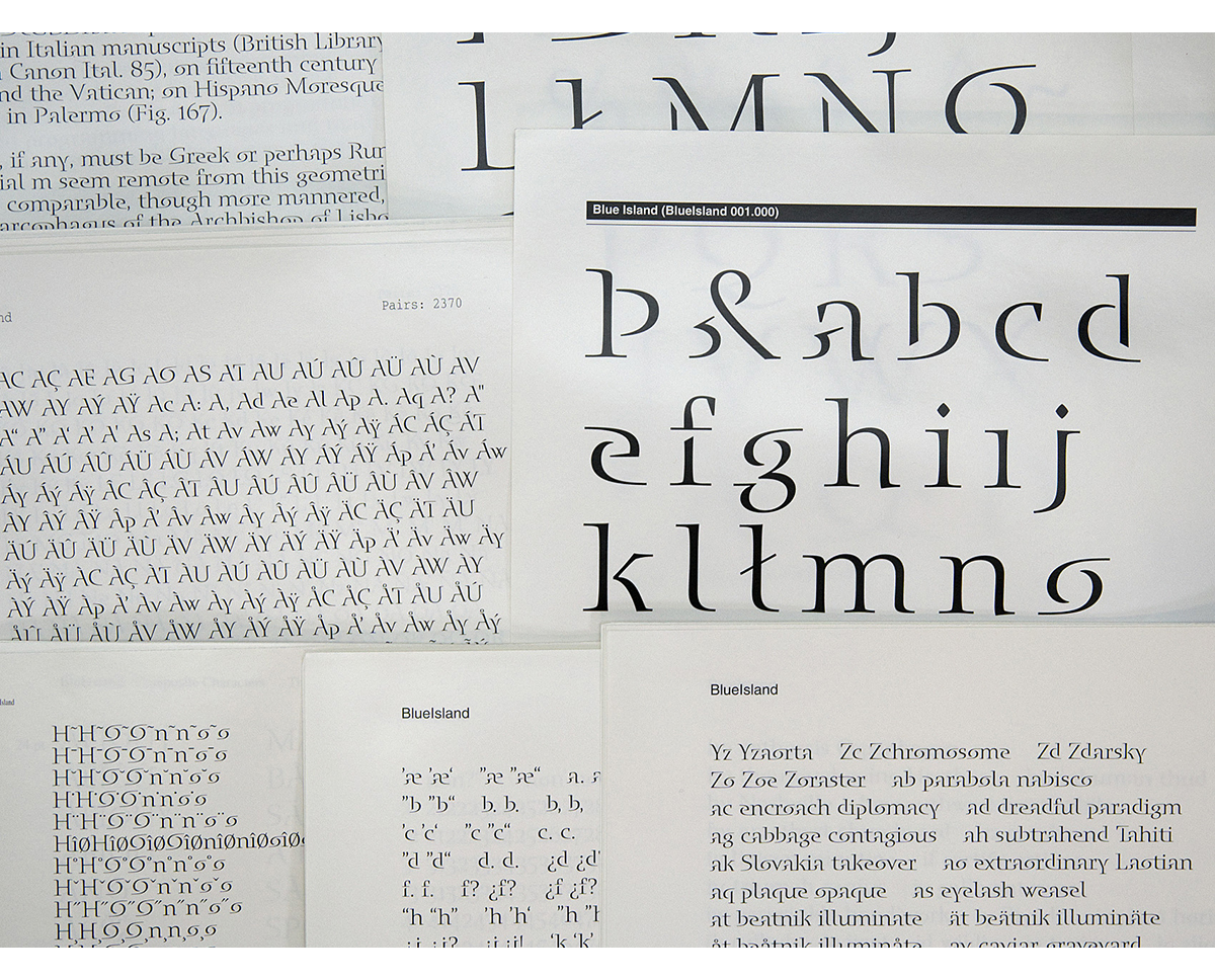
Blue Island grew out of a logotype concept I developed from linking capital letters. Essentially the illusion was to use elements of letters to create other letters. For example, the start and end swashes of a lowercase ‘n’ could create an ‘o’ when seen side by side. Or rather the ‘o’ is made from two disjointed strokes that attach to the letters before and following – giving the illusion of swashes, but also a letter shape.
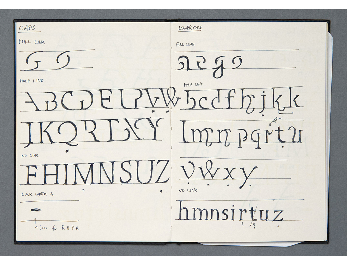
As the typeface was produced before OpenType was developed, each combination had to be checked to see how they flowed and where the idea broke – and if the breaks in the idea where visually acceptable. Nowadays many alternate glyphs would be used to create the linking effect – but this would reduce the challenge of the design and possibly result in more ‘normal’ letter shapes.
What lead me to making this? Well it was really the challenge to see if I could do it and what the end result would be. As to any change in process, well there was a major shift in how I worked. But this came as a result of working with Adobe on the design.
Prior to Blue Island I had no formal understanding of how to design a typeface. I was ‘learning on the job’. Adobe approached the design process with more structure. As I supplied development fonts, they produced and sent back bromides of the character set, setting, kern tables, marked up proofs etc. From this process I developed the way I work – more formally, logically and in stages. A typeface is an enormous undertaking and it’s easy to get swamped, overwhelmed and lost in all the elements. It is paramount to work in clear stages that build on each other.
Thanks. I enjoy making the specimen books. It gives me the opportunity to try things, say things, perhaps explain things, or not. There’s always additional support material on the websites, so the purpose of the specimens can afford to play with ideas more freely.
I should think the process is pretty much the same as most things – except I’m the client. To some extent they are ‘vanity projects’ and I do have to cost and budget them. I’ve noticed that they are unlikely to shift if they carry a cost, even if the cost is only a few pounds. So the challenge is to make interesting design at an affordable production cost that allows me to offer them free. How long I can keep doing this is questionable. One of the things stacked against it is the rising cost of postage, which I have no control over. It would be a great shame to only offer a PDF. Quite boring really – for me, as well as for designers keen on the tactile aspects of design. This is why I’ve looked at developing the Gallery and Explorer on my site, to try and show type in a different way; removed from the trappings of commercialism to focus on shape, pattern, experience, art.
Visual ideas start to take shape around four months into the typeface design, but work can only begin once the typeface is pretty much signed off. The typeface generally needs to be completed around 2–3 months before public release. This will allow time to create all the support material – not just the specimen, but the website pages, PDFs, marketing etc.
Join us in November for Part II
His new sans serif typeface, Claymore is out now.
You can see more of Jeremy’s work at: www.studiotype.com, Twitter and Instagram
![]()
![]()