One point of view is that type design has lost its creative drive. There is a huge amount of redundant type now. Software makes it easy to pump out typefaces but most of these are pointless. There’s an increase in the unlawful raiding other peoples’ work. I went to college at a time when aspiring designers where told to challenge and change the world; that design was exciting. I feel that design has become a dirty word now; one which is banded about as a bit of ‘gloss’. It’s depressing to see that the pioneering vision of designers from the 20th Century has pretty much gone.
However, it should still be an exciting time for type. The problem is that people aren’t prepared to invest in it, or build the time into a design programme and provide the budget required to develop it. It’s very easy to make a font but incredibly difficult to make a typeface.
When I started it was all about grunge type, broken type, poor quality was seen as an asset to make the typeface ‘edgy’. I looked more toward making a typeface that was in keeping with my type heroes – from whatever era. So I studied and stumbled, looked and looked, and questioned everything. There’s always another way to do something. My approach hasn’t changed.
I feel that nowadays it’s all about finding an old specimen book and copying that. Bringing a previous designer’s work back under the banner of ‘homage’. Even new typefaces are plundered by other designers, with little respect. I don’t see it as creative or clever, just boring really. I don’t understand why a designer doesn’t want to create their own work for tomorrow, to push their chosen design trade further and to challenge. We live in the 21st Century, but typographically we’re stuck in the mid-20th, in an endlessly revolving world of pastiche.
Perhaps the designers who use type need to push more; be less tied to last century’s styles and actively seek new shapes and new typographic patterning – new ‘Ways of Seeing’.
When I started to look at the history of type design I saw lots of drawings, many of which were technical drawings with measurements etc. I naturally took this to mean that this was how type was made. Certainly it was how type was made at a specific point in time and for specific typesetting equipment. But a look at how Goudy, Dwiggins or Excoffon worked will show that each designer developed their own way of working. It tends to be the production team who requires the formality of a measured drawing (again, for the technology being used). I tried to reproduce this way of working but soon realised that it was pretty pointless.
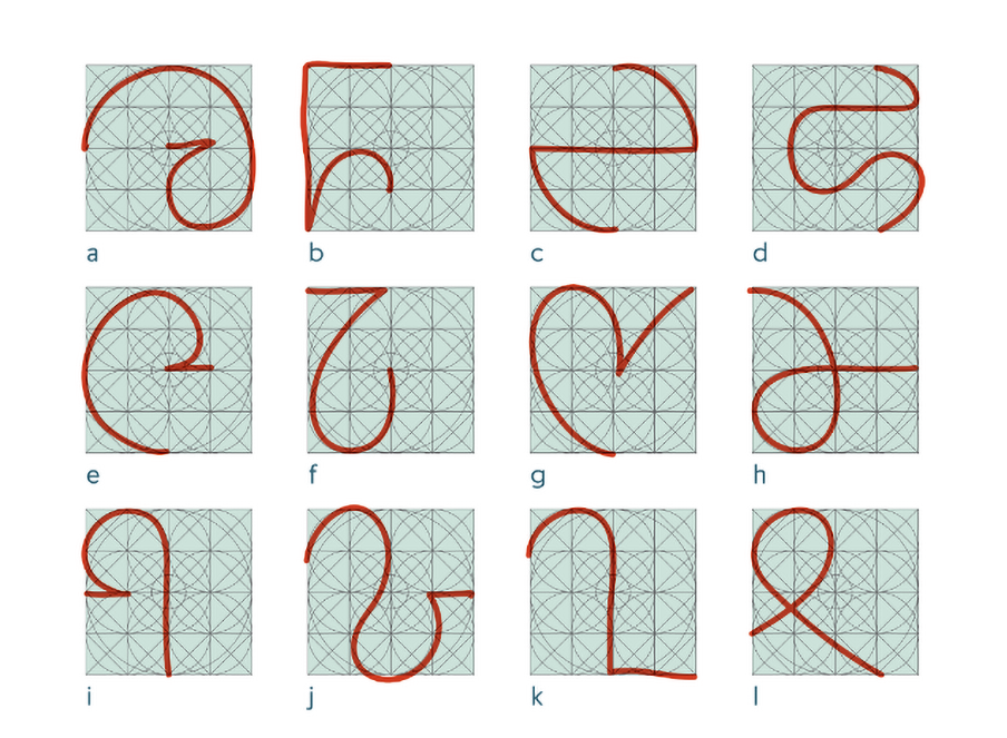
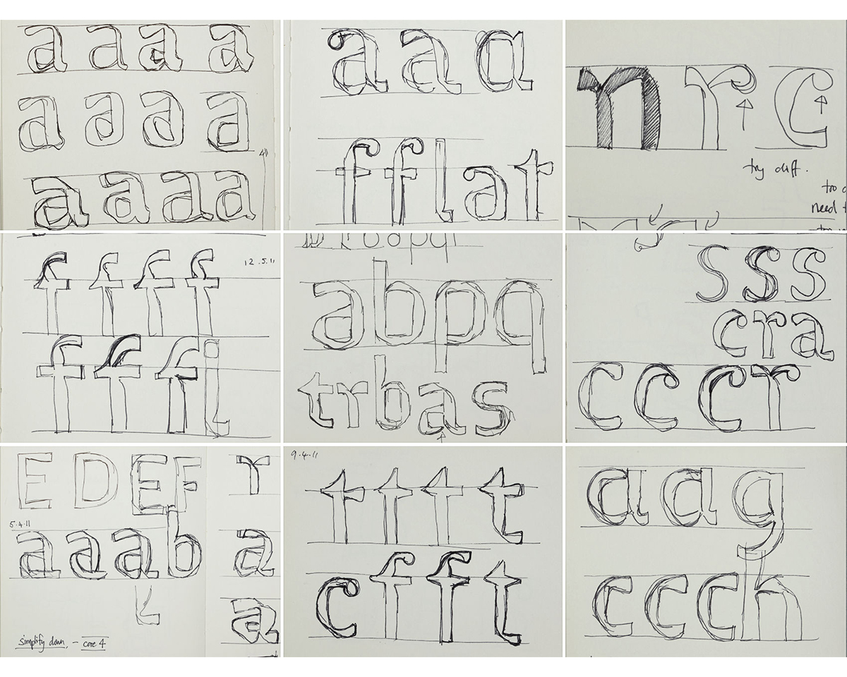
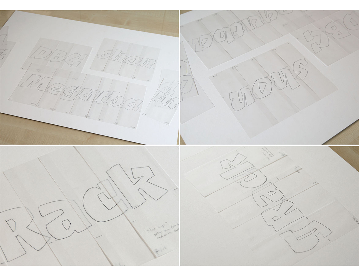
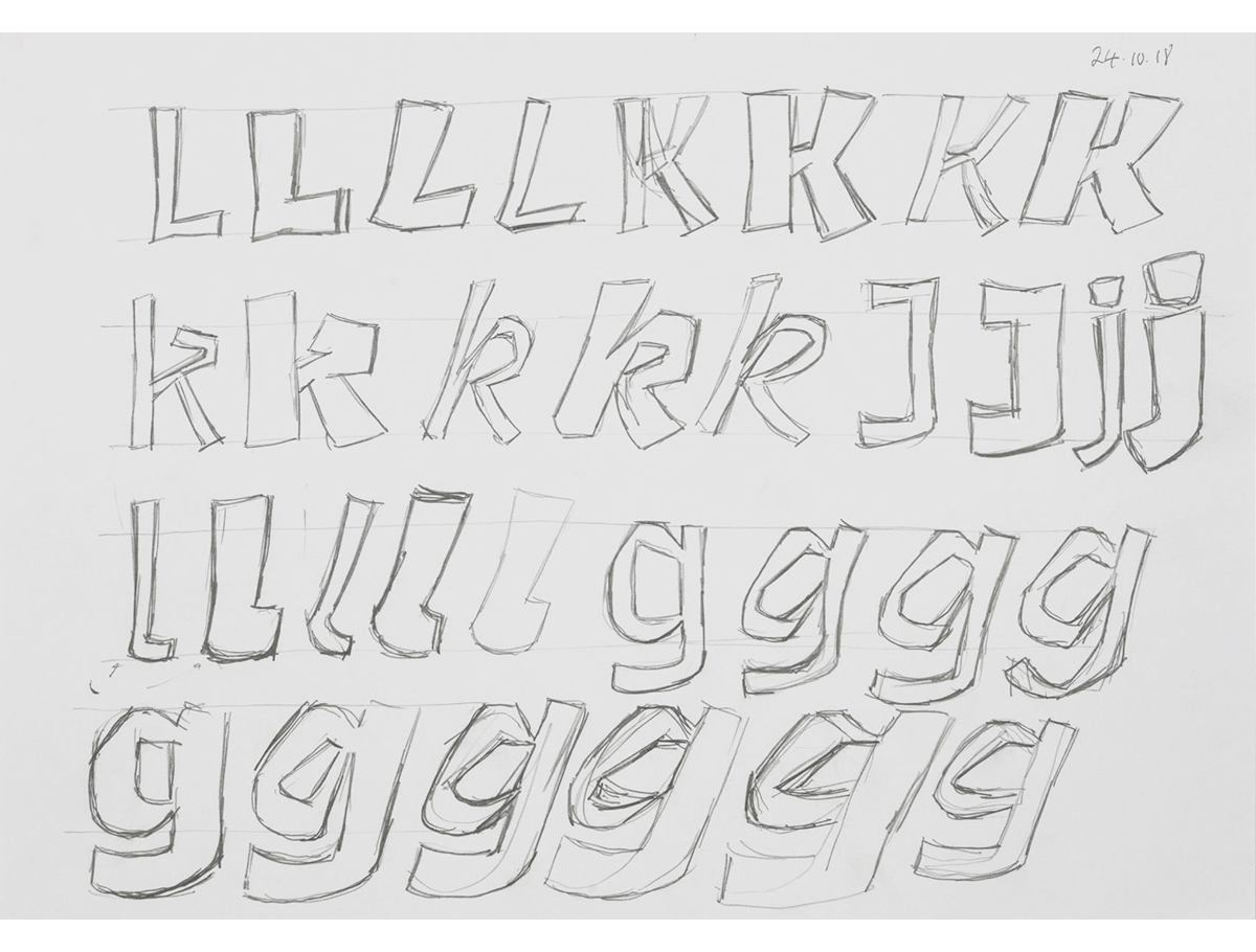
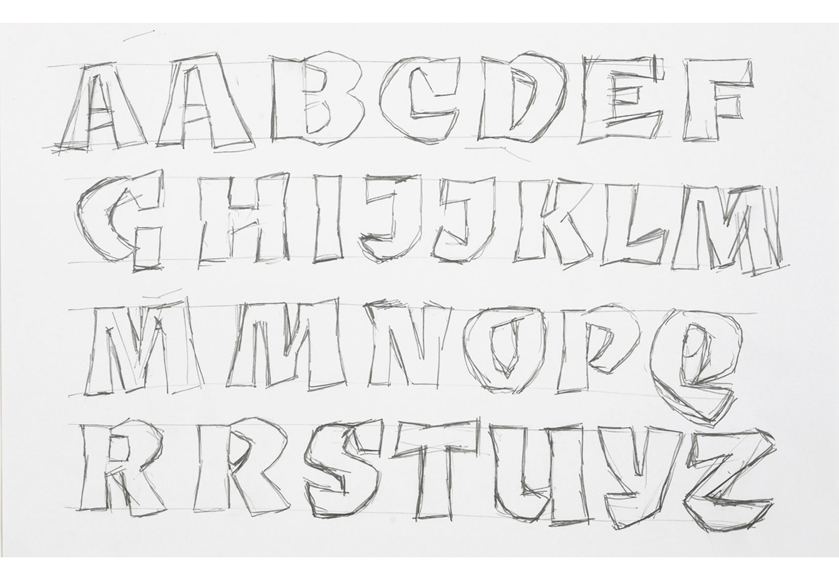
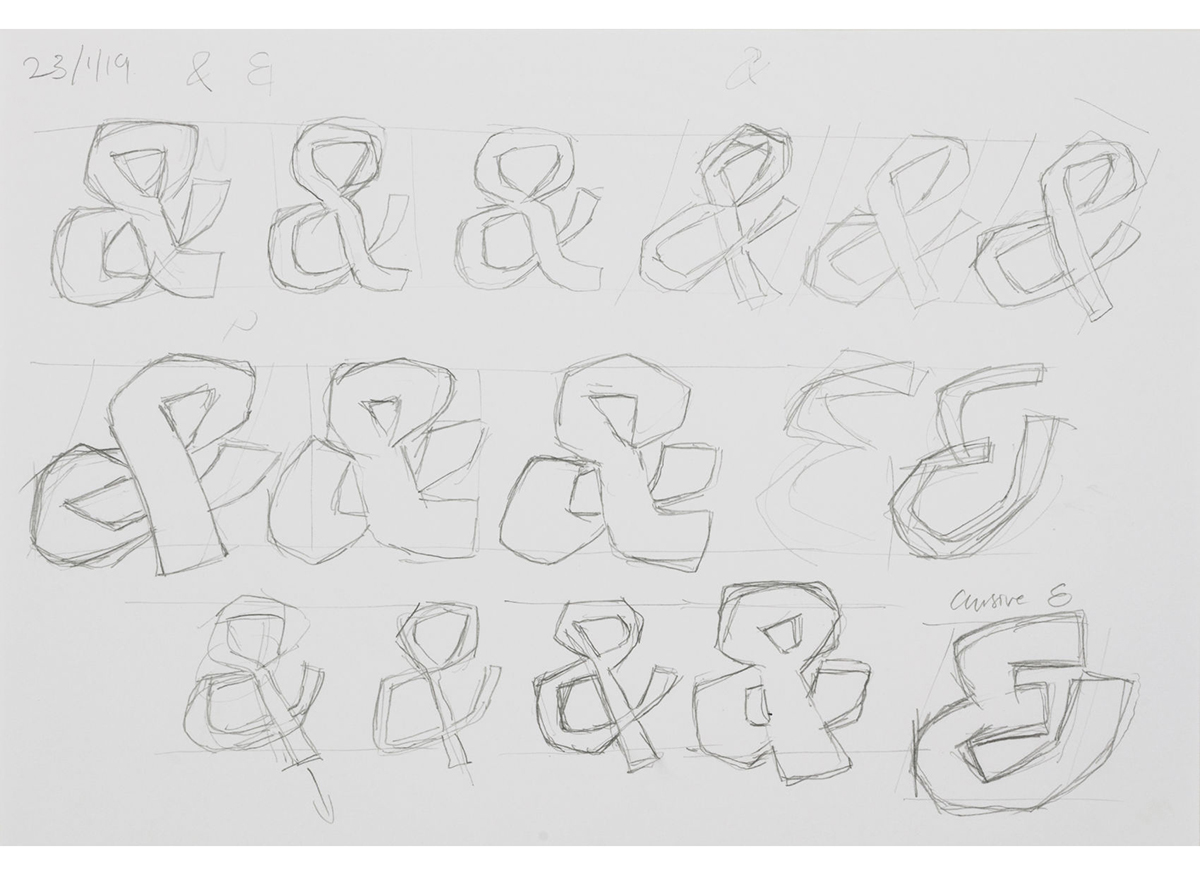
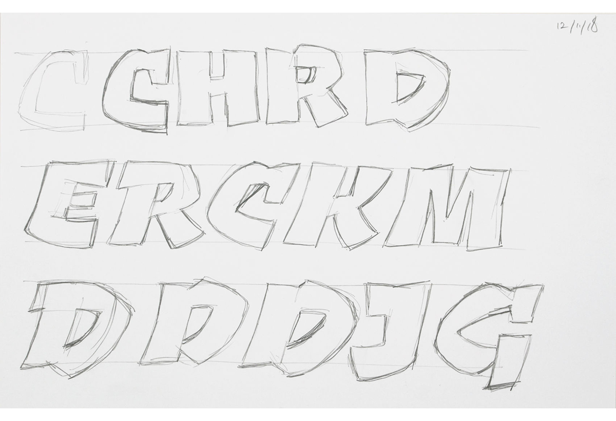
My earliest typefaces (Disturbance and Bliss) began in sketchbooks surrounded by other college work and comments. Since the mid-90s I formalised this to a dedicated A5 sketchbook for each typeface (sometimes two or even three books, if the type development needed it). The A5 holds all the thoughts, early ideas, questions etc. Work is dated to make it easier to reference. They seem to follow a similar flow – first few pages are text heavy with lots of ideas, aims and intentions. Then tentative drawings of key letter shapes and possible details. These increase to page after page of letters – visualising questions and comments.
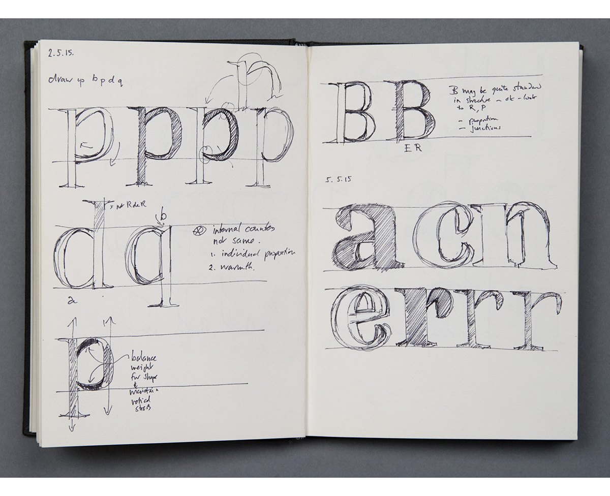
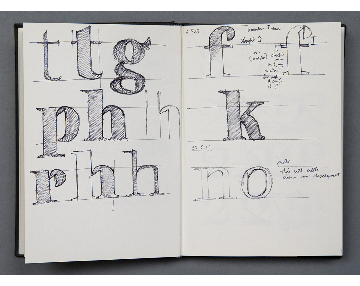
Once I have a roughly coherent idea of where I feel the typeface is going I’ll, work on A4 paper, taking the sketches to a more finished state. Again, sheets and sheets. I may look at how weight affects the shapes, and how italic may appear. Working through all the letters this way allows me to get a clear overview of the detailing and how the whole set could work together.
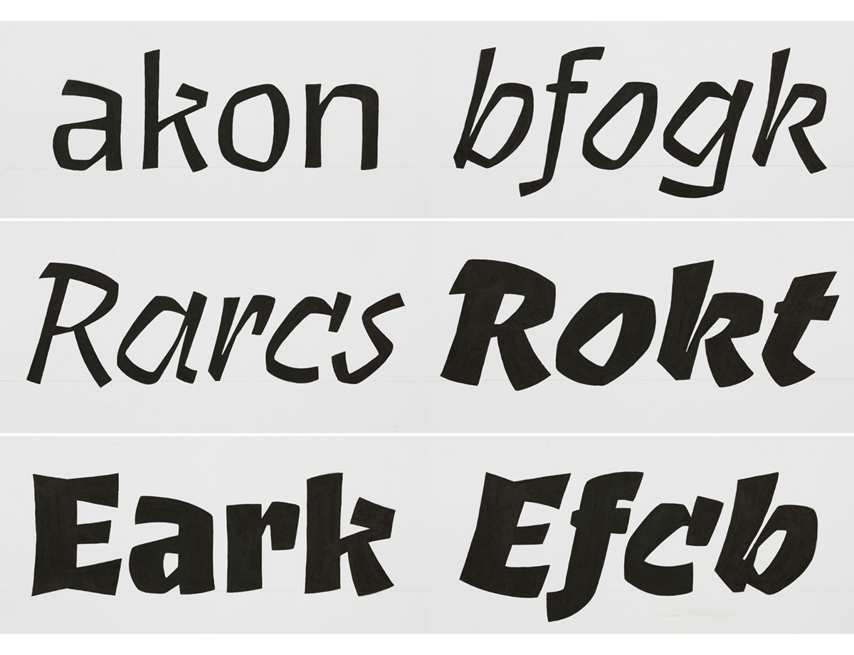
Next, I’ll turn several letters into more formal drawings on tracing paper. These aren’t production drawings. They’re a great way to make words up – very easy and quick to move around. Also I can lay them out and walk around them to see how the shaping looks from all angles. I know that these will never be the final shapes and that the process of working digitally will naturally change them as the typeface develops.
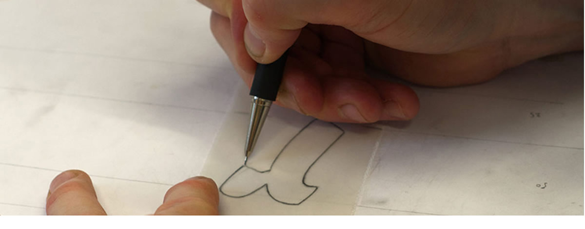
The fact that they are drawn (with Brucker, I also made several inked drawings) and have a naturally rough outline, they bear all the humanity of the hand made and allow me to keep a clearer view of the intention. The second they start to become digital the desire to make the outlines the best they can be takes over. It’s a constant battle to keep an eye on the original intention and avoid letting the computer dictate the design. The crafting of details comes later, the overall tone needs to be set first with all the ideas in place and functioning.
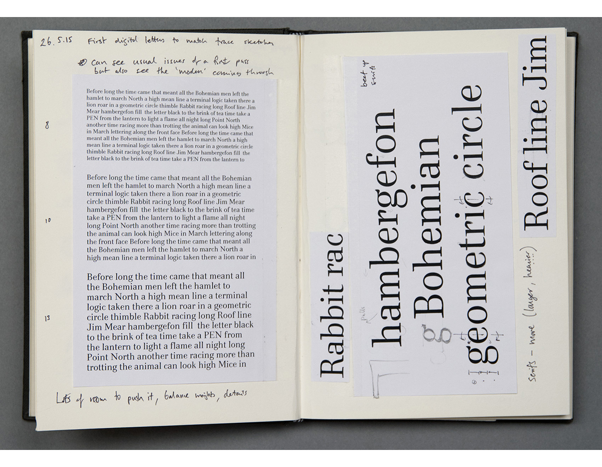
Digital work starts from the trace drawings with the A5 sketchbook to hand. First attempts are always depressing as the outline is cold an inhuman. It’s very easy to let the computer make a curve the way it wants to. So the early stages of setting up the digital design requires a lot of reworking to hone the developing letters so they work together as one. Endless round of corrections. I use an A4 ring binder to keep digital development and I also store the trace and A4 drawings in here.
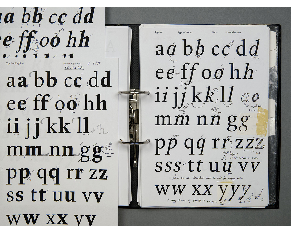
First the a-z lower case and caps are developed in roman and italic, numbers too, in a basic, general weight. When I’m happy with how these are functioning I’ll make the thinnest and the heaviest weights and work these up to the same level. I work in rounds and stages.
When the Light and Heavy core glyphs are working well, the remaining glyph set goes into production. I’ll add language sorts, alternates (small caps, figure sets), if swashes are part of the design, these may be done, then punctuation, sorts, etc. Each time reviewing the effects across the developing glyph set and altering where required.
I’ll review the general fit when the glyph set is complete. This often requires changes to the glyphs – fine-tuning the proportions, details, stem weights and so on. Kerning and hinting are added together with naming and legal info.
The analogue part is the soul of the typeface with the sketchbook being very much its life story. I find working this way endlessly refreshing.
I will also say that if it wasn’t for the computer I wouldn’t be designing type. I have no problem with using a computer, but because of my approach to type design I generally just use it for manufacture and not initial design development or creation as such.
Sure. It’s always been going on. Typeface revivals bring back designs from a previous era. Sometimes the aim to be as close to the original as possible, other times they are sugar coated with a bit of contemporary gloss to make them ‘relevant’ for now. We all look to the past for inspiration but I find it beneficial to mix this with oblique ideas or inspirations from other areas. Each designer will bring their own experiences to their work. This will inevitably involve quite random ideas from a whole host of areas. This way the ideas and shapes from the past are used to inspire and support a new design. There is opportunity then to make something fresh.
His new sans serif typeface, Claymore is out now.
You can see more of Jeremy’s work at: www.studiotype.com, Twitter and Instagram
![]()
![]()