I meant it figuratively. The term describes my basic approach to creating a concept-based image. Turning a complex, nuanced (at time, convoluted) subject matter/theme into a poignant, meaningful visual, one that speaks to the very essence of the theme, calls for a process of elimination (or distillation of sorts).For the sake of clarity, you remove everything that is superfluous. This way, less is more!
I measure it by the strength of its concept (the visual metaphor). Of course, the work must also look good. It’s about striking the balance between the two.
My style allows for flexibility. I take advantage of this. I make sure that both the tone of the illustration and the visual vocabulary I use are just right for the particular assignment.
Frankly, I cannot think of anything!
I think, the book I read as a student – ‘Innovators of American Illustration’ by Steven Heller is still very relevant.
I drink some wine! I believe that wine, in moderation, opens one’s mind.
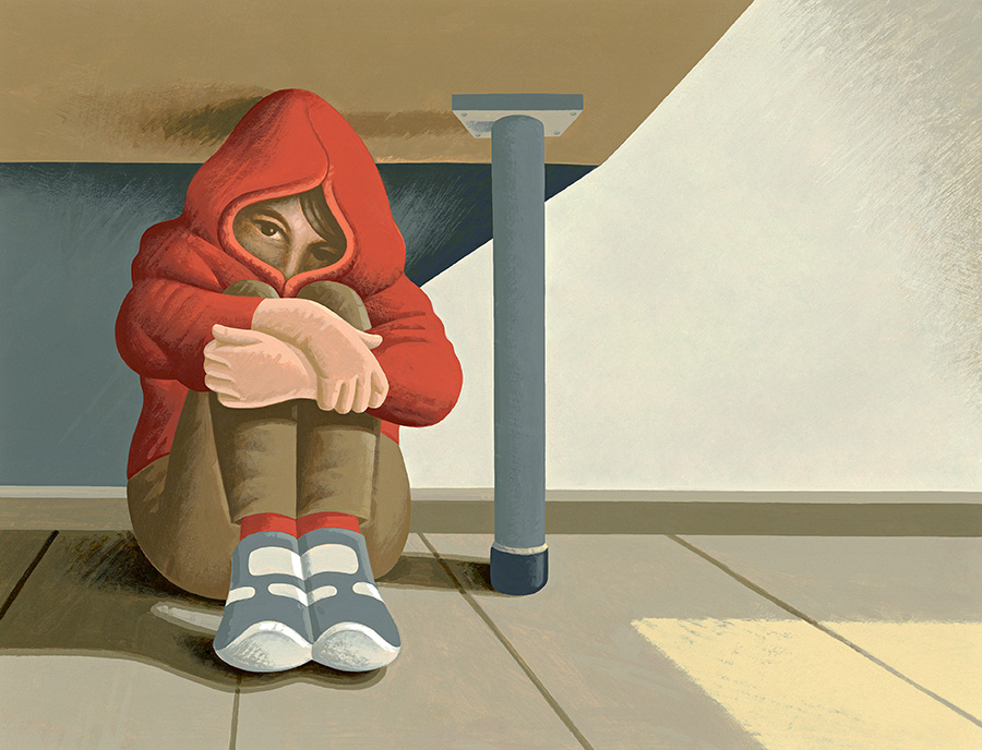
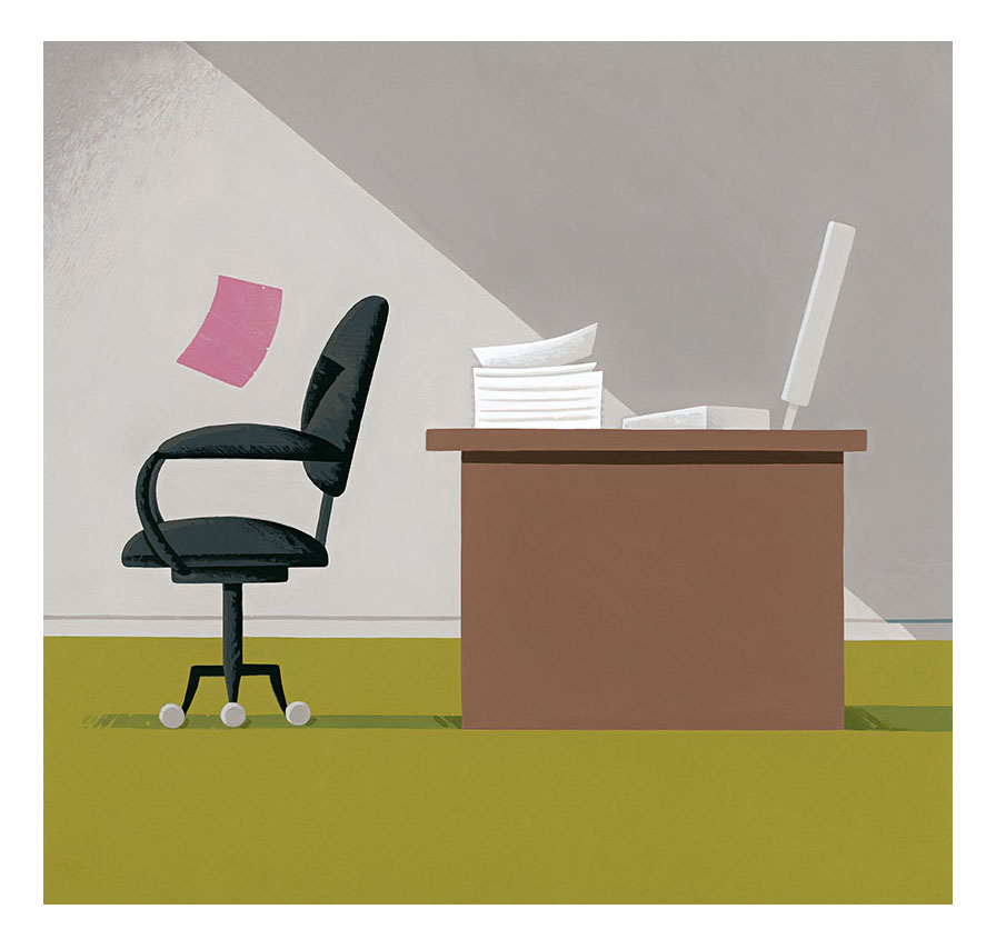
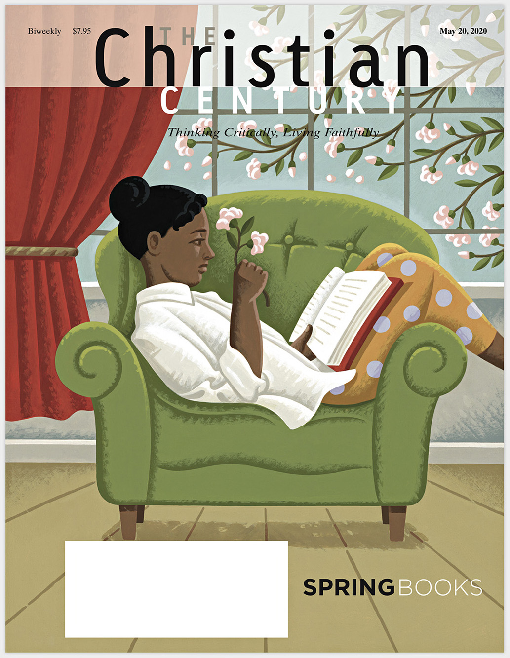
I’m working on a few editorial illustrations for magazines – The Christian Century, Human Resources Management Magazine and the Psychotherapy Networker.
Back
![]()
![]()