Now in the digital age, almost everybody has access to type and sees it on a regular basis. Before the computer, they had to rely on a designer to choose a typeface, because all they had was a typewriter. Computer and digital media have brought typography to the masses. Therefore, they are more aware. Puts more pressure on designers to educate clients on the proper usage of typefaces for communication purposes.
Yes, I’m very interested and inspired by Japanese letterforms and layouts, and they’ve influenced my work.
Typography is all about rhythm. Horizontal rhythm—the uniform spacing between letters and words—and vertical rhythm, the spacing between lines of text, also called leading, is equivalent to the beat in a piece of music. Body copy sets the vertical rhythm on the page and brings harmony to the layout. Leading sets up the underlying framework for the entire layout.
I’ve always felt the rhythm in my 20 years of designing. However, it came clear to me as I was writing course content when I began teaching typography ten years ago.
The first stage is to Discover. I listen to the client and learn everything using questionnaires and research. I question everything. This is the stage where I establish language and terminology that relates to the client’s voice. Next is the Decision stage where I decide what directions to take. I’m looking for something unique that will create impact and interest for the audience — which ideas will work and which ideas won’t. Last is the Design stage. This is where ideas come to visual fruition. What’s important is that the client relationship to the process is ever present, having buy-in at every stage. That way the objective is clear and there are no surprises in the end.
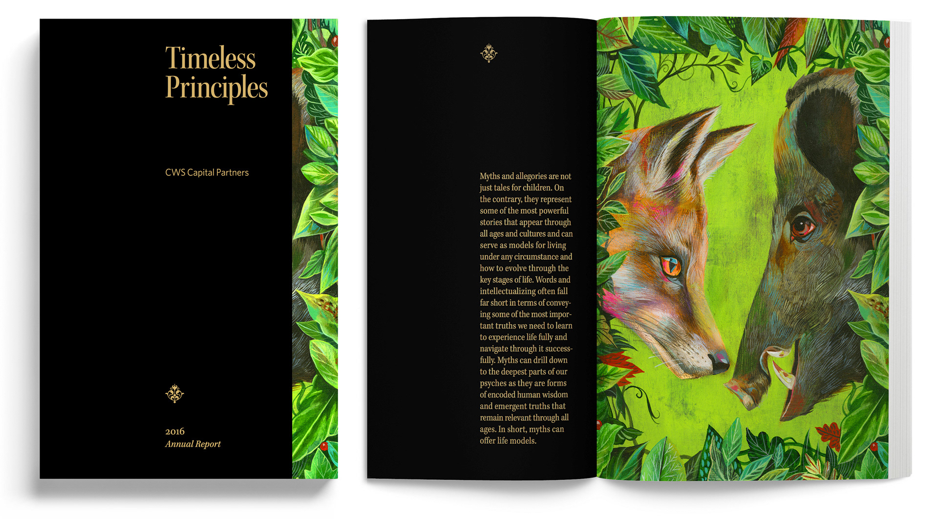
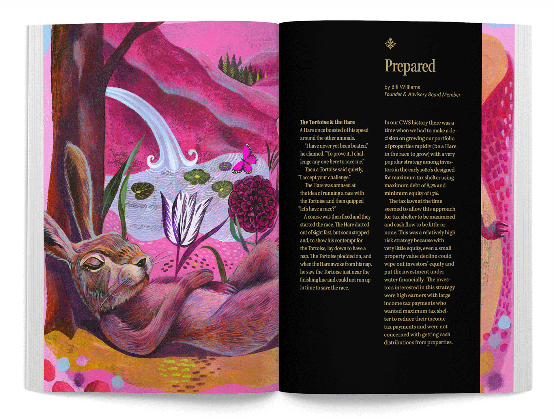
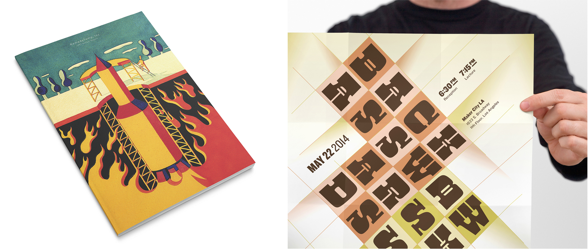
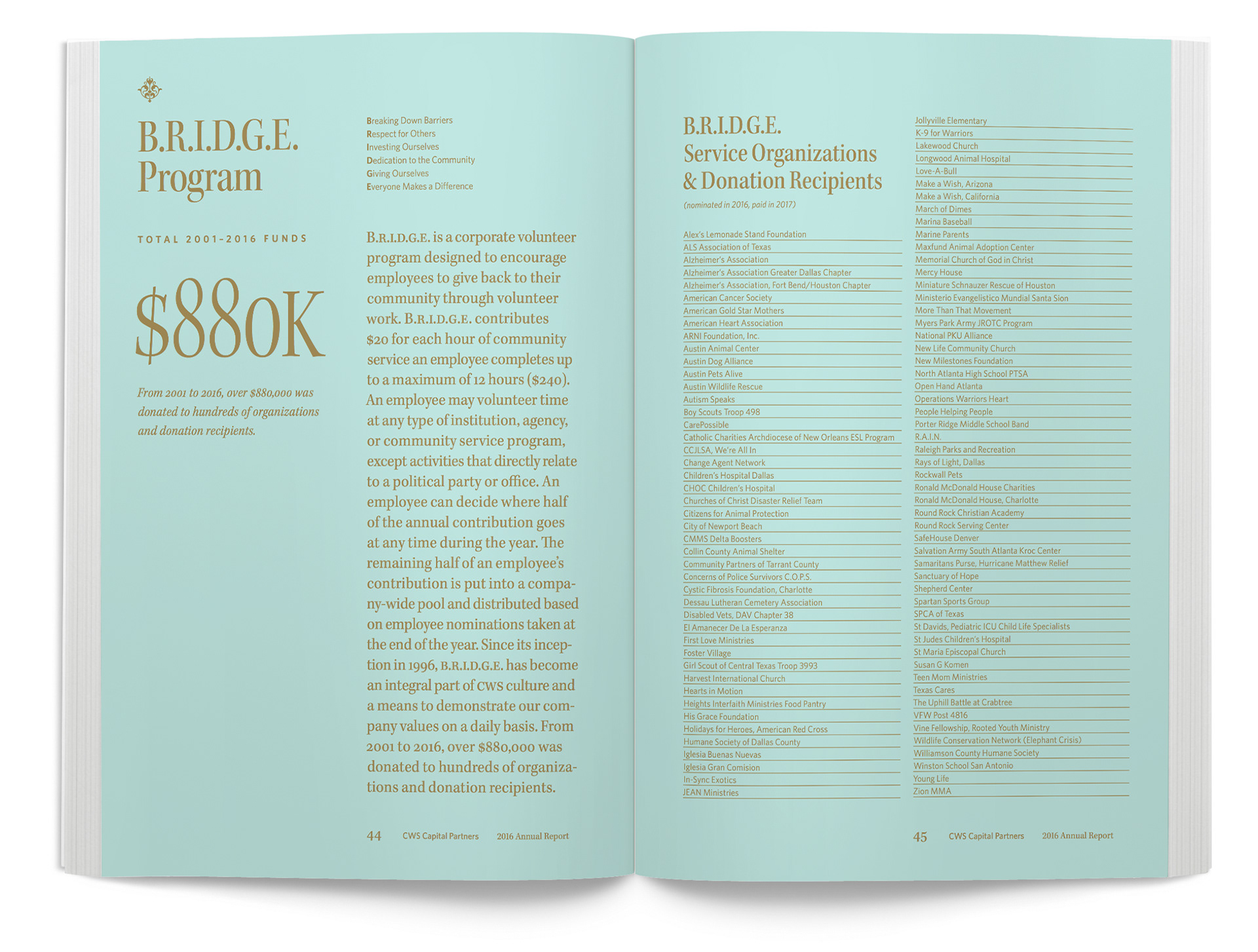
One of the wildest type experiments was in an annual report for CWS Capital Partners based on the concept ‘Circulating Value’. The design incorporated graphics and typography from obsolete American currency throughout the layout to give the reader the idea that the report, and the information within it, was valuable.
We researched and purchased some old bank notes to study the typography in order to accurately represent the look for the report.
The report was a hit with the client and its investors and won several design awards.
p>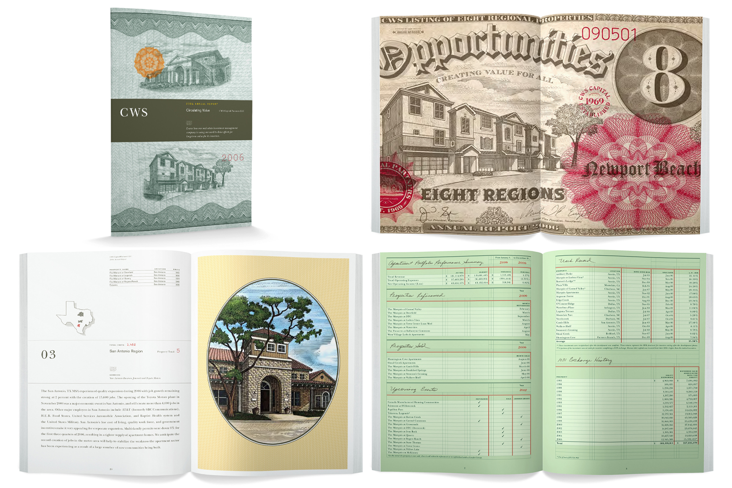
Teaching is important because it has brought an understanding of people and how to manage them. It has taught me to be lenient and empathetic with my employees and vendors. I love teaching my designers all the nuances on concepting, typography, layout, color and all the other aspects to design in my practice. In return, I learn many things from them as well and it has made my career richer and more satisfying.
For a simple, entry-level read, I would recommend Type Matters by Jim Williams. It’s a concise yet thorough read for those who want to get the ins and outs under their belt.
For an in-depth and detailed read, I would recommend The Elements of Typographic Style by Robert Bringhurst. This book includes all of the rules for setting copy properly as well as detailing the nuances for micro-typography.
Lastly, I would recommend Grid Systems: Principles of Organizing Type by Kimberly Elam, because learning grid systems for layout is very important for designers. Graphic design is all about creating visual systems which rely on grids for layout 99% of the time.
Personally, I drive. When I get in the car and see nature and environments and let my mind wander a bit, I let creativity have more space in my mind, therefore allowing it to expand. Ideas and concepts start to percolate and reveal themselves. I’ve always used this method of driving around Southern California since I was college and enjoy the freedom that it brings to the psyche.
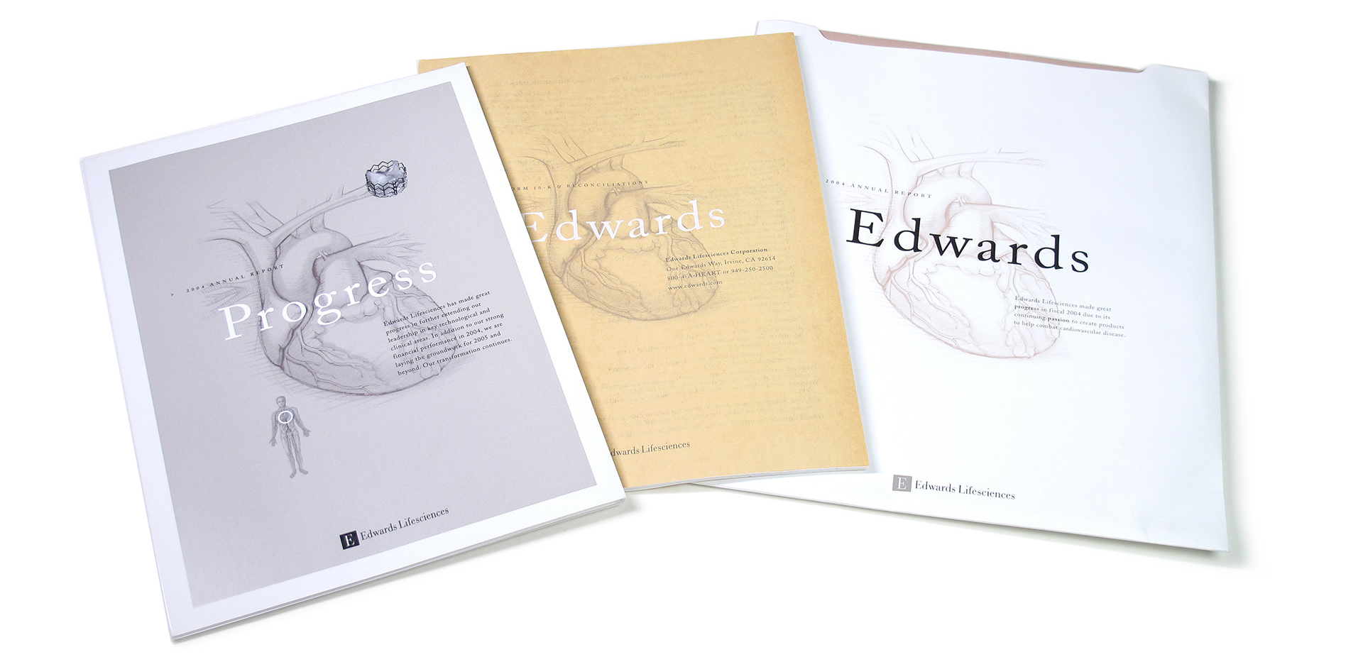
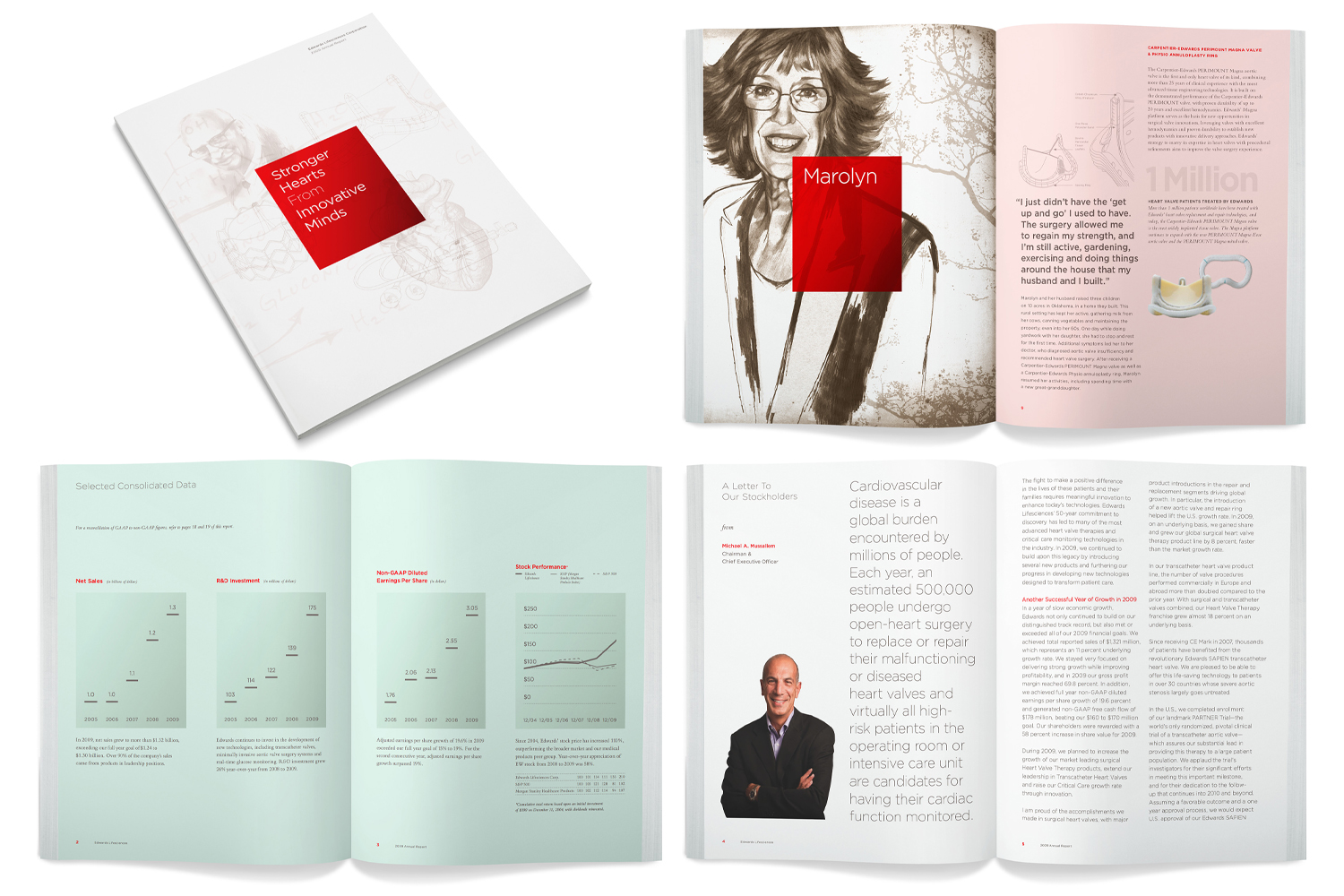
I’ve always been interested in painting and illustration, and have used artists throughout the years for imagery in the design of my annual reports. In the Edwards Lifesciences annual report titled Stronger Hearts from Innovative Minds, I commissioned portrait watercolor illustrations of the patients and physicians to demonstrate the human connection to their cardiovascular products.
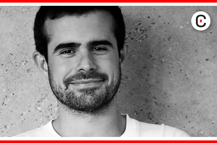
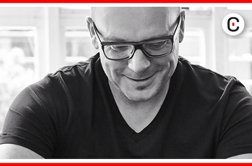
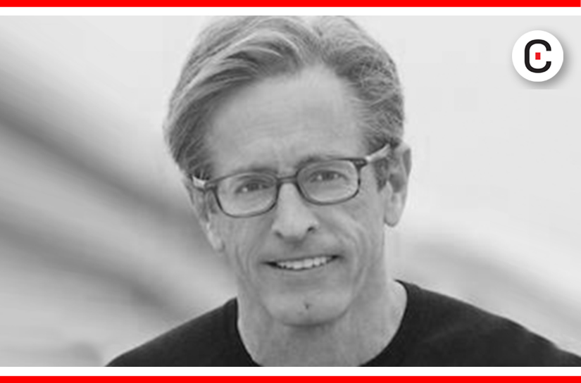
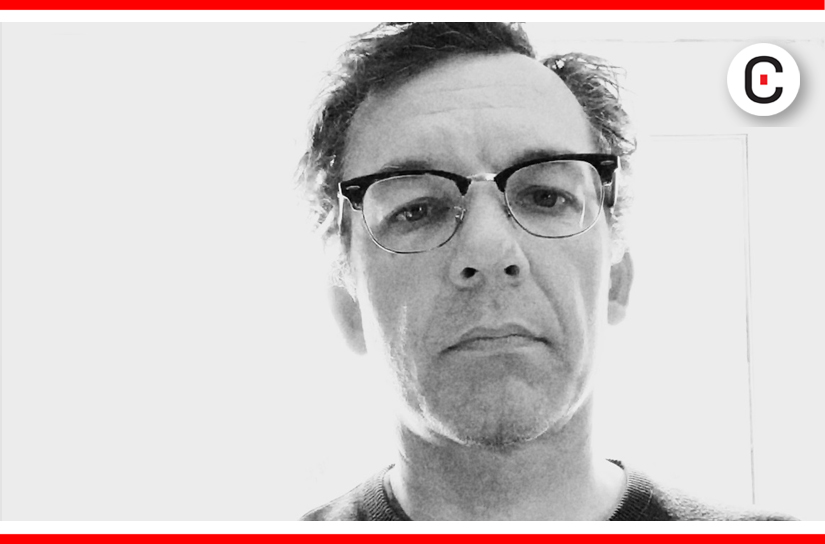
At the moment, I’m working on a case-bound 50th Anniversary edition report for CWS Capital Partners. The report is 62 pages in length and full of color photography of properties and executives, as well as dramatic black and white images that help tell the CWS story. Michael Grecco, a celebrity portrait photographer was commissioned to create the sophisticated executive images to help support the celebratory feel.>
![]()
![]()