I was lucky enough to just receive a commission to develop a typeface and from April/May 2020 to Jan 2021 I was involved with this. As the workload reduced I picked up the Claymore typeface that I’d put on hold and scheduled that for a June 2021 release.
A knock-on effect of the pandemic has been less licensing – perhaps because companies have been on furlough, cut spending, or unfortunately, folded.
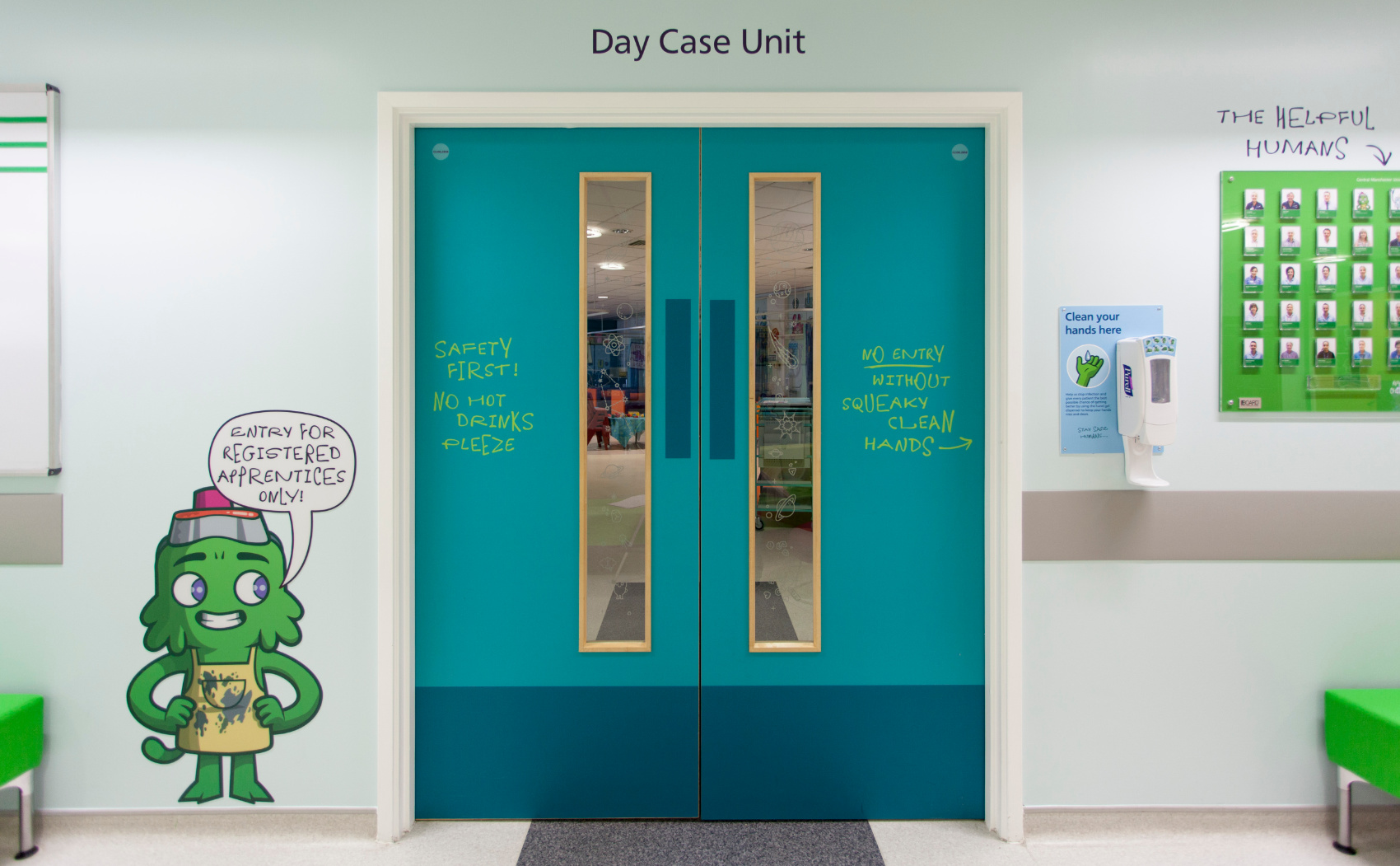
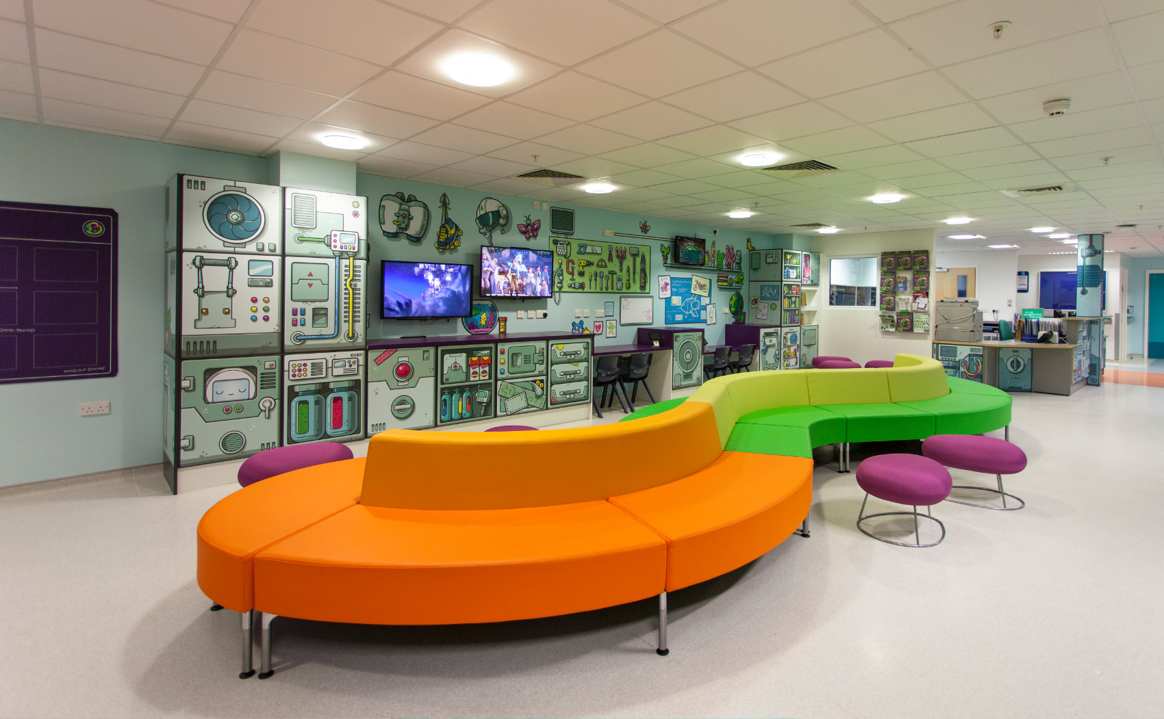
The project was the brainchild of Grant Windridge at Hemisphere Design in Manchester, UK. The team there developed the story where several aliens (Queezies) had been entrusted to find a cure for a disease that threatened their home planet. Interestingly, they found a potential cure in Manchester and embarked to Earth to discover more. Hemisphere’s design involved the aliens infiltrating the children’s hospital and scrawling on the walls etc. The graffiti was their translations of the technical terms –making them less scary and confusing for the children.
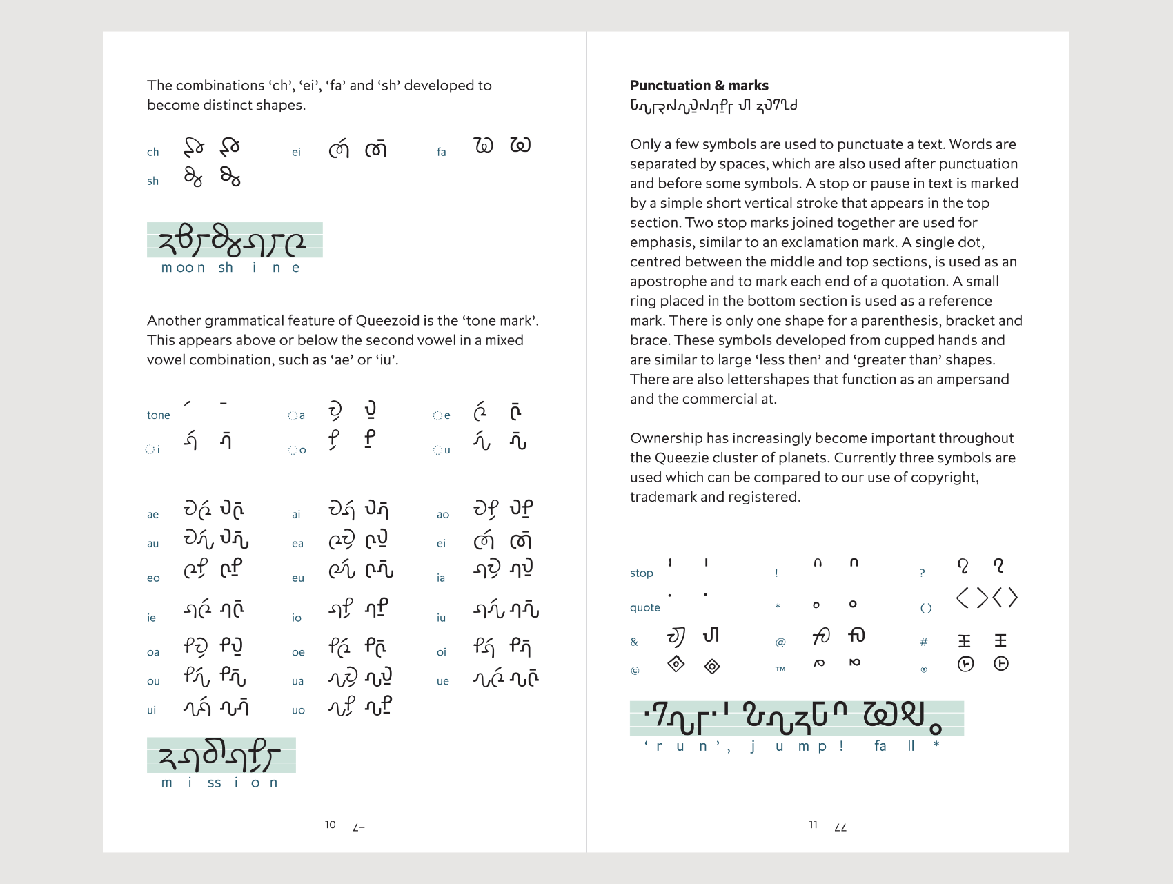
I was asked to create a typeface that would be used for their handwriting to be used on the walls. My approach was perhaps like Method acting. In order to understand how the Queezies could make our letters, I first needed to give the Queezies a visible script for their own language, this would suggest how they make their own marks. Did they have hands, did they use a stylus, did they write joined up, was their script left to right or vertical, and so on. Rather like Method acting I needed to give the Queezies a visible script for their own language that would suggest a way that they make marks. Did they have hands, did they use a stylus, did they write joined up, was their script left to right or vertical, and so on. By understanding this I could then apply their way of mark-making to how they may replicate the Latin capital letters of English. For instance they may not start or construct a letter A the same way we would. Hemisphere didn’t ask for a non-Earth script, only the graffiti one — I undertook this work on my own as part of the job and because I saw it as important to attain the end result.
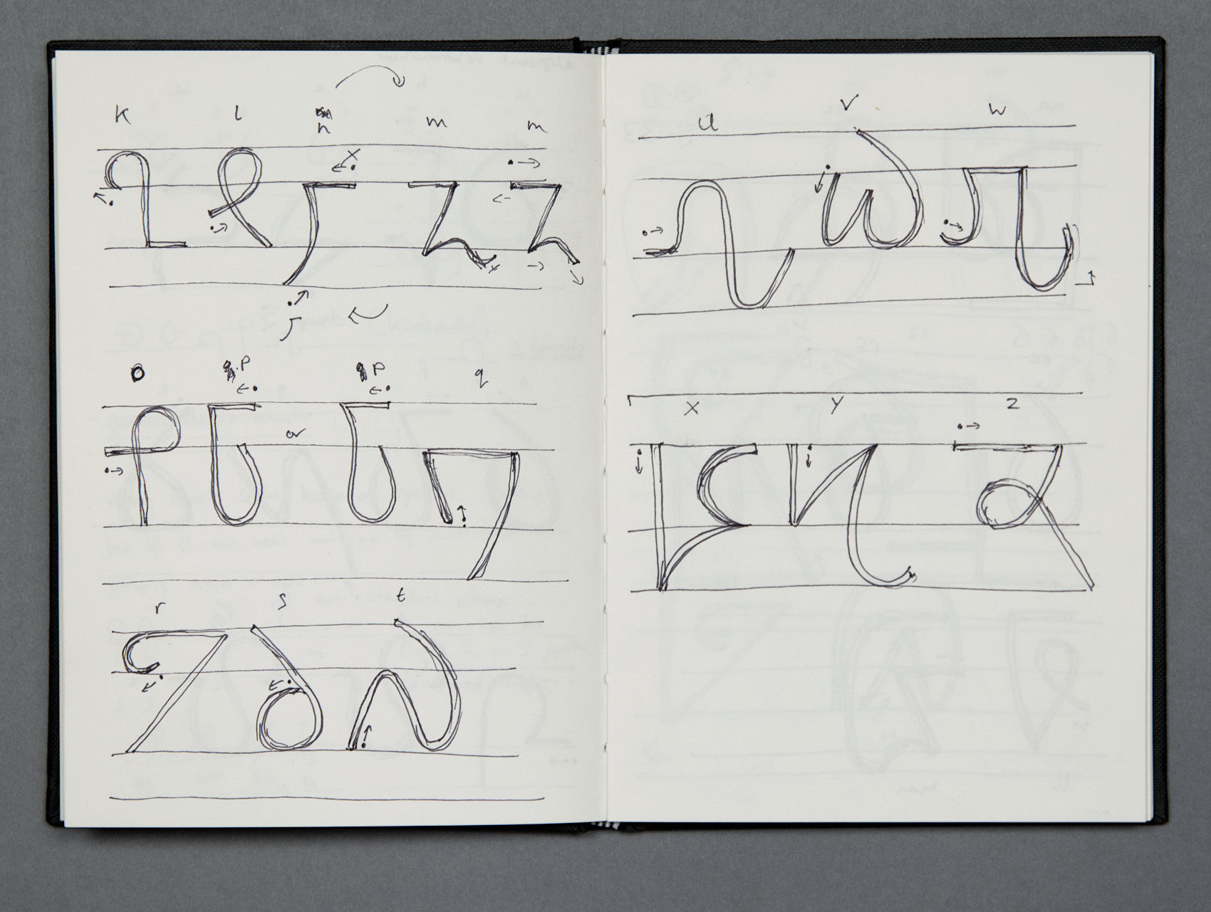
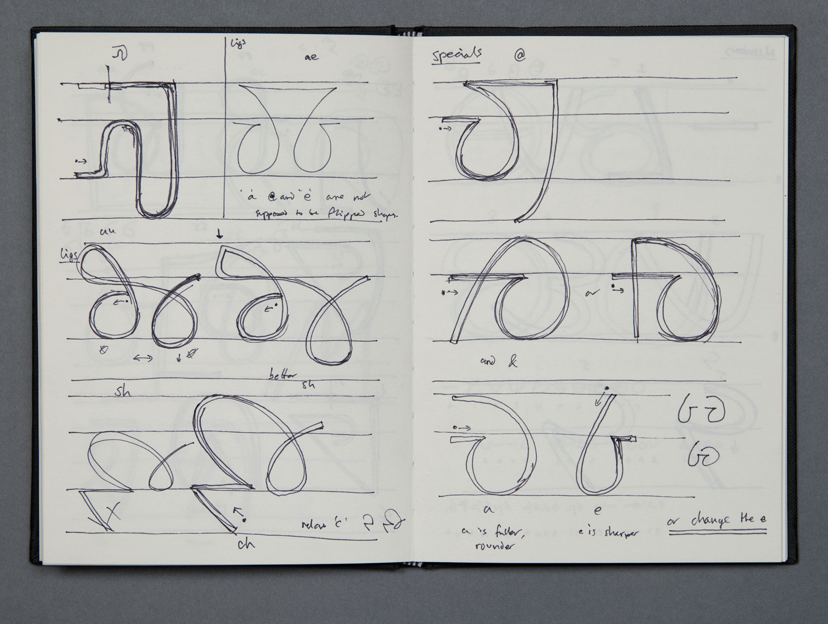
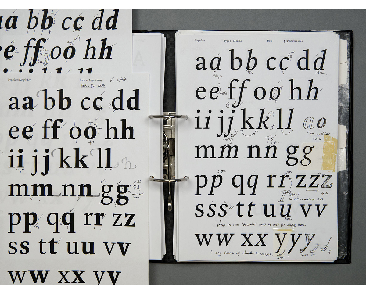
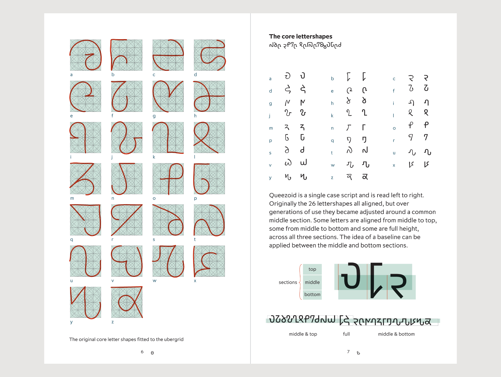
Looking at a whole host of different scripts helped to visualise ideas as to the shaping of the Queezie script. I established parameters in order to control the developing ideas. The text had to basically disguise underlying English text. The basic Queezoid script uses a set of different shapes for A B C etc. It’s a very simple structure but through applying OpenType technology the text can be manipulated and visually changed as it’s set.
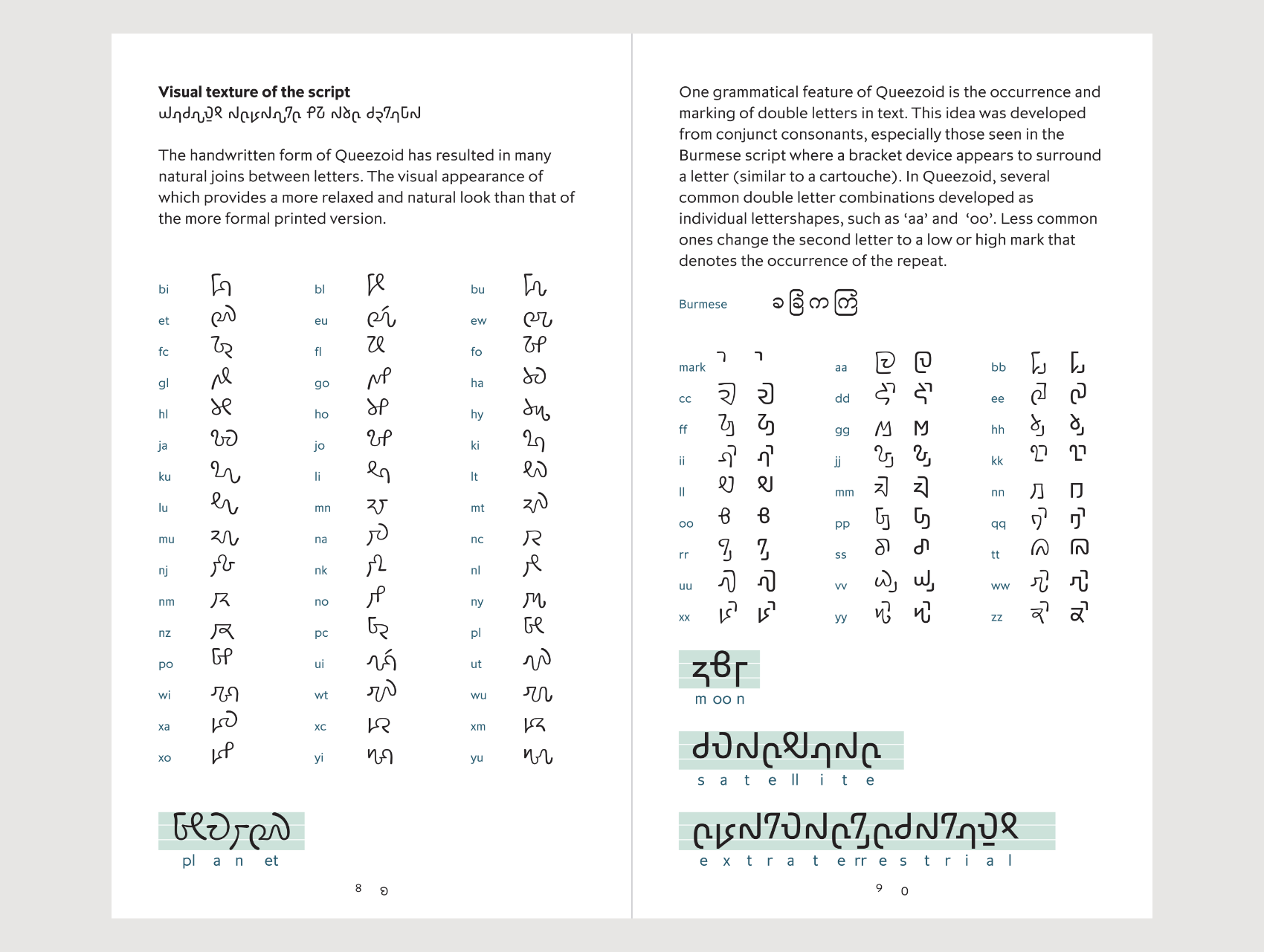
One visual problem became apparent though – where repeated letters appear side by side (such as ‘oo’ on moon). The repeat stuck out like a sore thumb, so I devised a method to handle duplicate letters. I also played with the idea of tone marks to add another layer of visual texture to the script. A tone mark is added to the second letter in a double mixed vowel combination – for example, the word ‘pear’ would receive a tone mark to the ‘a’ glyph.
Looking at a whole host of different scripts helped to visualise ideas as to the shaping of the Queezie script. I established parameters in order to control the developing ideas. The text had to basically disguise underlying English text. The basic Queezoid script uses a set of different shapes for A B C etc. It’s a very simple structure but through applying OpenType technology the text can be manipulated and visually changed as it’s set.
One visual problem became apparent though – where repeated letters appear side by side (such as ‘oo’ on moon). The repeat stuck out like a sore thumb, so I devised a method to handle duplicate letters. I also played with the idea of tone marks to add another layer of visual texture to the script. A tone mark is added to the second letter in a double mixed vowel combination – for example, the word ‘pear’ would receive a tone mark to the ‘a’ glyph.
It became a thing in its own right and I made a full script version of the idea. During Hemisphere’s design development I noticed that they’d used the alien script on the side of the spaceship, which was odd as the script was a handwritten style. It made sense that a more formal letter, not a handwritten one, would be used in this context. So I made a more formal style — a kind of ‘state approved’ version. The PDF describes the type, as well as a few issues of our newsletter Footnote 25 and Footnote 30.
As far as I know the project started to be rolled out, but a change in management at the hospital resulted in the project being cancelled (and unpaid). Hemisphere had to close as a result, which was unforgivable. But hopefully children didn’t suffer – just have to look at blank hospital walls instead of having their imagination fuelled.
I’m not wholly up to speed with info online as I’m old and prefer books 🙂 I will say that much of what I have seen online tends not to focus on the creative side, but more the how to make (using apps etc.) and promote how ‘easy’ it is to make a font.
When I start a new type I tend to gather research from around the subject that has prompted the new type design. This could be anything.
Books specifically on the design of type are few and far between; there isn’t a huge amount as everyone does it differently. The applications used though tend to force you to make type a specific way. I also tend to make type the long way and avoid automation on what I see as fundamental stages (spacing, kerning, hinting). I keep an eye open to concepts of automation but remain uncomfortable in certain aspects. But this is my approach – as I say, everyone does it differently. If we all worked the same way the end results would increasingly be the same! (it’s heading that way as it is).
Books on or by specific type designers are an excellent insight to type design. I would always recommend looking at the history of type. Books such as these are very important as they guide you through concepts and histories.
Adrian Frutiger – ‘The Complete Works’
Alexander Lawson – ‘Anatomy of a Typeface’
Christopher Burke – ‘Gerard Unger: life in letters’
Frederic Goudy – ‘Typologia’
Gerard Unger – ‘Theory of Type Design’
Gerard Unger – ‘While You’re Reading’
Sébastien Morlighem, Martin Majoor – ‘José Mendoza y Almeida’
Sébastien Morlighem, Sandra Chamaret, Julien Gineste – ‘Roger Excoffon et la Fonderie Olive’
Walter Tracy – ‘Letters of Credit’
The Claymore specimen booklet contains a short text that puts forward five ‘Principles of Type’ as a guiding concept to approaching the design thinking of a typeface. There are plenty of books on how to make a font but not much at all on how to create a typeface.
I was working on a type during 2020 lockdown, but this is under NDA and may not see the light of day for five years or so. As this came to an end in late 2020 I picked up the design of Claymore and scheduled it for June 2021 release. This took up most of the first half of 2021. Now I’m gathering together a few ideas to see which I want to take forward for a potential 2022 release.
Other than that I have the task of moving all the typeface masters to a different application. The process takes me a week of concentration per master to make sure no elements are missed – all the naming, fit, kerning, hinting, features need to be replicated (or improved). A typeface is never finished as such; they constantly require care.
Interview Part I
Interview Part II
His new sans serif typeface, Claymore is out now.
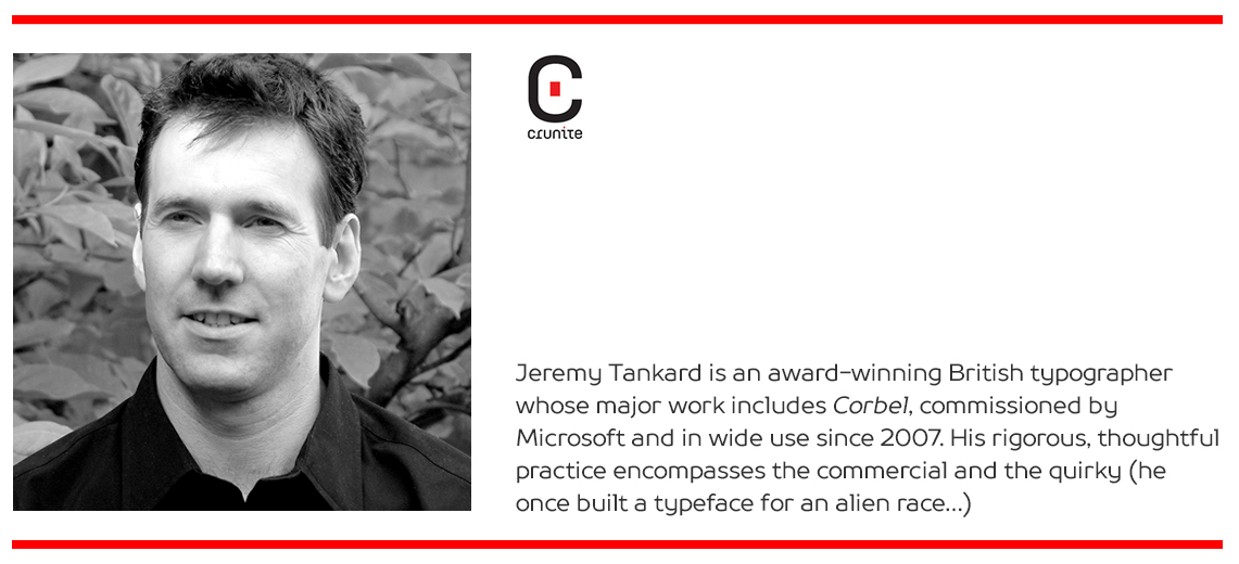
You can see more of Jeremy’s work at: www.studiotype.com, Twitter and Instagram
![]()
![]()