
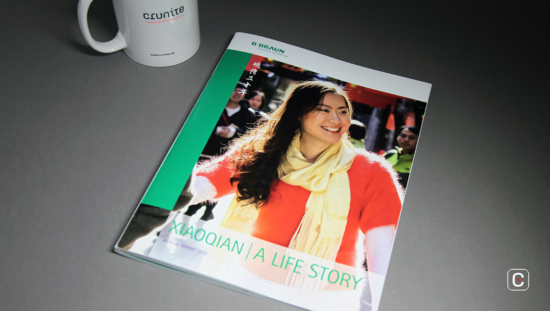
B Braun’s annual report ‘Xiaoqian, a life story’ is very much a part of the company’s annual report and web site, although on the web site it took a bit of scrolling to find it as it sits along side the organization’s portfolio of products, facts and figures. The colours and image used on the front cover impart a soft, warm quality inviting would be readers to turn either turn the page or click it, depending on the medium, and look inside.
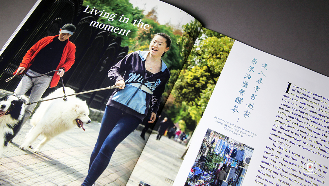
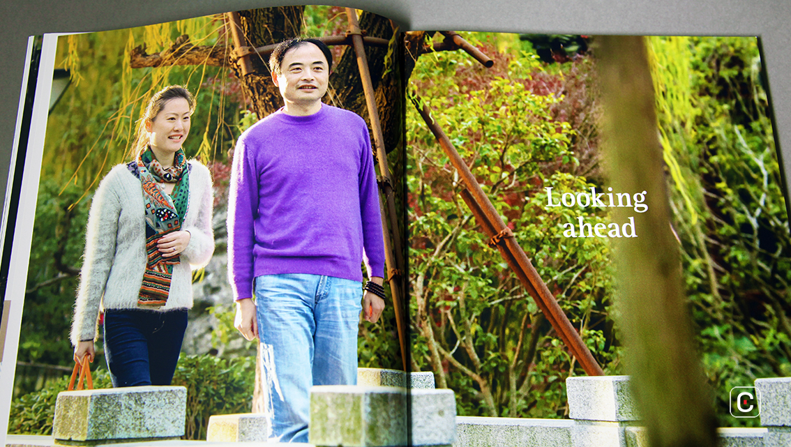
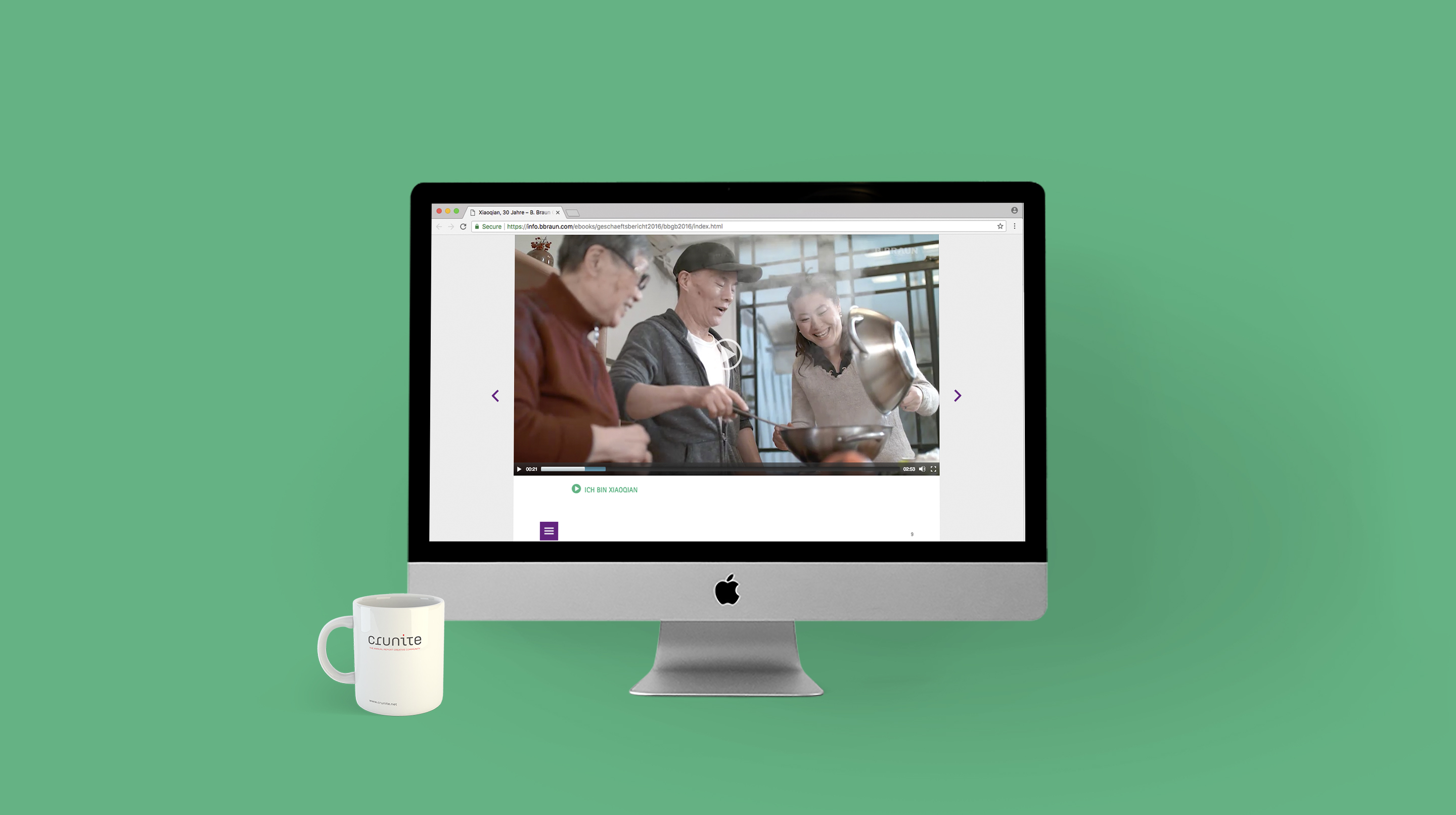
The report’s idea is simple and delivers the company’s message of showing where B. Braun makes a difference in protecting and improving people’s health and lives in a clear, authentic manner. Xiaoqian, a single 30-year-old woman from Shanghai, China is the report’s protagonist and represents the company’s diversity, opportunities, and changes.
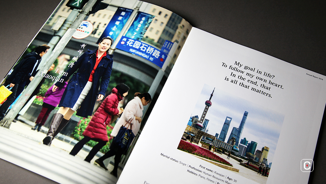
The narrative’s focus is on health and the value of life in relation to the topic of illness. It takes the reader on a journey through Xiaoqian’s everyday life as the daughter of a Cancer patient. It ties Xiaoqian’s story to the different aspects of the health care company in an engaging way because it personalises the report. This in turn captures the attention of investors and enquiries from would be clients.
On the web site the no-nonsense text blocks are easily navigated. There is a short video introducing Xiaoqian, and a graphic that provides more information related to cancer when moused over, this gives the reader a choice of whether they want to learn more or not. Navigation around the report is made relatively painless thanks to the useful breadcrumb trail at the top of the pages and a funky purple button on the right of the pages gives quick access to information elsewhere on the page.
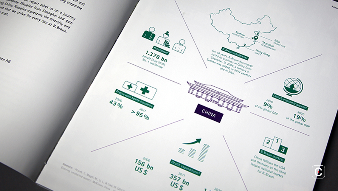
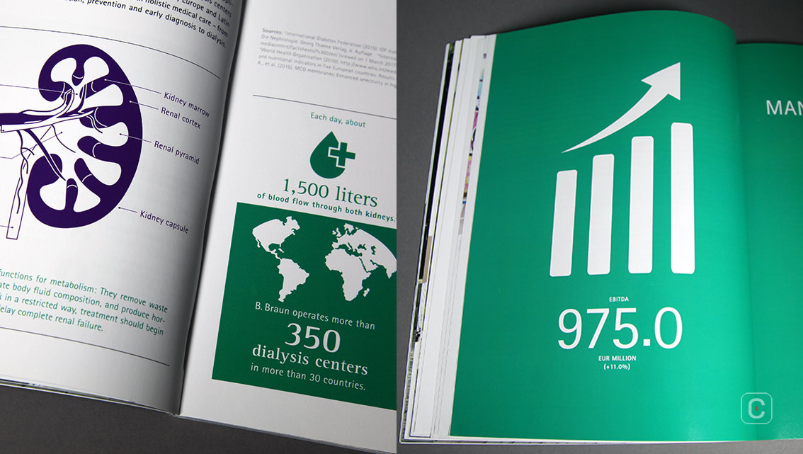
In the printed report, the infographics use the colours white and teal to draw attention to the information either in the form of solid teal backgrounds or simple, clean line illustrations.
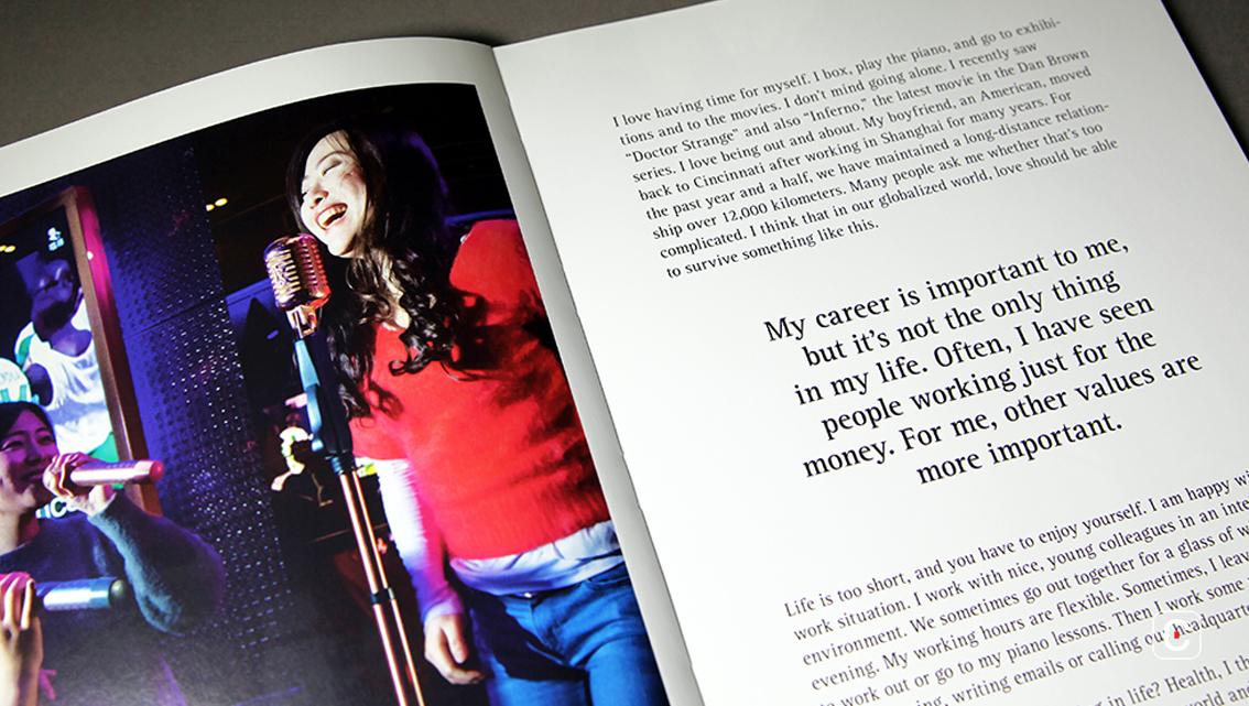
In both hard and soft versions of the report a straightforward writing style is used. Chunks of information highlighted in a humanist sans-serif font evoke a feeling of warmth and personality as does the soothing teal colour. It’s a feeling that serves the report well.
![]()
![]()


