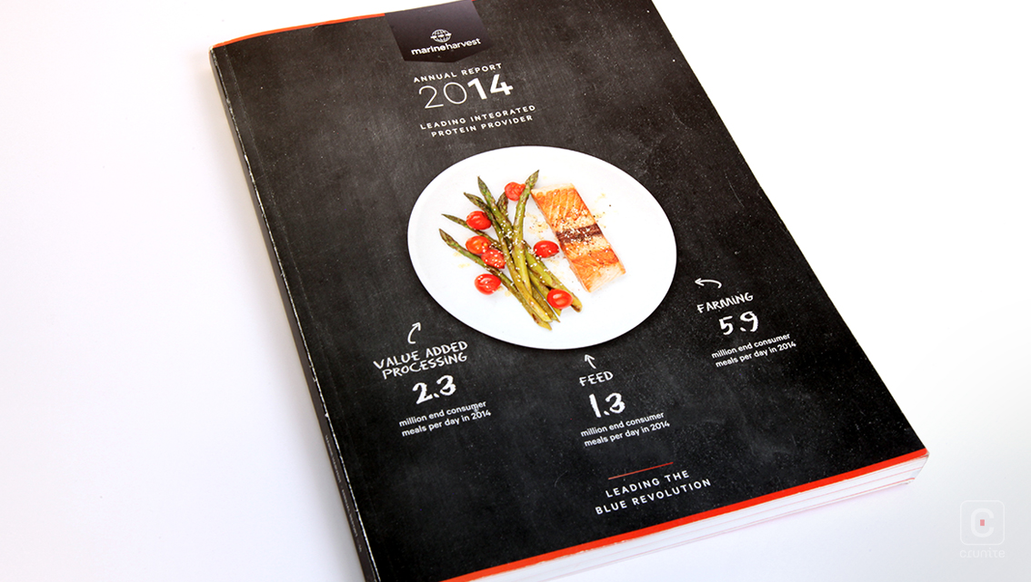
The Marine Harvest Annual Report does justice to this set of extraordinary fish farmers with a report design that resembles a menu. The cover features a perfectly cooked slice of their farm-raised salmon with a side of cherry tomatoes and asparagus; a mouth-watering dish perfectly complemented by the black slate background and chalky white typeface.
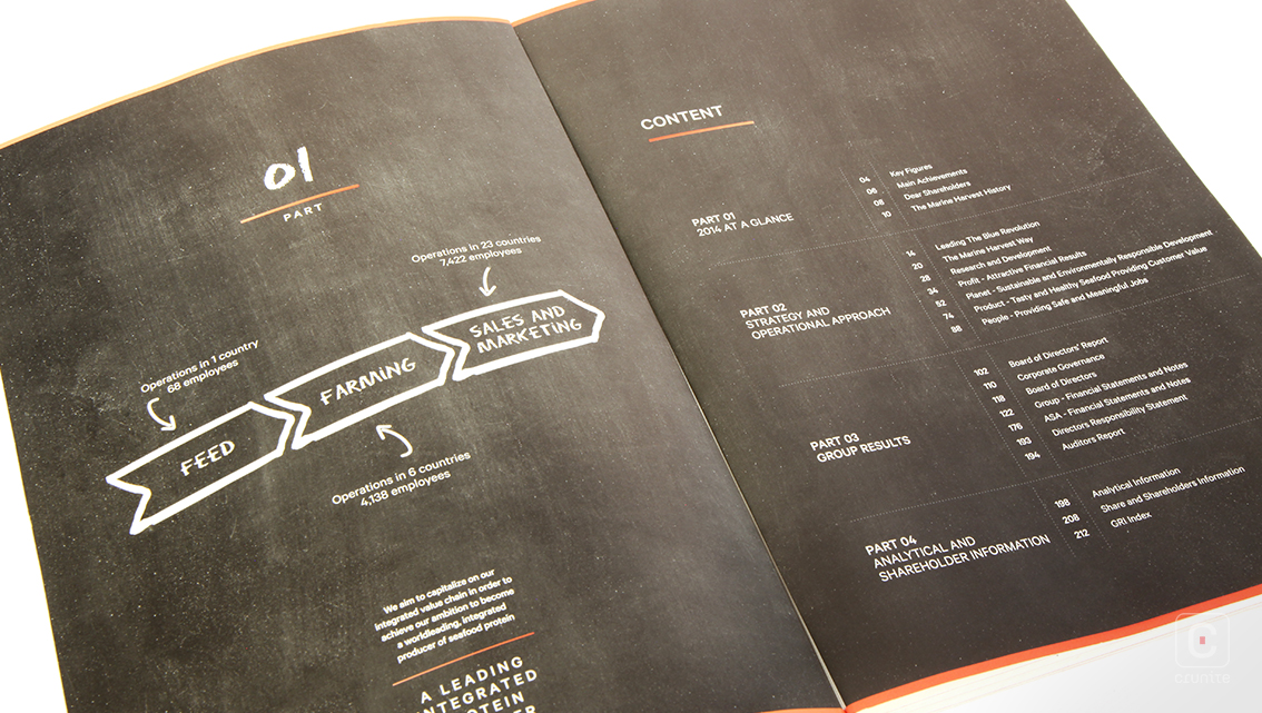
Divided into four main parts (each with its own black slate contents page cataloguing the subsections) the account includes in-depth facts and figures about the company. Furthermore, each subsection follows the same introduction format: heading, summarisation and pictures.
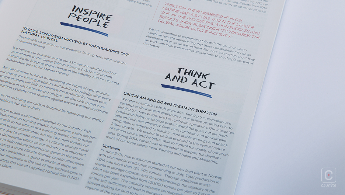
Written in simple English, the two-columned content uses a mix of serif, sans-serif and chalky typeface throughout the report. Headings appear in bold, uppercase letters while quotations and extracts are italicised serifs, while regular content adopts a thin, sans-serif. The chalky font however is reserved for the more inventive pages, illustrations and occasional highlights. Thus, the contrast between the weights of the typefaces combined with ample breathing space around the unjustified square paragraphs brings the whole report together.
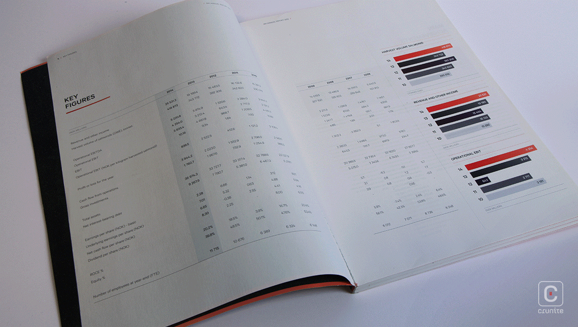
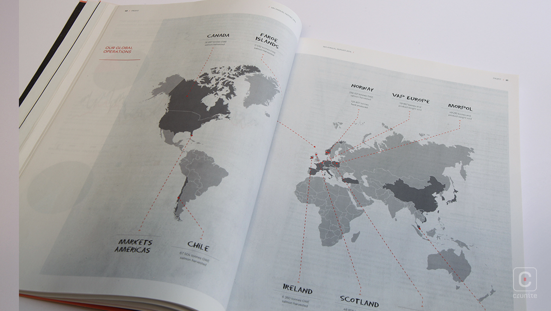
Rectangular images are evenly scattered throughout the report. These range from pictures of their crew in action to 3D images of their equipment to product package shots. While the CEO is honoured with a B&W landscape portrait before his review, the members of the Group Management Team and Board of Directors’ are displayed through individual B&W cut outs against a grey ribbon with introductions; an instantly professional look. Apart from these the report holds no additional images.
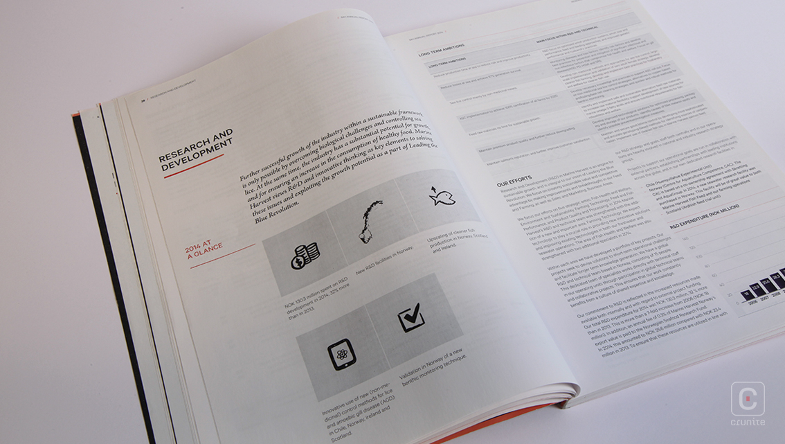
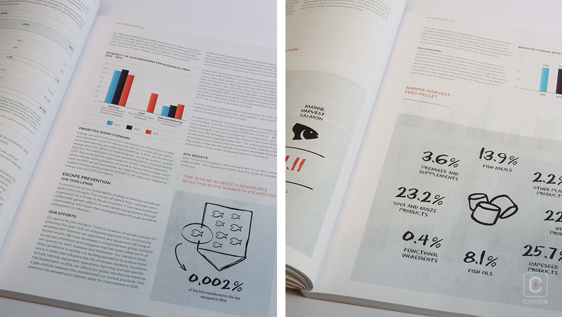
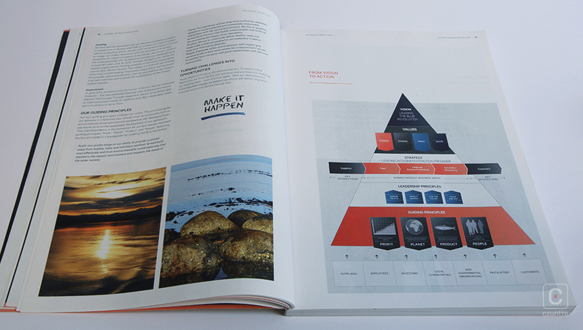
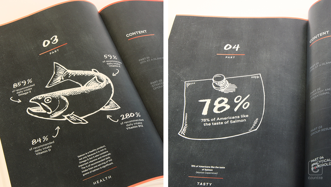
The iconography used is a unique feature seen prominently throughout the report as they are depicted through small chalk illustrations in grey boxes. The thin basic headers and page markers tie the whole design together, making this report a professional yet fun presentation of marine harvesting.
![]()
![]()