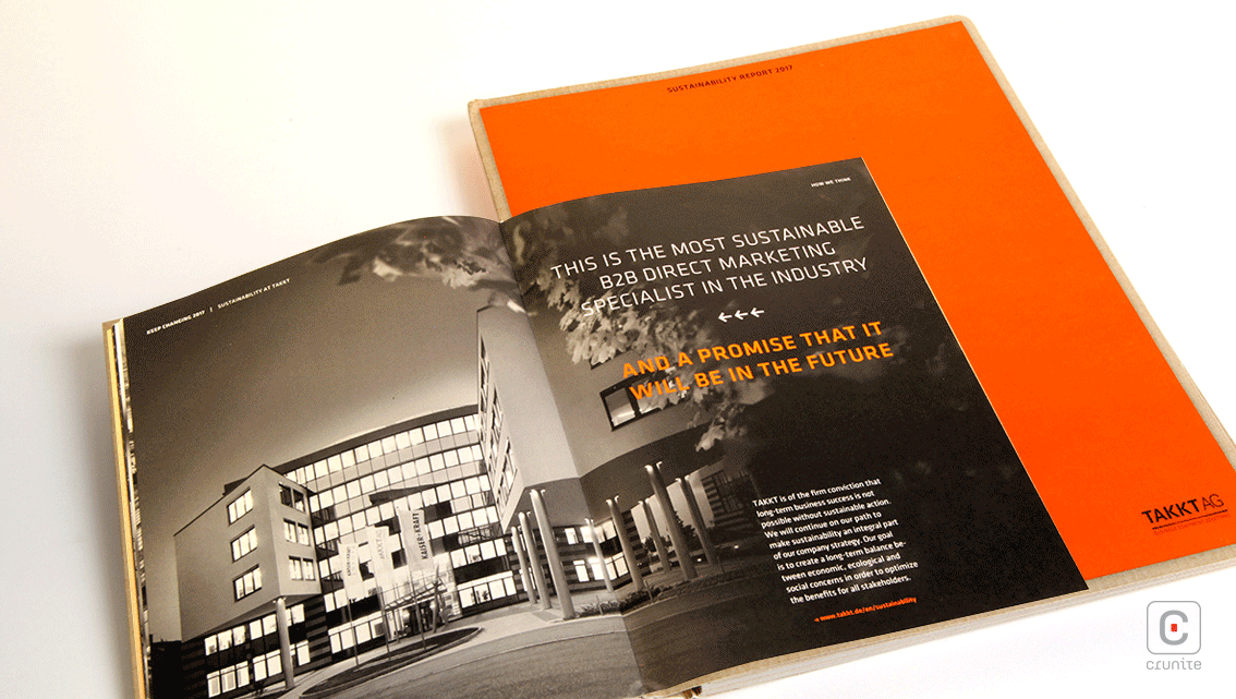
TAKKT AG is a business-to-business direct marketing company that provides business equipment in Europe and North America. It offers everything from pallet lifting trucks to collapsible boxes to containers for hazardous materials.
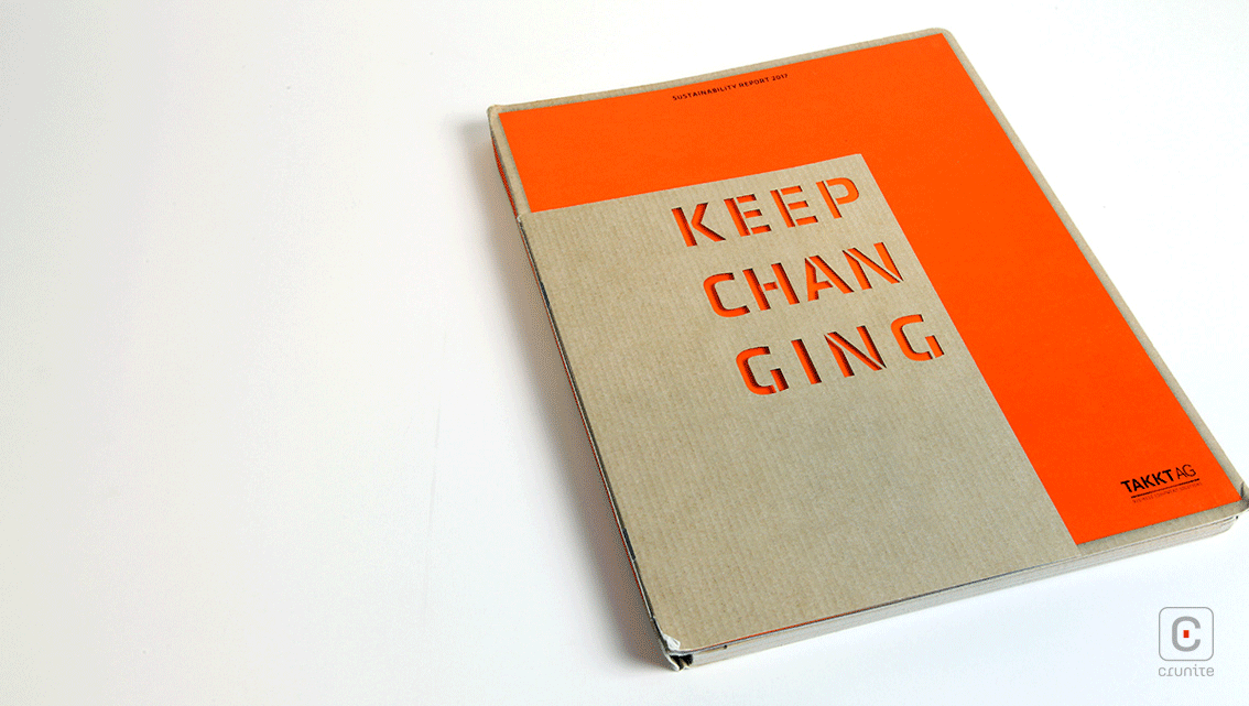
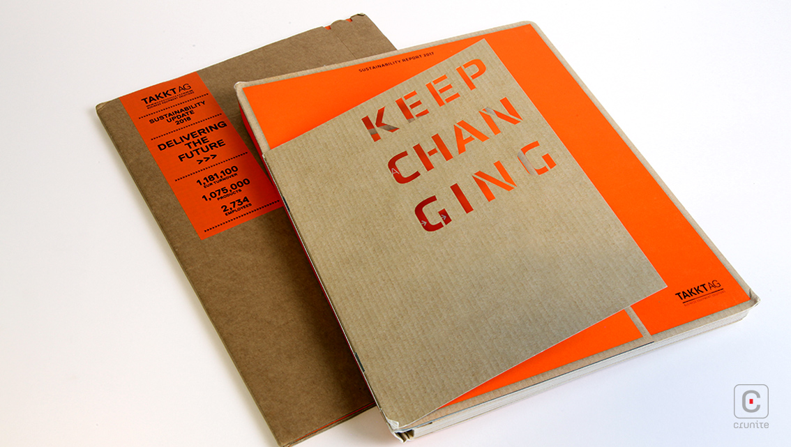
The cover lays these out with stenciled, die-cut text and a 2-colour palette that includes the brown of a cardboard box. For the main section titles, only the stenciled text is used and it’s a shame the die-cut wasn’t applied to these, for consistency.
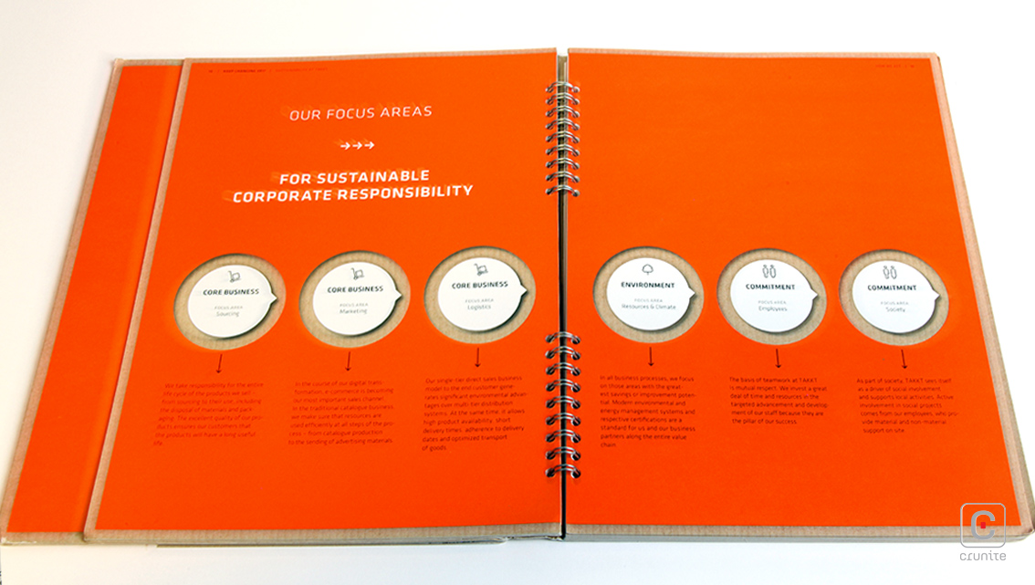
Other aspects of the design that suggest the company’s line of business include a metal spiral-bound spine, a small introductory booklet glued to the front cover and the GRI Standards Context Index in a see-through pouch glued to the back inside cover. The other half of the 2-colour palette is a bright orange, used to enliven the muted brown of report as well as to guide the eye around the contents.
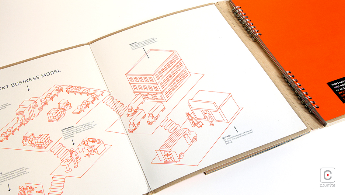
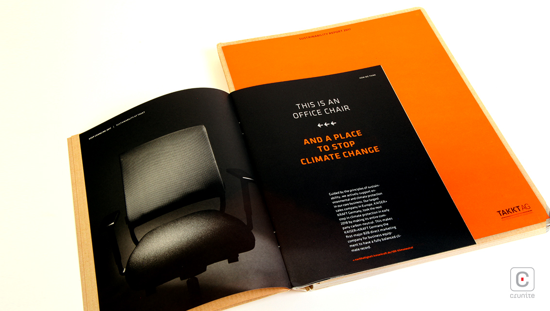
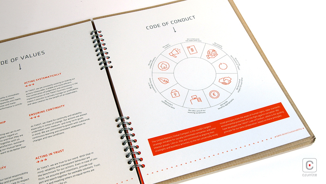
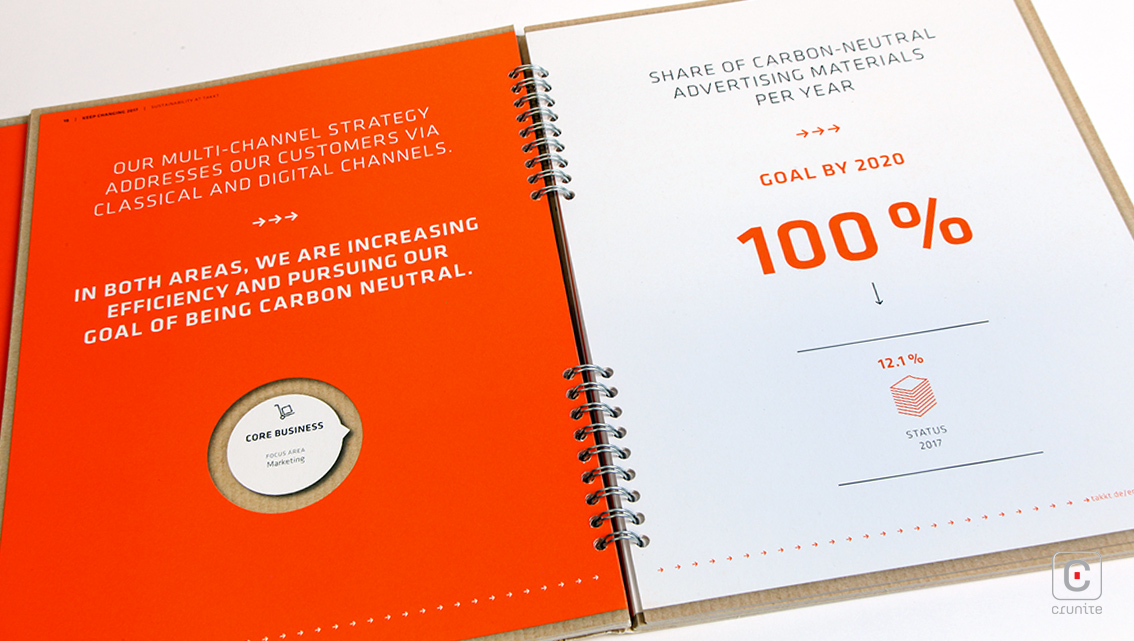
Photography is used only in the introductory booklet, while the main report uses illustrations. The card stock is a counterintuitive choice that works surprisingly well – it is hard to riffle through the book, but given that the book is only 48 pages long, the heavy cardstock encourages fast page turns. Infographics are sparingly used and designed as minimal schematics but are effective in showing TAKKT AG’s process and trading systems.
These elements of design are repeated in their supplemental 2018 sustainability update, using a cardstock that resembles heavy boxboard, complete with a tear-away perforation to ‘open’ the report. The design of both reports is clean, simple to understand and as a result the books are a quick read, perfect for a company that specialises in getting goods to its customers swiftly and without fuss.
![]()
![]()