
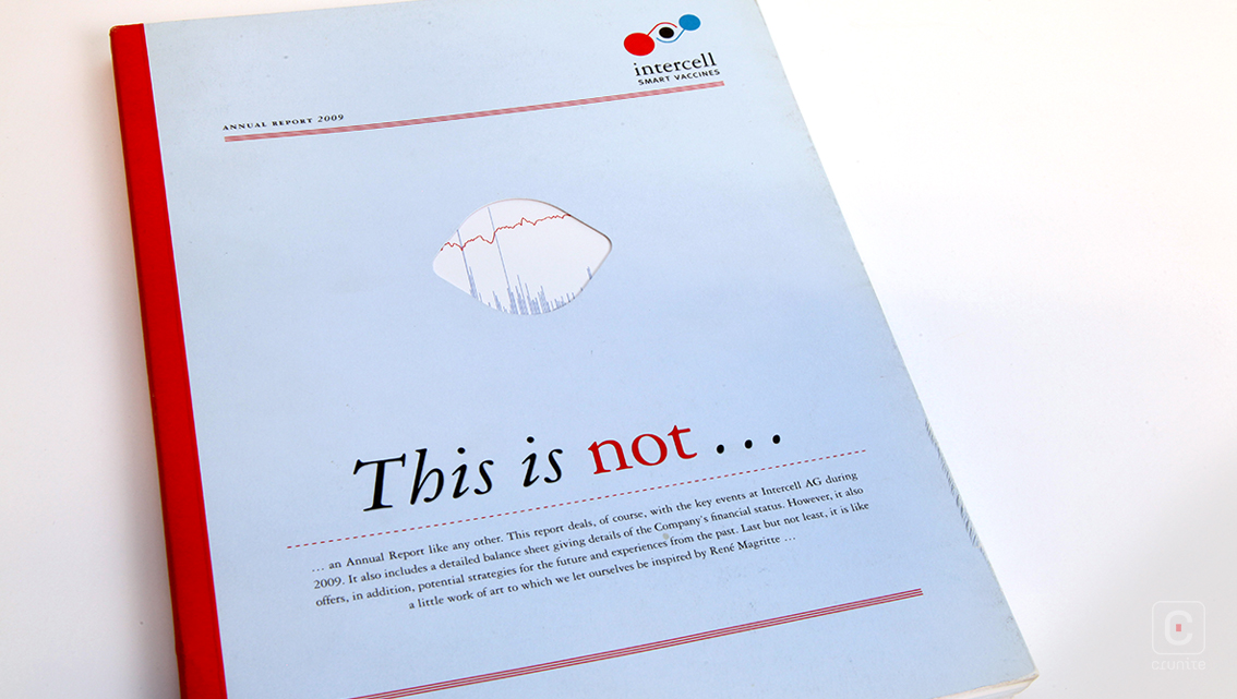
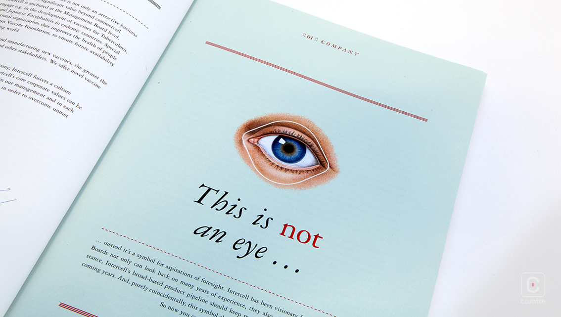
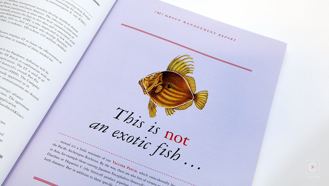
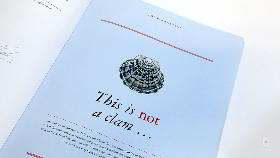
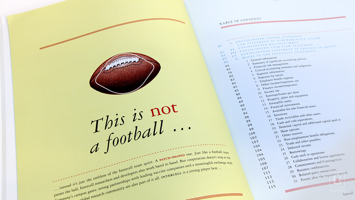
Intercell, prior to a merger with Vivalis, was a Viennese biotechnology company that developed vaccines for infectious diseases. Their 2009 report focuses on the development of a new vaccine patch. The shape of the patch appears throughout the report like a chorus in song, tying the report together visually and thematically.
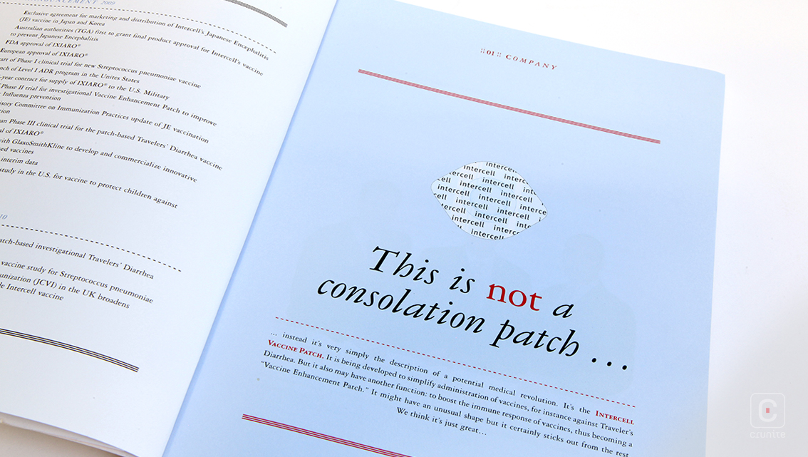
Inspired by the work of René Magritte (in particular The Treachery of Images), the shape of the vaccine patch is overlaid on familiar objects that echo its shape – an American football, the body of a fish, a human eye and so on. The connection to Magritte is unclear, but makes for a lively, playful addition to the visual elements of the report.

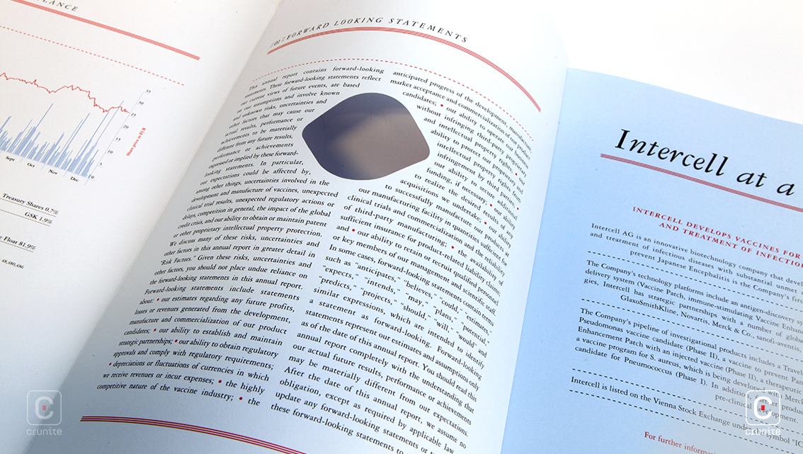
Aside from the colour present in the illustrations and the corporate portrait, the remainder of the report makes use of a restrained colour palette of pale blue, red and black. Infographics use mainly the blue as well as fine line work, resulting in graphs and charts that do not overpower the reader.
Carefully laid out text with plenty of negative space to balance the elements on any given page help with ease of navigation. Coupled with the thoughtful placement of illustrations, this is an easy report to digest.
![]()
![]()


