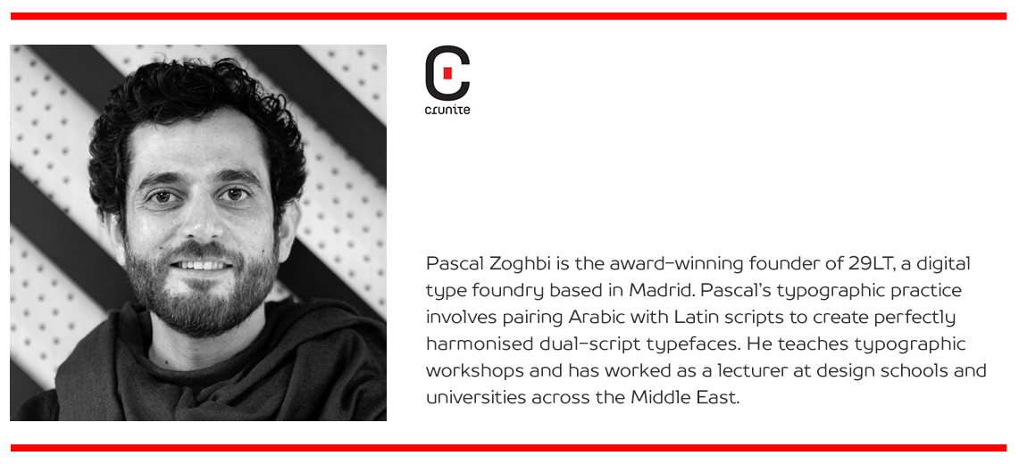
Pascal Zoghbi is the award-winning founder of 29LT, a digital type foundry based in Madrid. Pascal’s typographic practice involves pairing Arabic with Latin scripts to create perfectly harmonised dual-script typefaces. He teaches typographic workshops and has worked as a lecturer at design schools and universities across the Middle East.
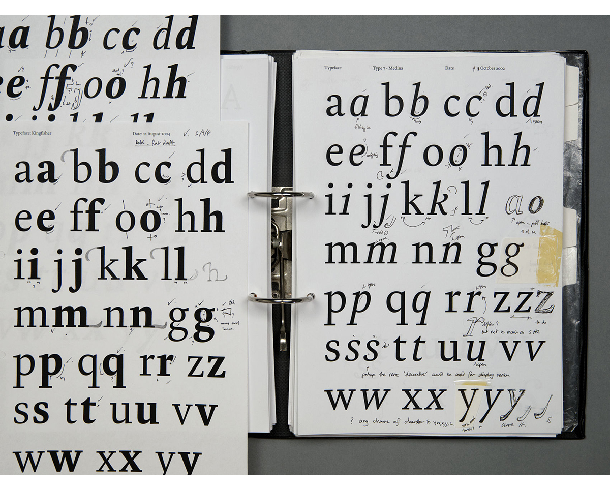
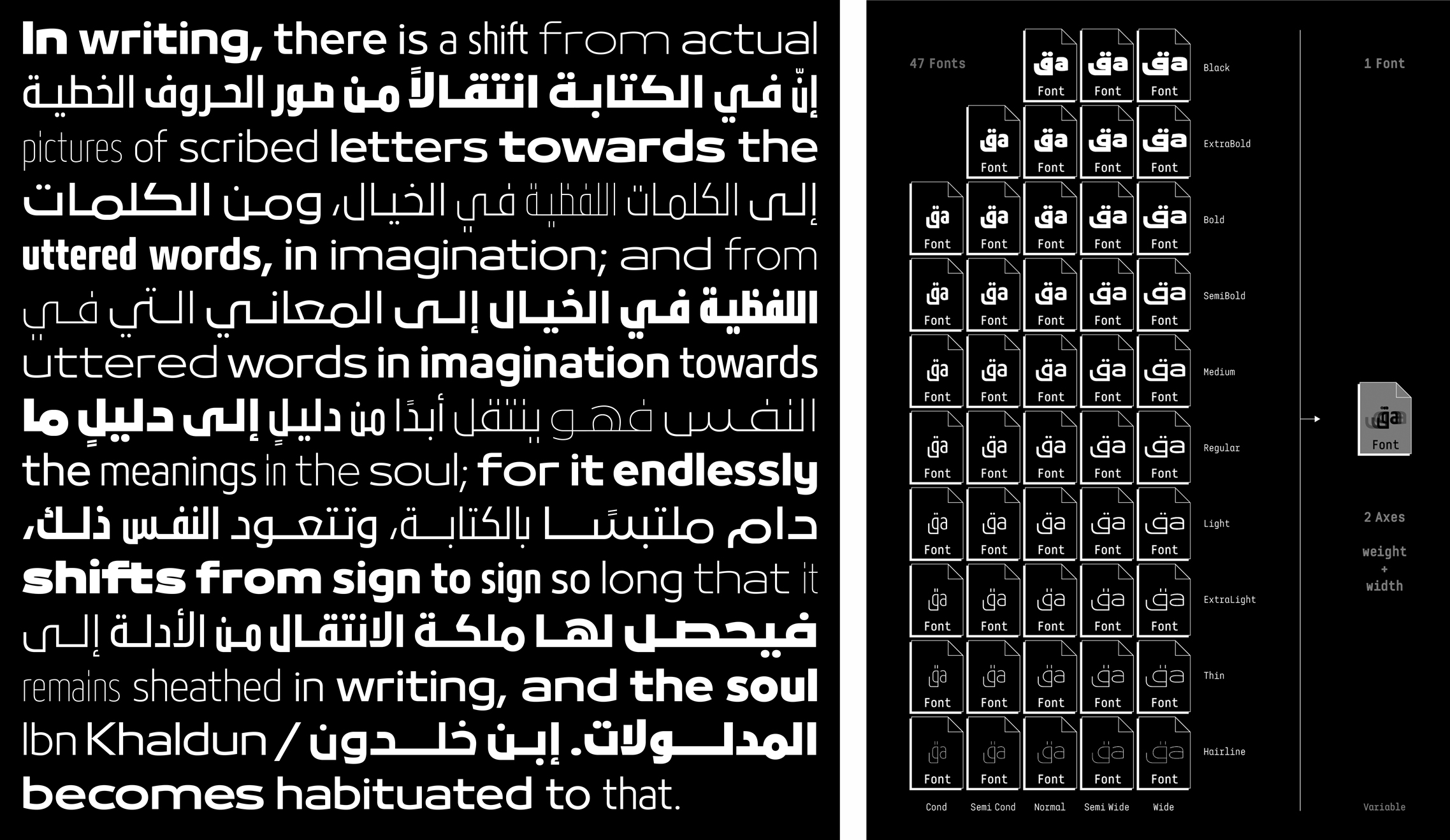
It varies from project to project and depends on the choice of calligraphic style, the concept, the briefing and so on. Bukra started as a bespoke project for a commercial entity in the United Arab Emirates and they wanted something sturdy and bold within a geometric typographic context. Based on the brief, I did some research and chose the Archaic Kufic Arabic style since it is bold while humanistic at the same time. The Archaic Kufic style is written with a thick qalam (reed pen), creating chunky letterforms with small counters.
At the beginning, it was only Bukra Black that was created for the brand. After five years, once the client’s license expired and the rights came back to 29LT, we created five weights for Bukra. And after another 5 years, the typeface grew to 94 styles, composed of ten weights with matching slanted forms, in 5 width versions; Condensed, Semi Condensed, Normal, Semi Wide, and Wide. The typeface is available now as a variable font in two axes; width and weight.
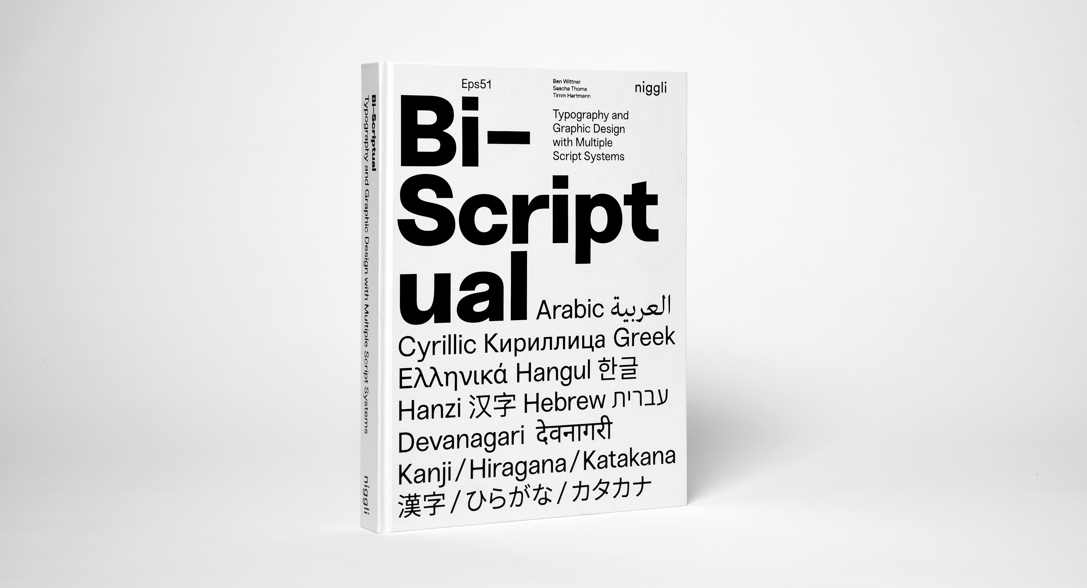
Wittner and Thoma are friends and colleagues. I worked with them on several dual script projects (Arabic and Latin) in the past years. Actually, my work is featured in a new book they published, called ‘Bi-Scriptual’. This book is not only about Arabic and Latin but many other scripts, like Cyrillic, Greek, Devanagari, Hangul, Hanzi, Hebrew and Japanese.
It’s been more than ten years since the Arabesque books were published, I think. At the beginning, I was in the process of learning all the different aspects of the Arabic scripts and playing around with different techniques. Now I feel I am more experienced in the type design field. Of course, I’m constantly learning about the Arabic script and others, doing research and analysis. The main difference is that before I was a freelancer working with typography, and now I run a type foundry and collaborate with professional type designers from around the world.
I’m trying to expand my mind – at the start I was working only with Arabic scripts, then Arabic and Latin scripts, and now with the global community and clients around the world, knowing multiple scripts is very important. I would like to extend the script coverage of 29LT from Arabic and Latin to other world scripts.
It’s the heart, yes, and I would also say it’s the bread and salt of any kind of design. The first thing I do while working on a design project is to pick the appropriate typeface, so it’s true to call it the heart of Arabic and Persian design culture.
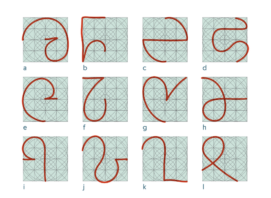
I think Arabic typography is very fluid – more open to experimentation because there aren’t as many rules defining it compared to Latin scripts. In the past, if you learned Western typography, depending on the school you followed, there were certain rules and regulations you followed, and there were certain design schools to follow. Arabic typography has less of this – designers can rely on the heritage of the script.
Arabic typography is changing now – there are more rules but also there is still a lot of room for experimentation. Arabic calligraphy has very strict rules to it, but Arabic typography takes inspiration from it and is created based on contemporary design approaches. If you want to learn calligraphy you have to follow the rules, but for type design, it is more open – the designer can interpret the calligraphy in new ways and draw contemporary letterforms based on a certain design decision.
My move to Spain was purely personal; it wasn’t linked to work or career. I’m married to a Spanish graphic designer and we moved to Spain when we decided to start a family. The visits we did to Andalucía in the south of Spain opened my mind to the rich Arab and post-Arab cultures in Spain.
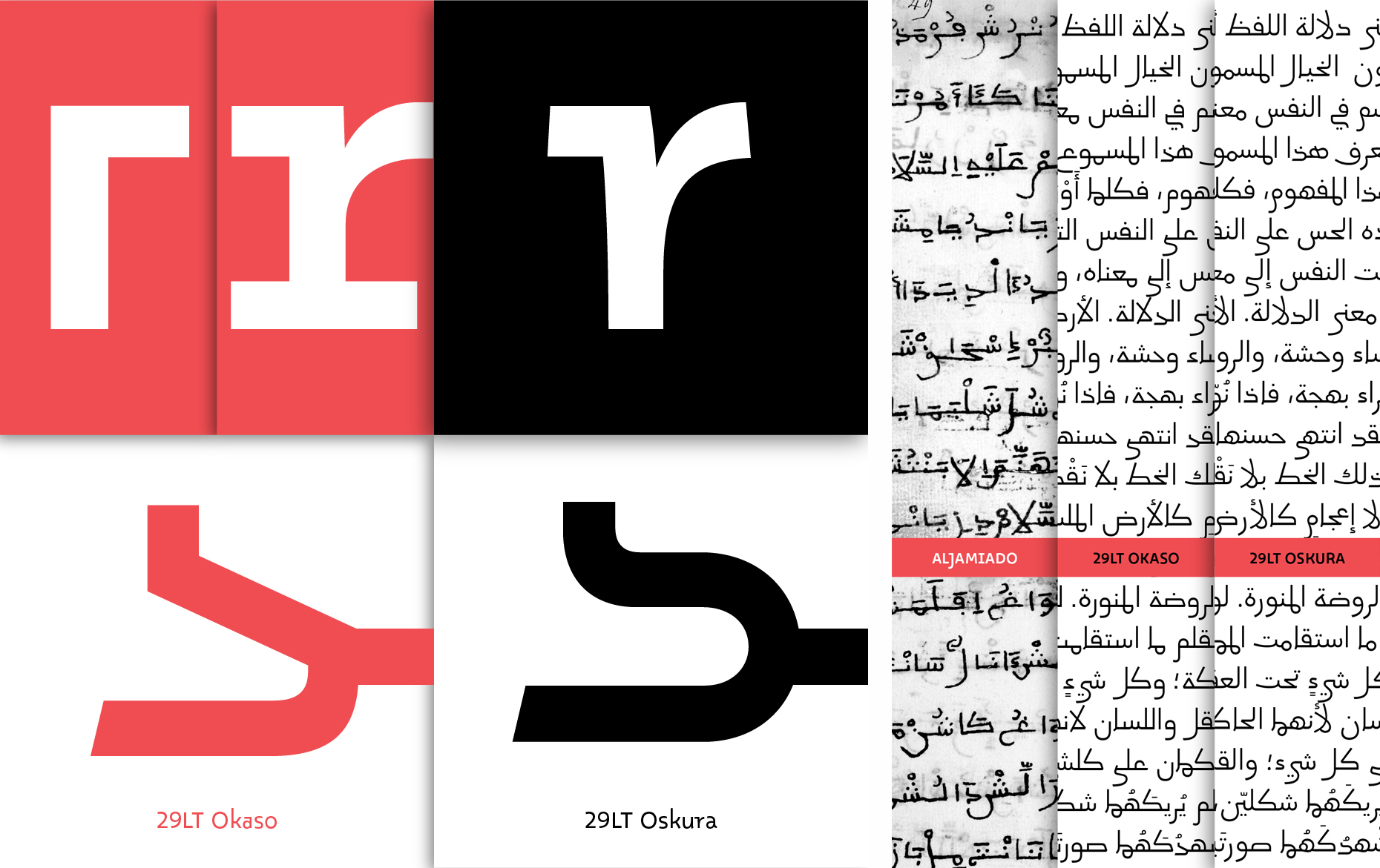
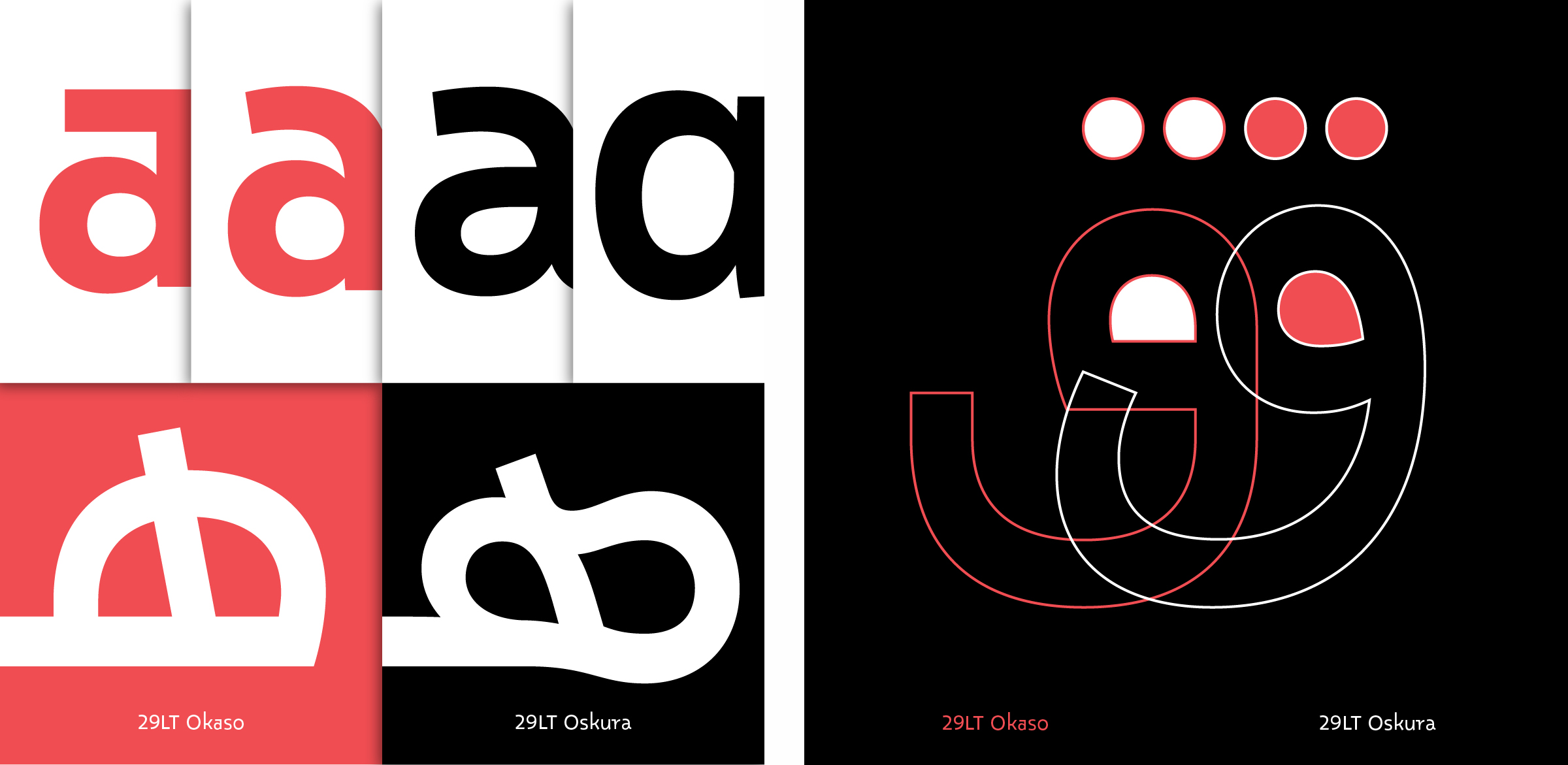
One of the main topics I got interested in was the Aljamiado scripts. I started working on a new type family based on this concept.
The first typeface to come from the research was 29LT Okaso, published in 2020. This year we are publishing 29LT Oskura, the second typeface in the expanding type family. The design of both typefaces is based on manuscripts that were written during the Catholic Reconquista of the Iberian Peninsula and the gradual retreat of the Islamic Caliphates. With time, the Muslims who remained on the peninsula started losing the Arabic language and started speaking Spanish. Because the Arabic script was essential in Islamic and Arab culture, they wrote Spanish using the Arabic script, especially for religious texts. If you look at these manuscripts they look like Arabic, but when you read them, you’re reading Archaic Spanish! It was a kind of defence system – to keep their heritage present and alive.
I’m very happy to be living in Spain and I can find research topics that connect me to my heritage as an Arab person. There are so many links between the Spanish culture and the Arabic culture. They say that there’s around 10,000 words in Spanish that come from Arabic origin. So linguistically also, it’s very interesting. There’s a design aspect, a typographic aspect, an architectural one – there are so many bridges between the two cultures to draw inspiration from.
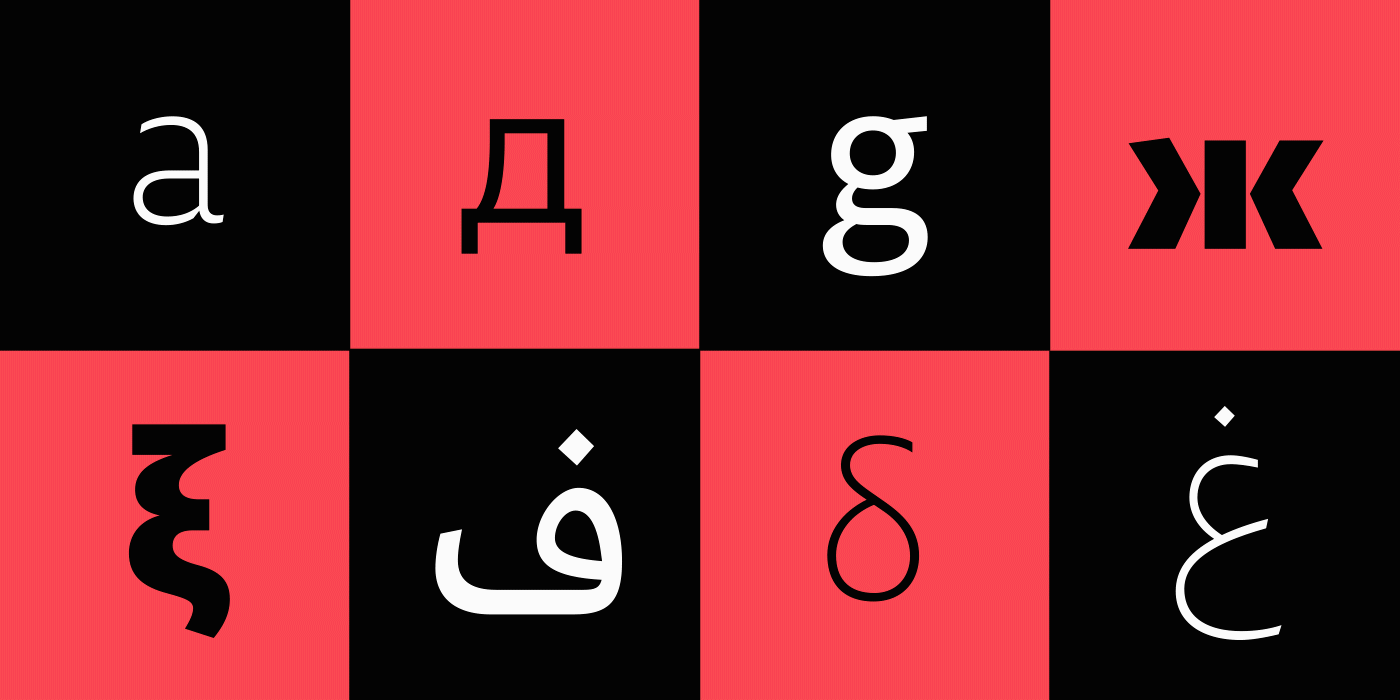
When I started 29LT, I was focussed on the Arabic and Latin scripts, primarily since most of the projects in the Middle East are multilingual – Arabic-English, or Arabic-French. At 29LT, I assign the appropriate type design team for each typeface based on the design concept and technical requirements.
The Arabic and Latin letterforms are designed from scratch, together, and they follow the same design approach and learn from each other. It’s not like the Latin script existed and we created the Arabic for it or vice versa. Both scripts are created harmoniously together. I think this is what distinguishes 29LT from other type foundries where most of the time the Latin script exists and they create an Arabic typeface to match it.
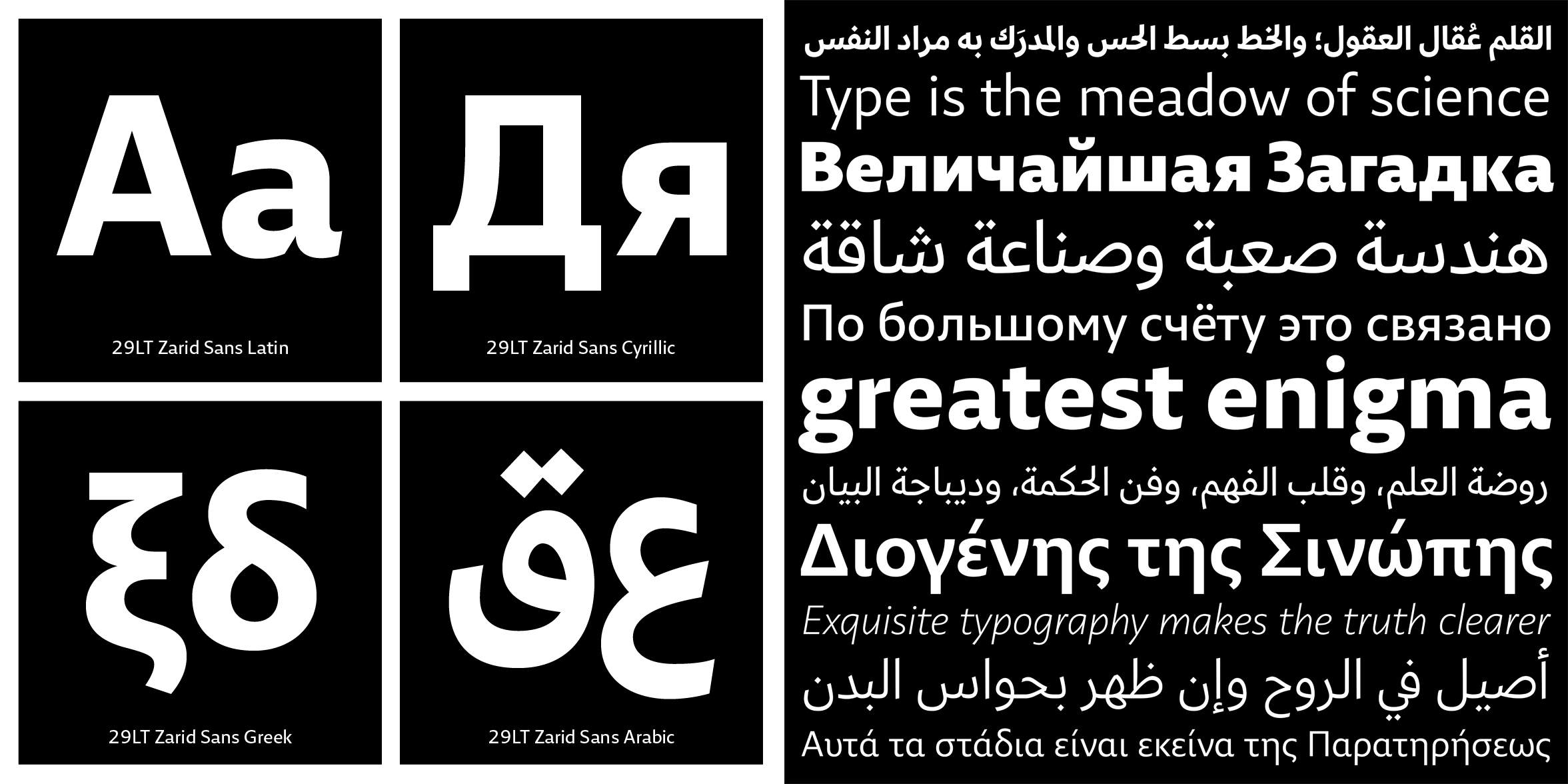
Since 2020, I started expanding the scripts support at 29LT. For example our typeface 29LT Zarid Sans has Arabic, Latin, Cyrillic and Greek at the moment, and hopefully more to come in the future like Chinese, Hindi, Hebrew, and others.
How has COVID19 affected you as a designer? In what ways do you think the pandemic will have a lasting impact on who you are and how you work?
I heard from colleagues of mine who are single, or their kids are now adults and living alone, that it was a very productive year for them, because they were focussed more on type and they were producing a lot of new work.
But in my case it was not like this. My kid is now three and last year was a bit hard because we were all at home for three months. We couldn’t go to the office and my kid wasn’t able to go to school so my working time was cut drastically and I wasn’t able to work as efficiently as before.
This year is a bit better as schools are open again and I have made a proper home office space. But still, I am not as focussed or efficient as I used to be when I used to go to my office. Hopefully it will get better soon – maybe next year? Who knows how long it will last! It’s crazy.
The one I talked about earlier is a good one – ‘Bi-Scriptual’. It would be the first on my list as a multilingual design approach. I would also say there’s lots of books by Khatt Books about Arabic typography and design culture.
It was in collaboration between Mediamatic and the Khatt Foundation. I was the art director for the design team. I recruited four Lebanese designers to go with me to Amsterdam to work with Mediamatic and the Khatt Foundation. It was to create an Arabic version of a well-known store in the Netherlands called HEMA.
In the Netherlands, for Christmas, for the feast of Sinterklaas they have a tradition of giving chocolate letters as gifts. So we created some Arabic chocolate letters as part of the ‘El HEMA’ exhibition/store that sold several renowned Hema products recreated using Arabic typography.
We designed the letters and sent the designs to a machine that made a mould. Then we poured in the chocolate and put it in the fridge. It was such a nice project!
When I was back in Lebanon, my friends and I used to make chocolate cookies in the shape of Arabic letters. It was funny because you mould the letters in a thin weight and when they come out of the oven they’re in a heavy weight with all the counters clotted. You can watch them shrinking in the oven!
Usually when I have a block it’s coming out of stress, or I am overwhelmed by an idea. I try to relax by taking a hike or an excursion into nature. Also, before I go to sleep I try to think of different kinds of projects and make a mood board in my head. My mind keeps working in my sleep and sometimes I have fresh ideas in the morning.
Sometimes it’s about giving it time – I have to stop working on the project for a few days and when I come back I get a new perspective on it.
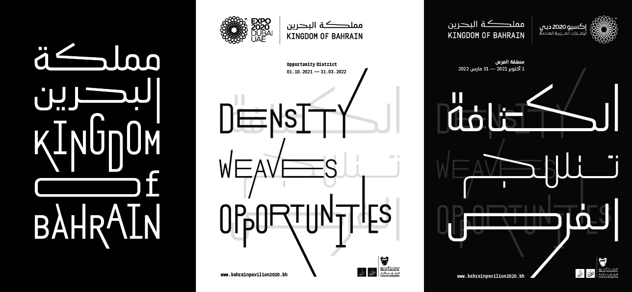
Currently I’m working on a branding identity for the Bahrain Pavilion for the Expo 2021. I’m building a custom typeface for the pavilion, and I am implementing it in all the visual identity items such as the website, posters, a book, an exhibition and so on. I’m creating this with my wife, Clara Sancho. I also recently finished a logotype for a new Arabic online platform called Majarra.
You can see more of Pascal’s work at www.29lt.com or on Facebook, Twitter, YouTube and Instagram
Back![]()
![]()