
The Hugo Boss annual report of 2007 is a puzzling affair. For a company associated so potently with contemporary fashion, the design of the report is surprisingly average.
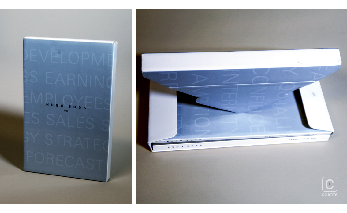
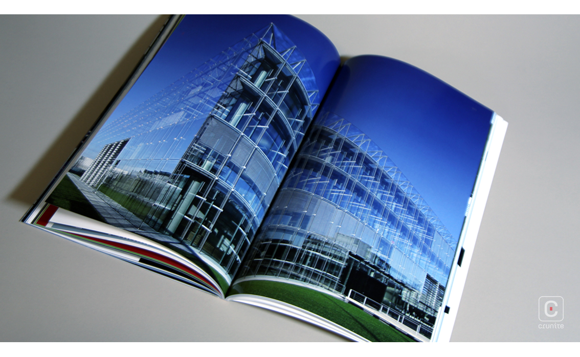
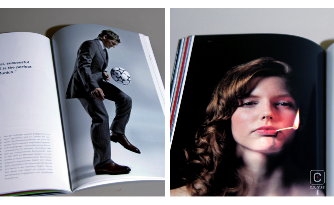
Content is split between two books – the report proper and a company profile. The annual report is the more interesting of the two books. In it, photography takes an odd twist – the main images are black and white architectural photographs of the company’s buildings. There are almost no people visible in the images. It’s a strange, lonely approach to corporate photography.
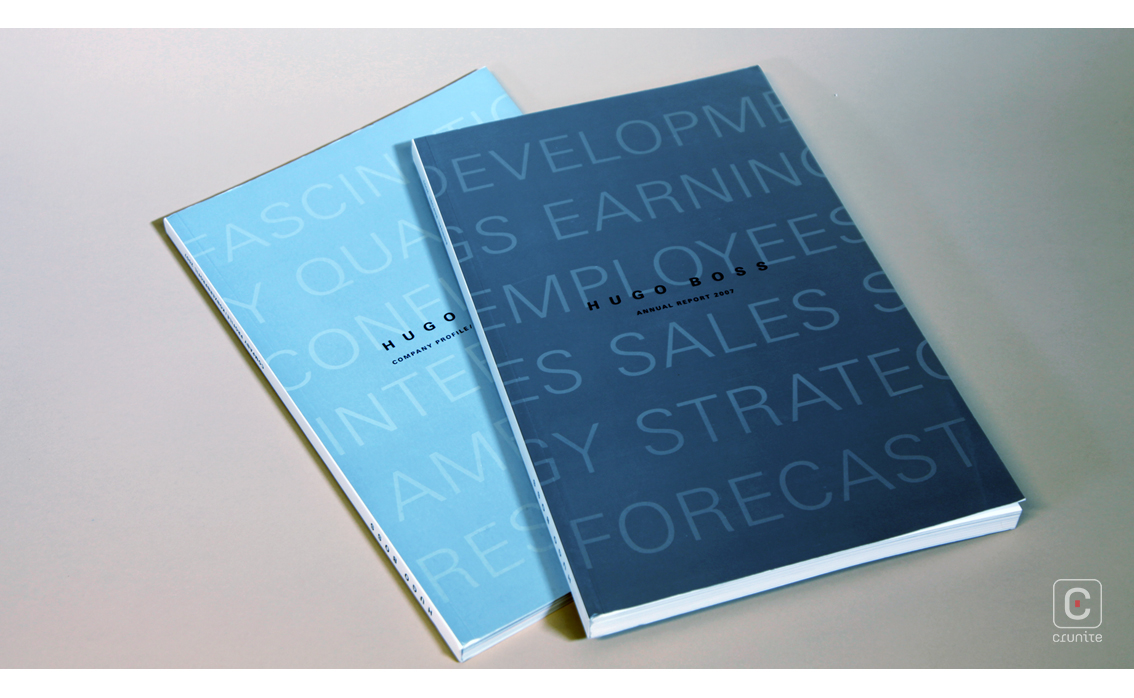
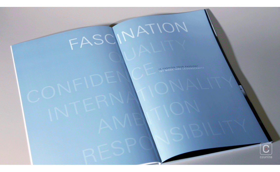
The report makes restrained use of a silver ink to separate sections of the book and for titles. This ink has been carefully matched to a metallic light blue ink for the second of the two books, the company profile.
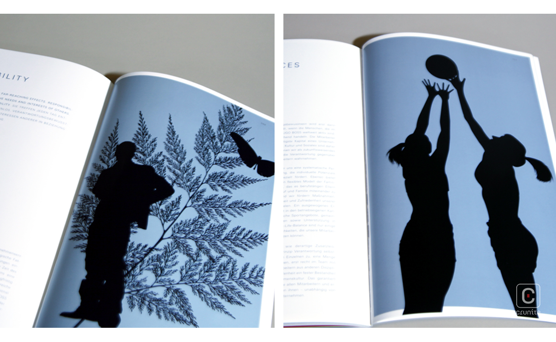
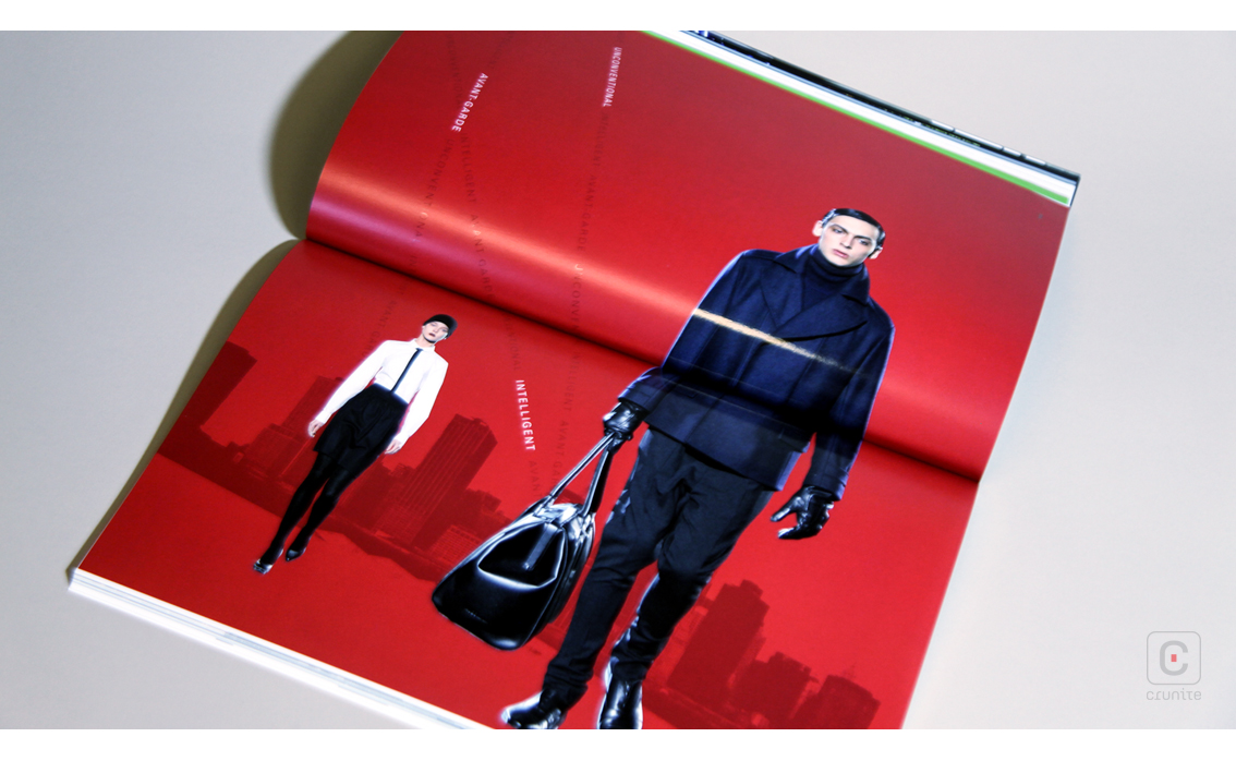
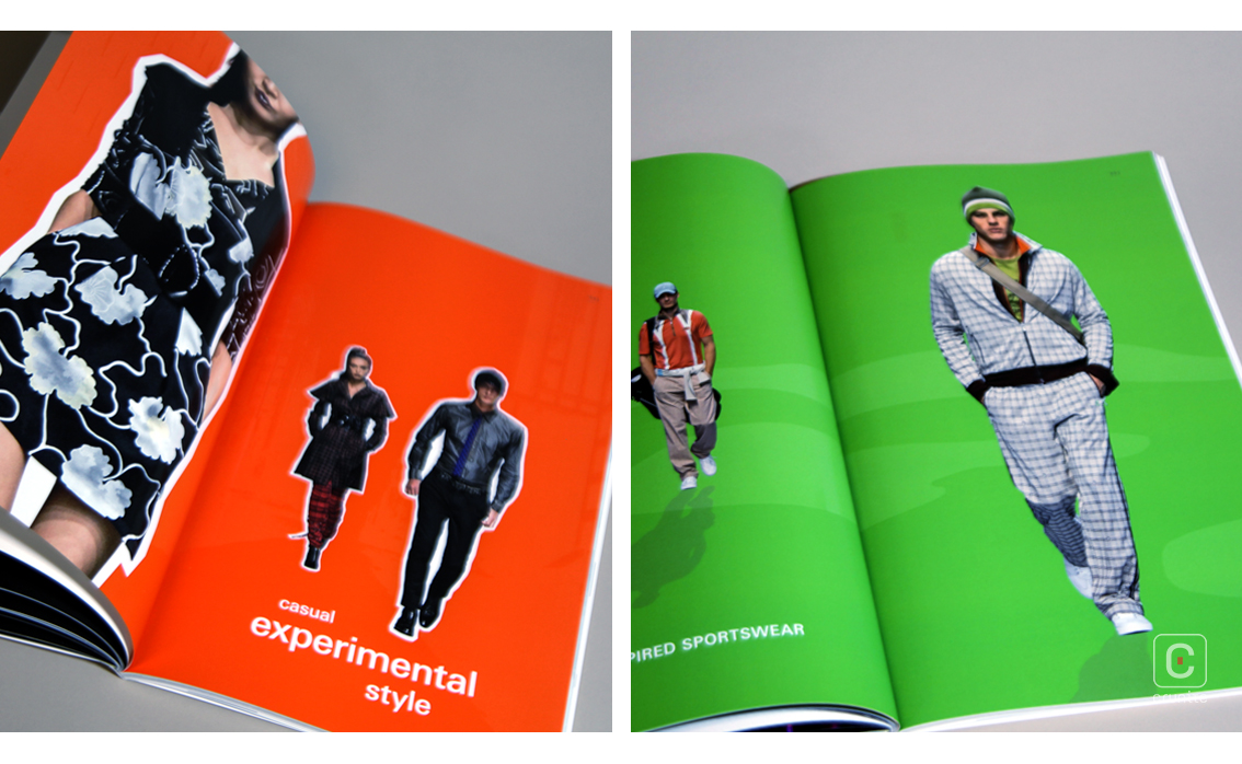
The company profile is an odd book too, but for a different reason. Here the photography is haphazard – low resolution images from the catwalk, overexposed images from after parties, photographs of accessories that make the book look like an inflight magazine, the list goes on.
Back
![]()
![]()


