
Boralex is a Canadian producer of renewable energy — specifically wind, hydroelectric and thermal. Their slim 2008 annual report is an easy-to-digest 32-pages long.
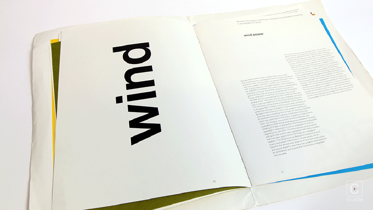
Perhaps this is an allusion to the effects of wind? While there is no literal connection to the business of the company, the effect is certainly memorable.
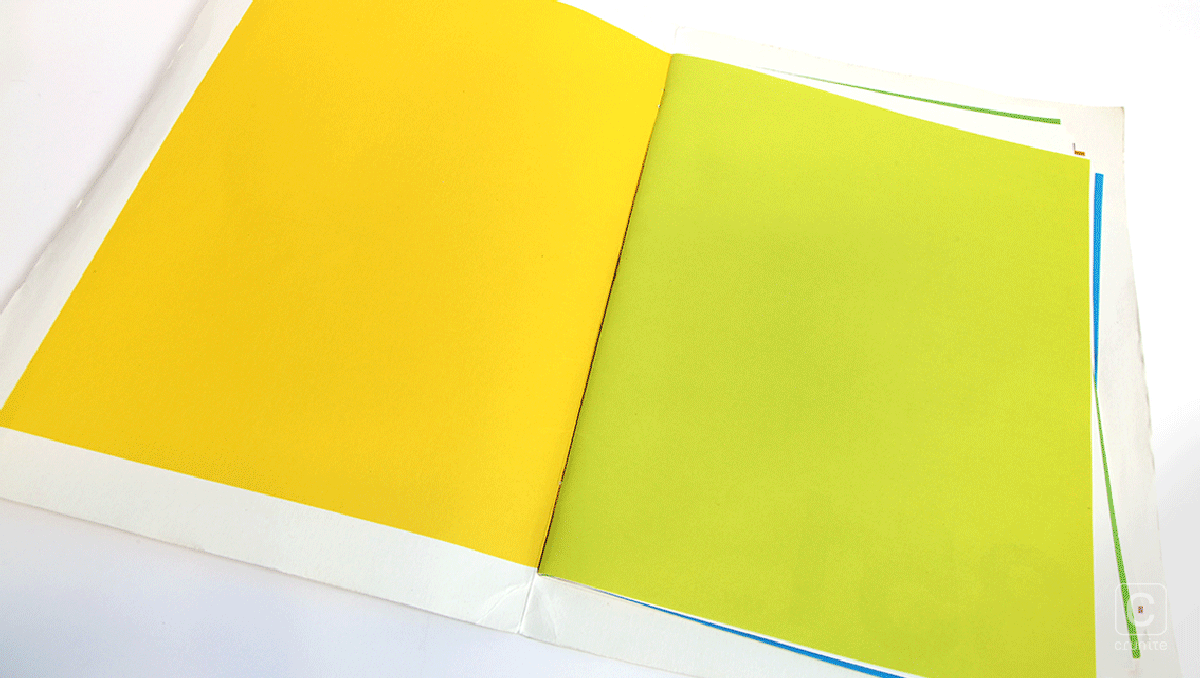
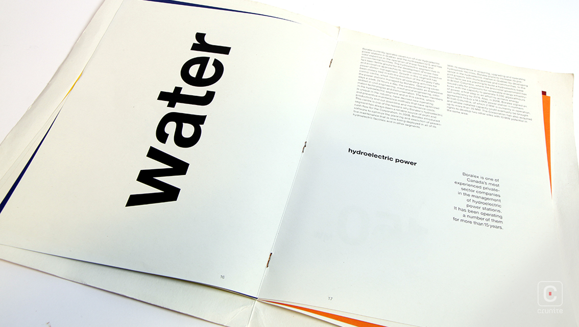
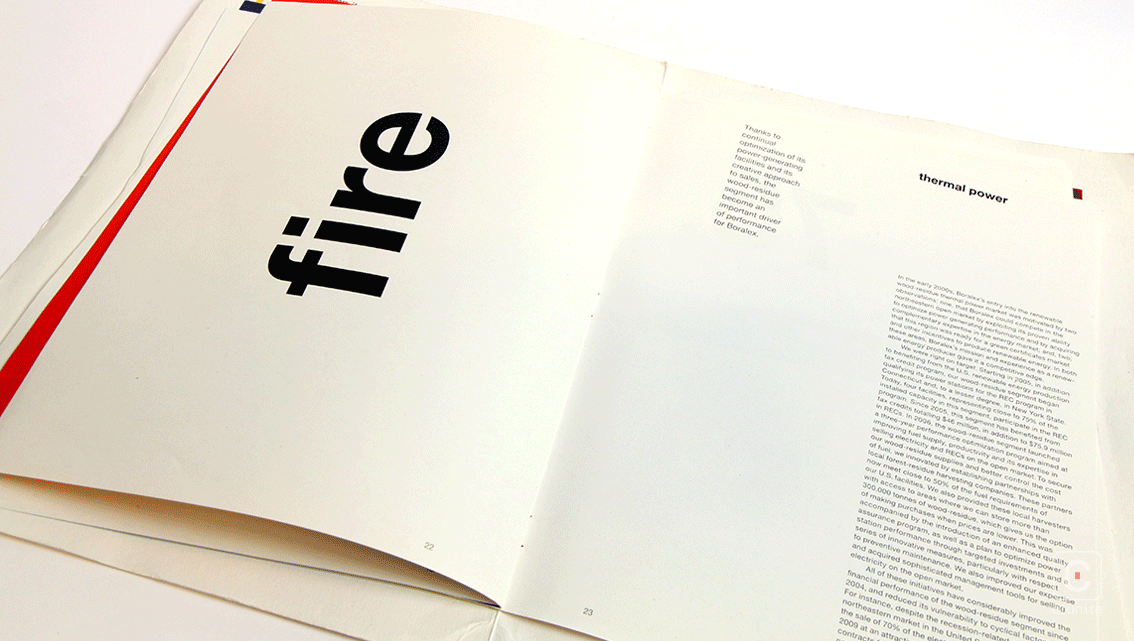
The same holds true for the use of colour. Aside from the section dividers, the entire report is black and white. The section dividers are double-page spreads presented in full-bleed swatches of bold colour, making for ease of navigation.
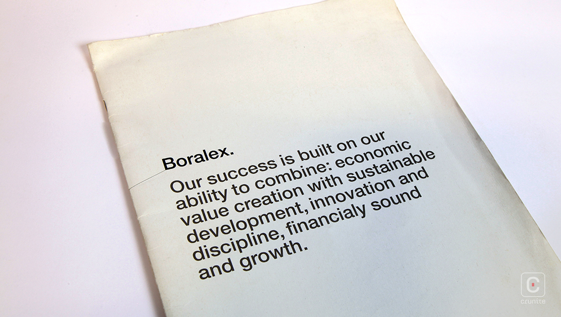
Type treatments hew towards a Swiss sensibility – a simple sans serif in multiple weights and sizes, set on a grid that hugs the page edges. Text sits as close to page edges as possible and this gives the report a sense of space.
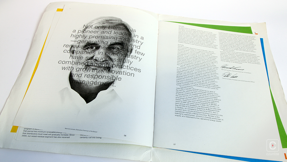
The corporate portraits take an interesting approach to the chairman and CEO. Each gets a page to themselves and the slightly jarring effect of seeing what is essentially a passport-style headshot blown up to full-page is softened by the photographic treatment. Shadows have been stripped away in favour of soft mid-tones and highlights, creating an airy page. The pale gray text superimposed on the face serves to further lighten the page.
![]()
![]()


