
HiQ is a Nordic information technology company. Their 2017 report is a study in clever colour use and creative corporate portraiture.
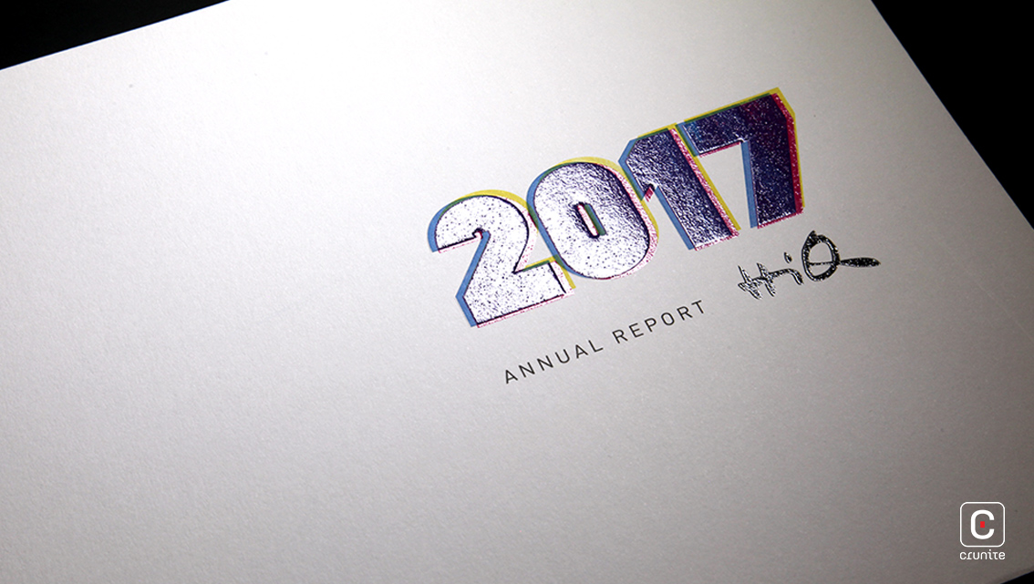
Colour is used primarily to suggest a joyful working atmosphere and a playful corporate mindset. Bright, simple colour combinations suggesting an almost childlike glee adorn the report. Magenta is used as a navigation aid in a most effective manner and ties together the text and the visual elements of the design.
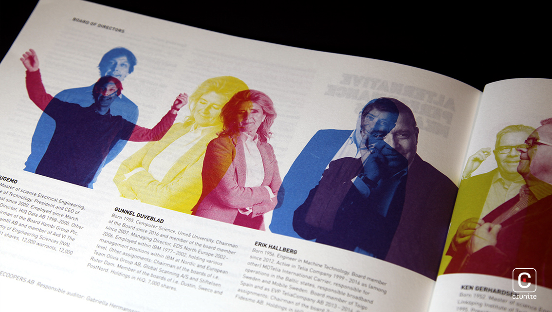
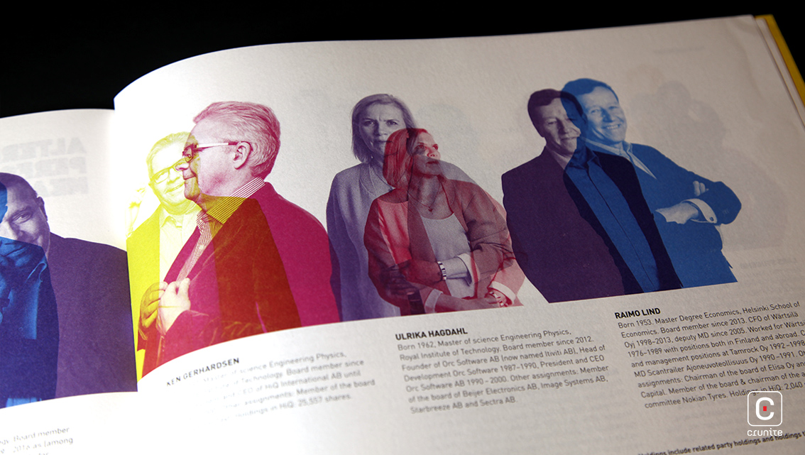
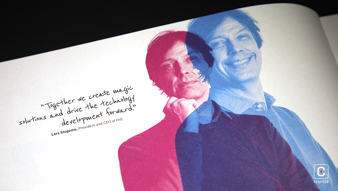
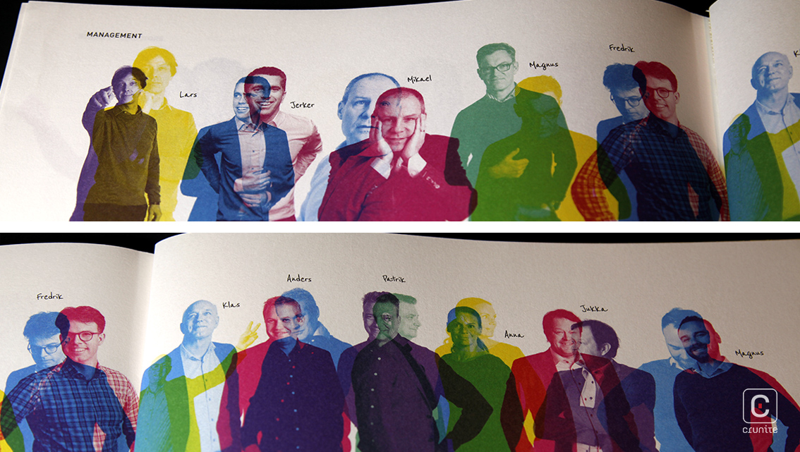
The treatment superimposes two different images of each subject. The images are presented in monochrome, using the palette discussed above. Each image portrays a different aspect of the subject – in one the subject is thoughtful, in the other they are playful. The effect is remarkable and does more to convey the personality of the subject than a single image ever could. Superimposition of portraits is a hard effect to get right and this report does it beautifully.
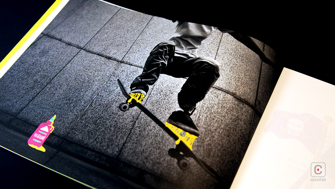
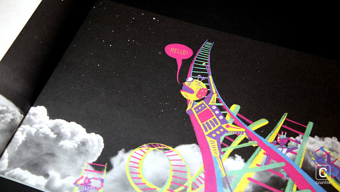
Photographs used in the thematic sections are mostly black and white but with brightly coloured illustrations amending and annotating each image, again suggesting a playful mindset.
Body text appears in a nondescript, lightweight, sans serif while pull quotes use a typeface meant to resemble handwriting. Add to these the playful colour palette used throughout the report, and these design elements go a long way to reinforcing the lighthearted sensibilities of the company.
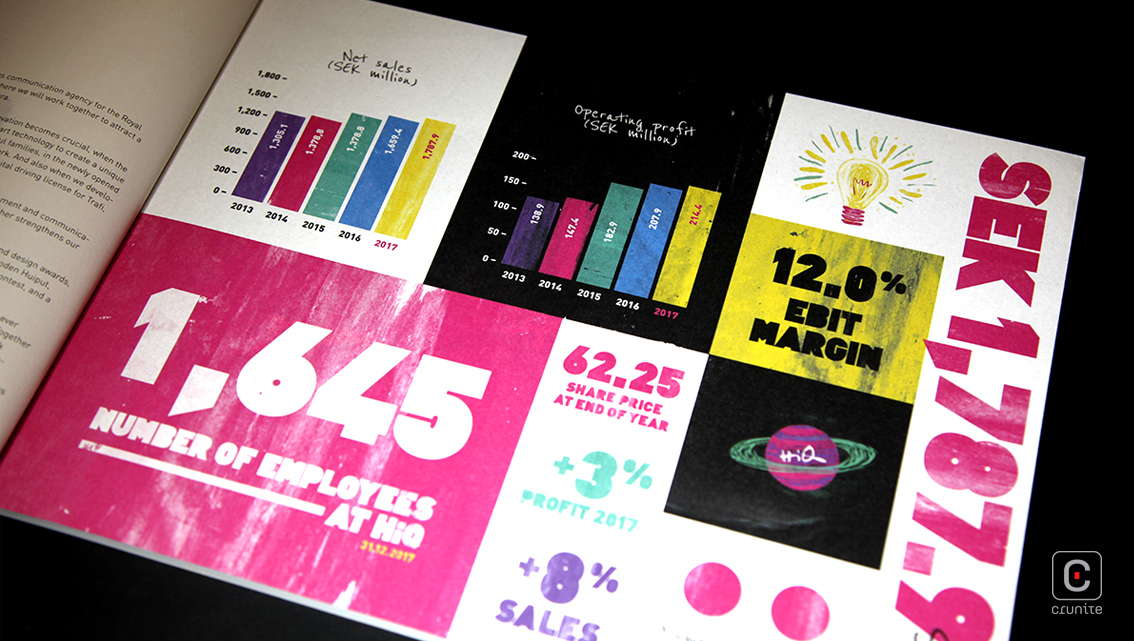
The horizontal orientation of the report is refreshing and the main impact is on the financial section – unlike in vertical reports, here the numbers have room to breathe and make for easy reading. This is reinforced by the generous use of negative space throughout the report.
![]()
![]()


