
Stand is an organisation that provides child services – education and healthcare in the main, to vulnerable children and families in New Zealand.
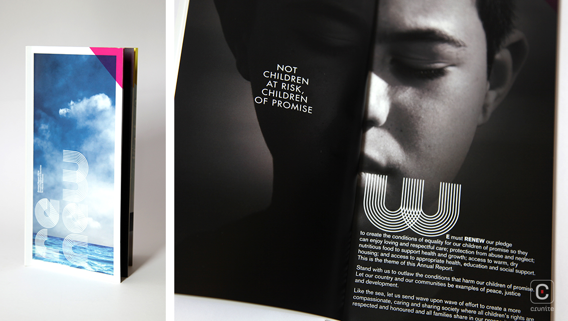
Perhaps taking inspiration from its name, the Stand reports are tall, slim books that suggest a person standing. Each report is no longer than 48-pages, adding to the effect. Four reports are considered here: 2012-2015.
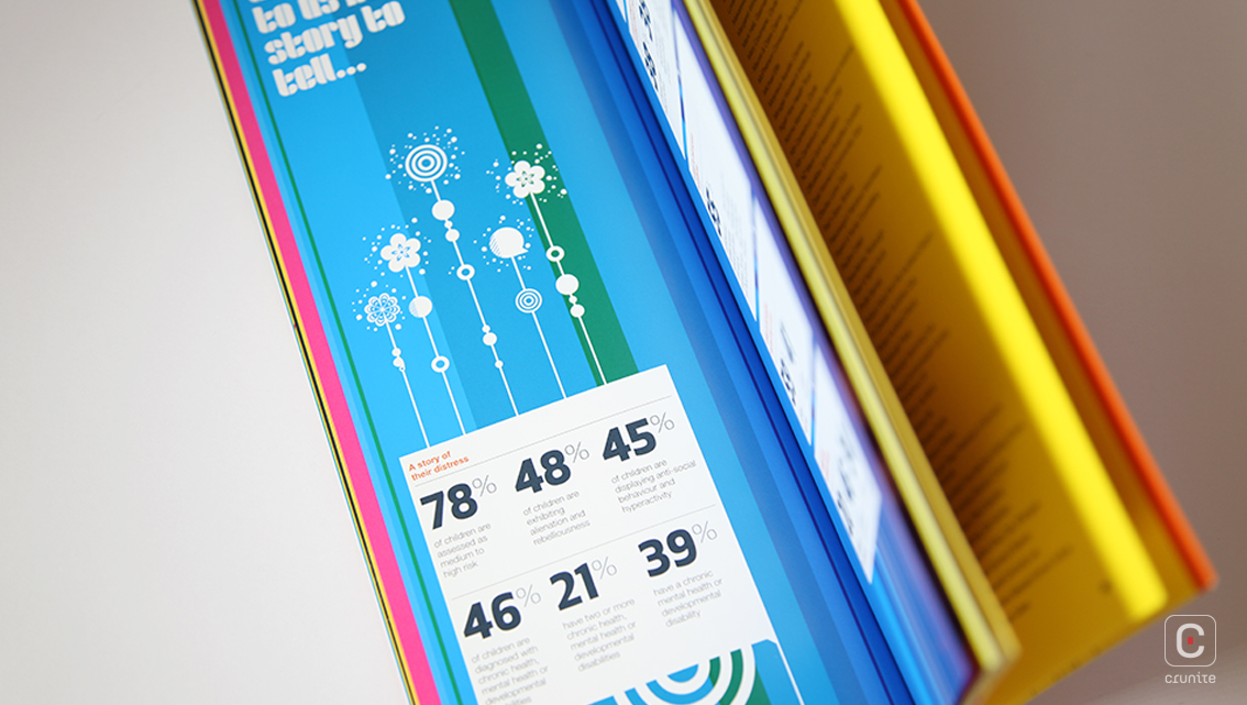
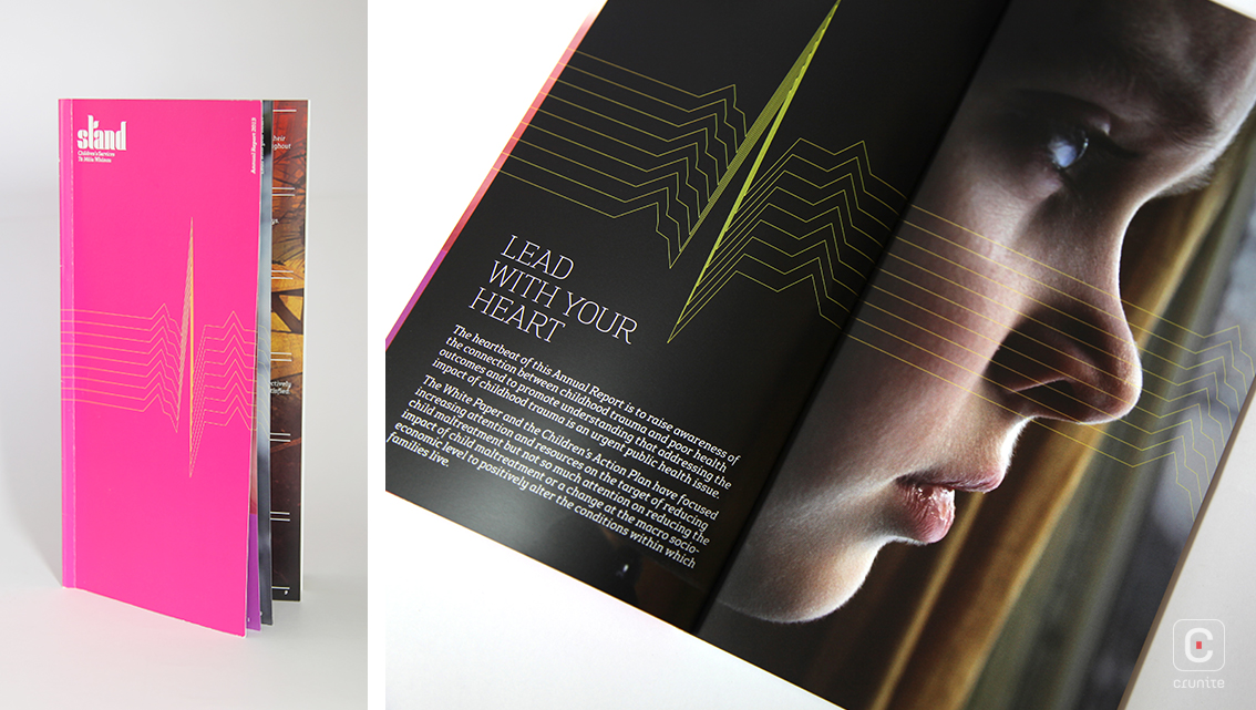
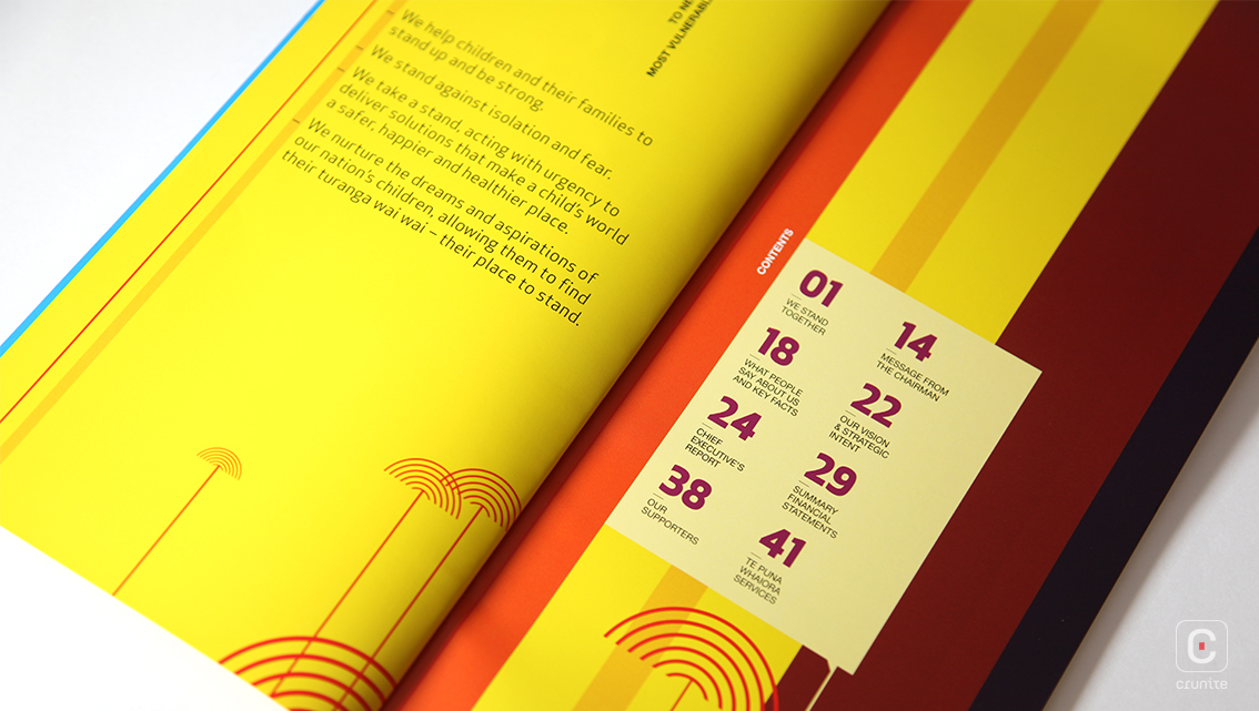
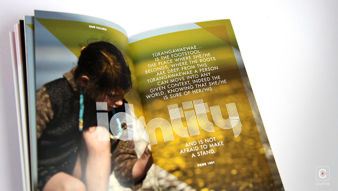
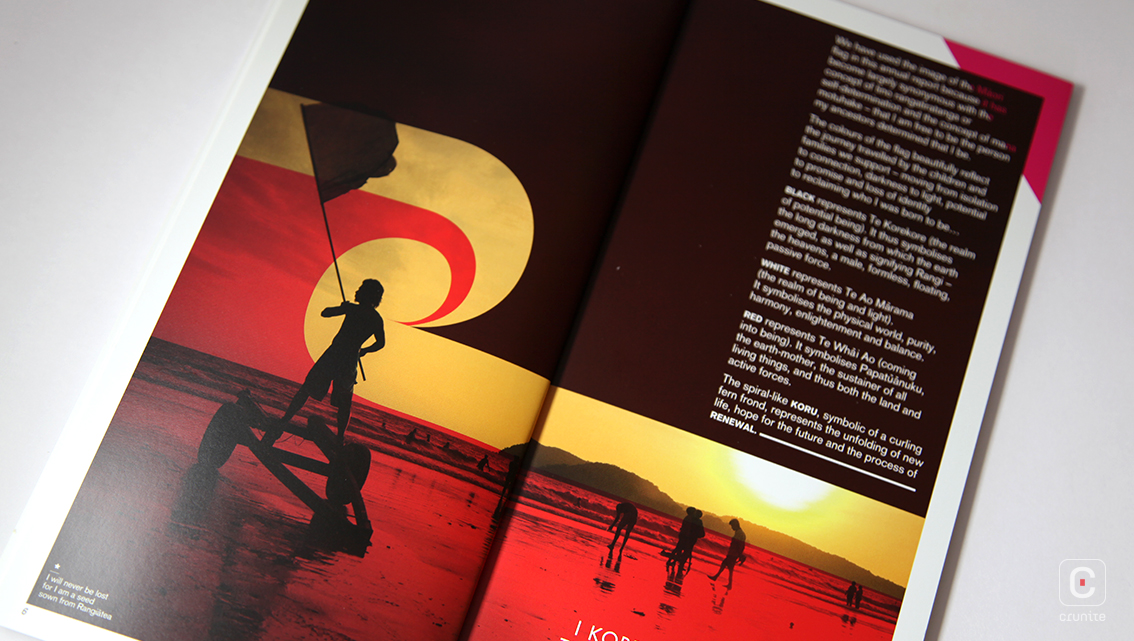
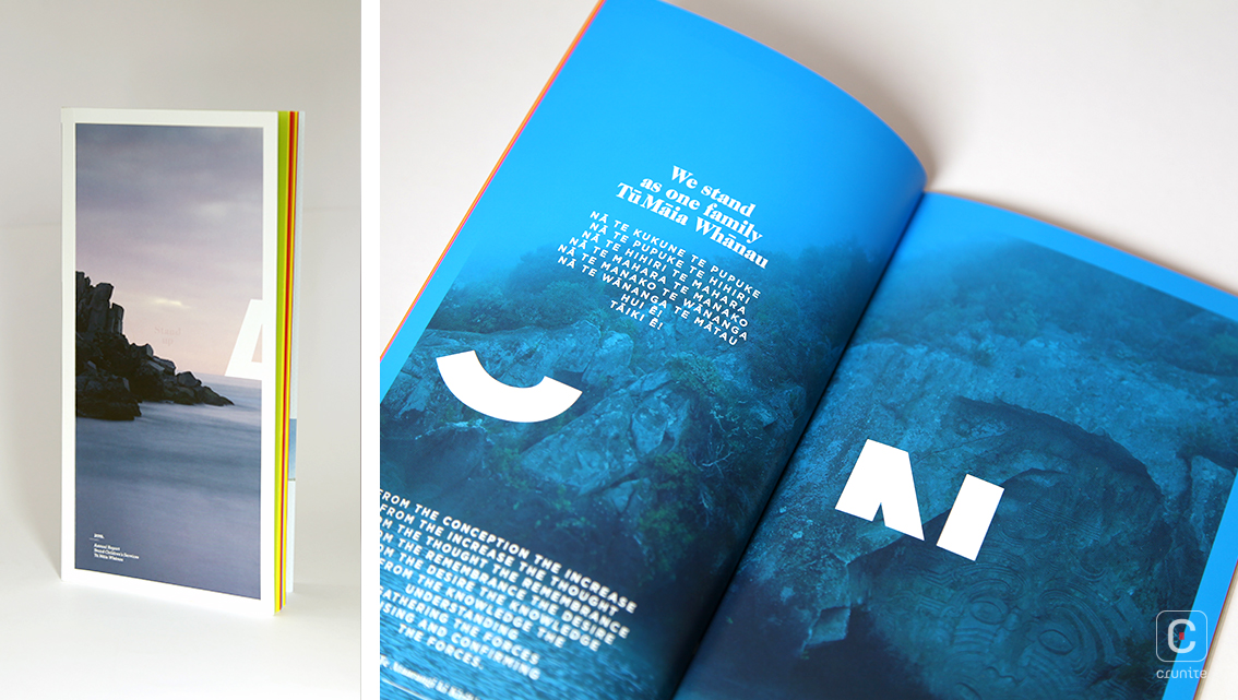
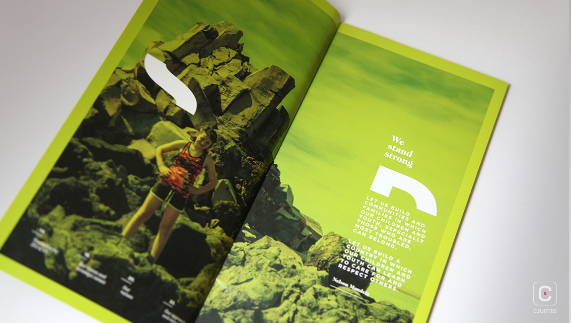
Given how grim some of the statistics are and how severe the plight of Stand’s beneficiaries, it feels like a balm to read something so colourful. Colour overlays on photography and coloured typography set on coloured backgrounds abound and are almost reminiscent of music magazine design from the early 2000s.
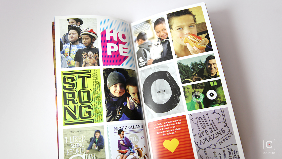
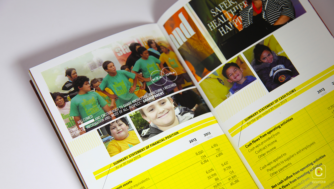
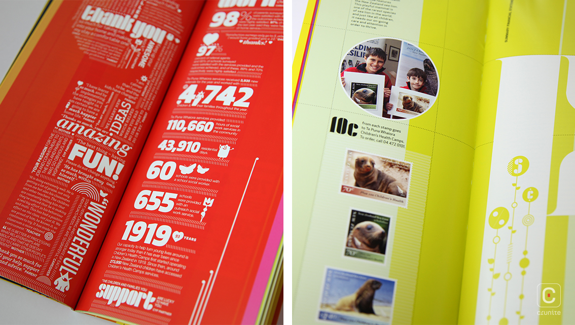
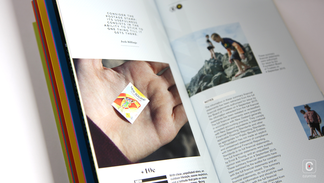
This use of colour extends to the reporting – statements and financial reports sit on brightly coloured backgrounds and are interspersed with portraits of beneficiaries. This has the unusual effect of making the financials flow seamlessly from the thematic material. This is not a technique frequently used in annual report design and it makes for a welcome change.
The type used in the reports switches between a light, modernist serif and an unremarkable sans serif. The type treatment is mostly consistent across the reports as is the book size (except for 2012).
Each report discusses the work of Stand but chooses as its focus one particular aspect – in 2013 it was the link between childhood trauma and the development of heart disease in later life; in 2014 it was the right of children as defending against or remedying poverty. This again lends itself to the reader seeing the full scope of Stand’s remarkable work.
![]()
![]()


