
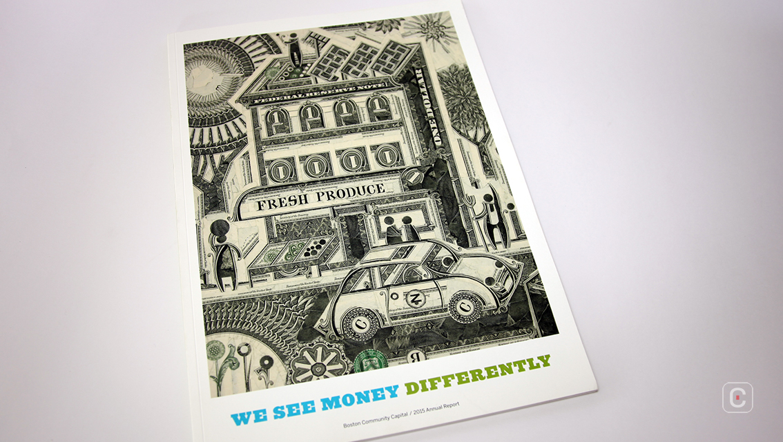
When is a dollar not a dollar? When it’s illustrating the Boston Community Capital 2015 Annual Report ‘We see money differently’. The contemporary front and back cover is meticulously constructed from a historic source, US dollar banknotes, and has been produced by American artist Mark Wagner who specialises in US dollar currency collages. Section’s of Wagner’s approachable and culturally relevant image are also used inside the report providing a social commentary which fits with the company’s profile of a non-profit company that invests in self-sustaining low-income communities to create opportunities for its residents. The collage also aptly shows how money can be seen differently.
The theme of ‘different’ continues in the choice of report size. As well as the choice of a non-traditional medium, the US dollar bill, for it’s front and back cover collage, the company opted for a non-traditional 24 x 33.5 cm size for the actual report which is larger than a standard A4.
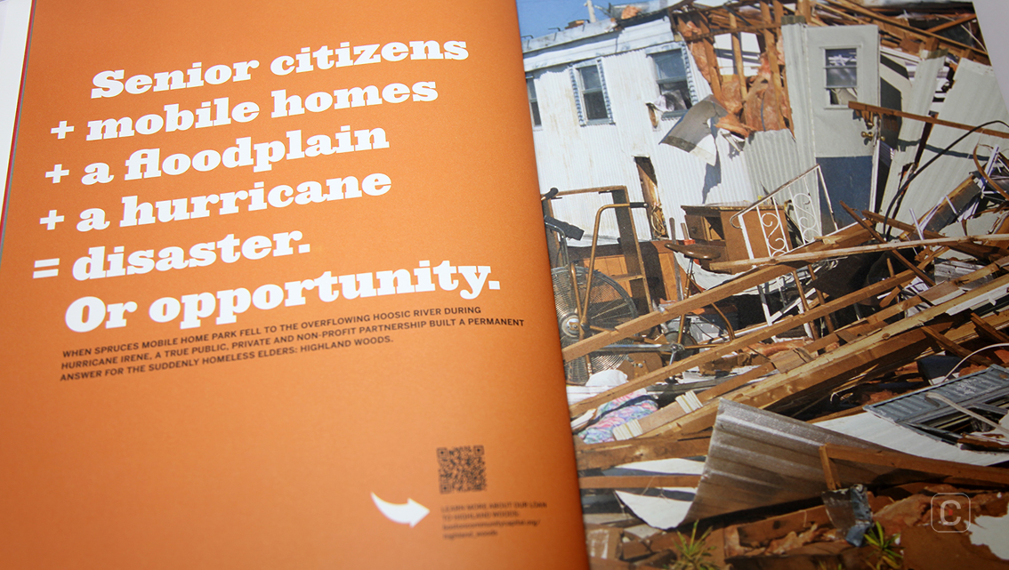
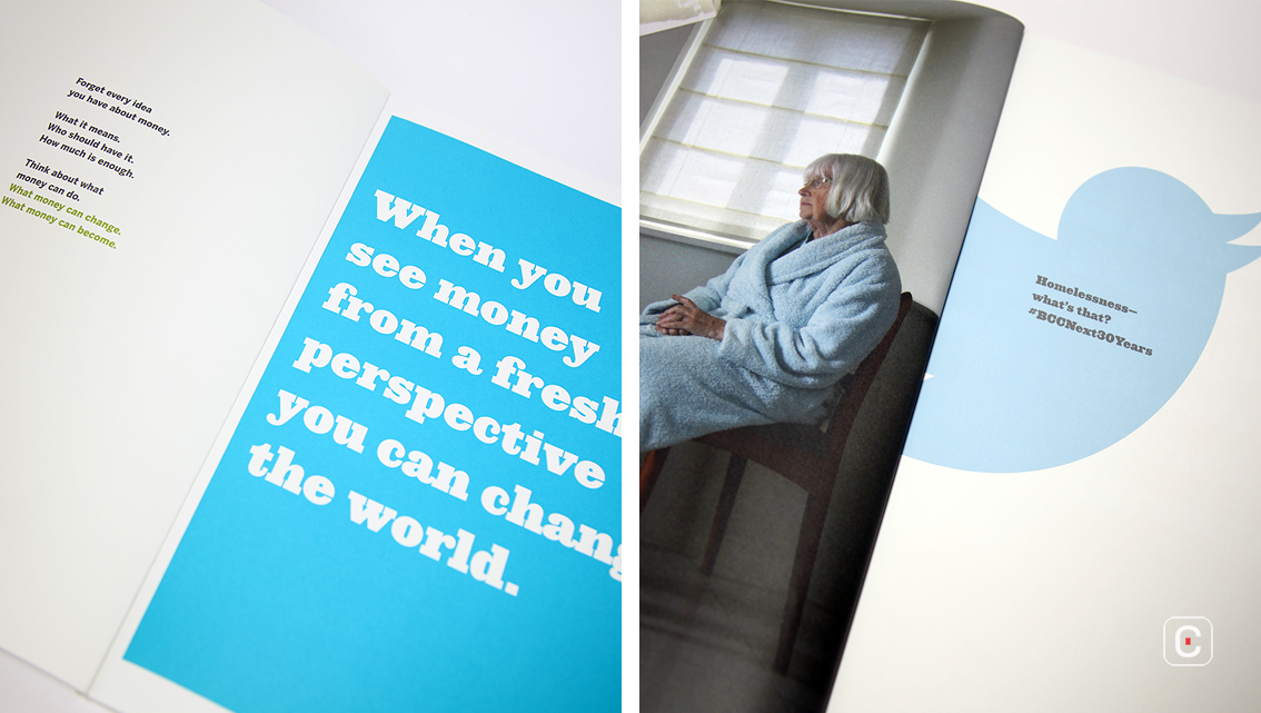
As well as breaking the format of a traditional A4-sized report filled with information that requires lots of reading, this report is presented in a more visual and digestible way.
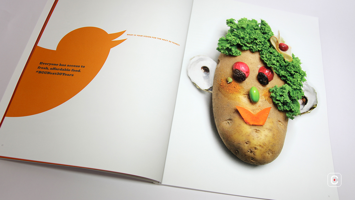
If readers want more information, this can be accessed via QR codes. Boston Community Capital have also harnessed social media in the hope of generating conversations on twitter, twitter hashtags appear on many of the pages.
The fonts used in the report work well together, they are well balanced and create a solid, well-anchored style. For headings, the easy-to-read slab serif font is quite masculine and bold and therefore a great choice for a company wanting to be associated with strength and loyalty. It grabs the attention of the audience much like a headline in a magazine might. The sans serif body copy is also produced in an easy-to-read font. Together, the font combination visually communicates the symbolic physical strength of the company.
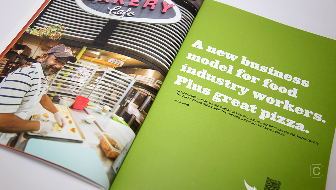
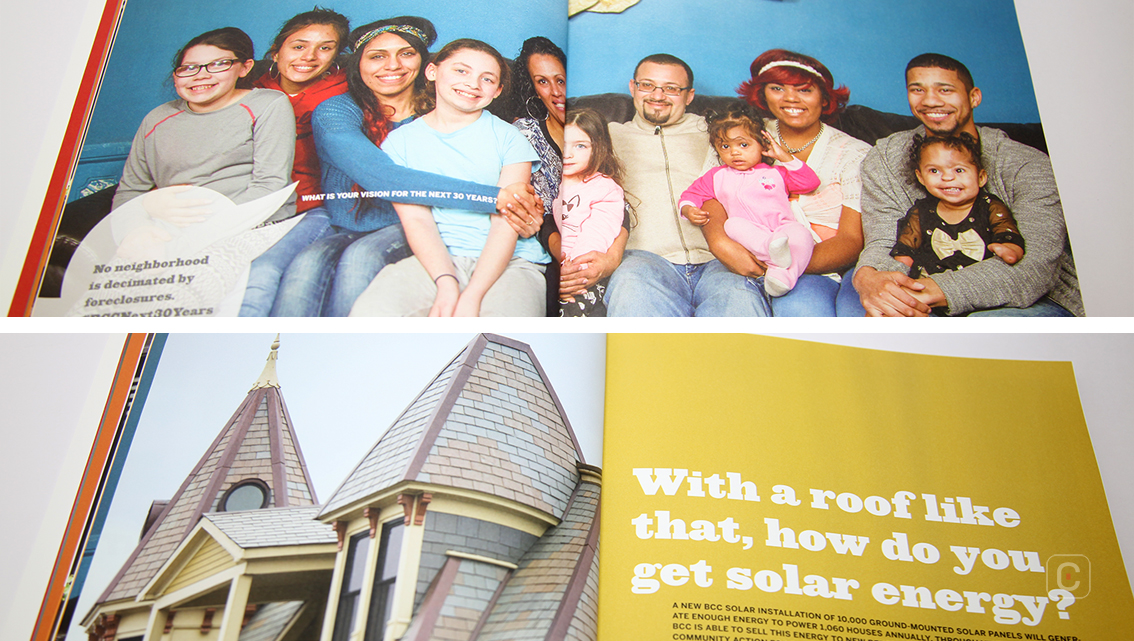
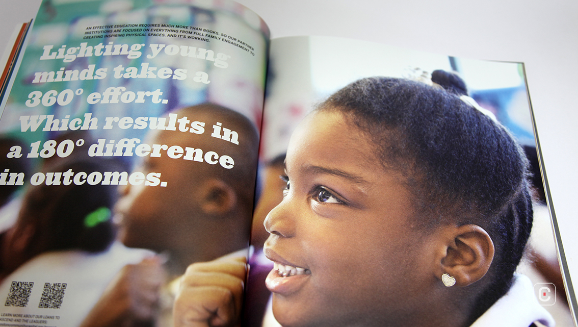
In terms of photography the editorial style has an upbeat, looser, more real feel about it which gives the report a more relaxed, approachable feel which in turn compliments the user-friendly language used. Colour tones are pulled from the photographs and used for background colours on opposite pages. This enhances the text on the corresponding pages as well as forming consistency and visual harmony. Some of the background colours even form a relation with the company’s logo; blue, yellow, green and black.
The desaturated urban landscape photograph spread across pages 27 and 28 has a powerful moody grittiness to it.
Towards the end of the report a 7-page list of pretty much everyone connected in some way with the company is laid out in a fashion similar to that of an index. This is accompanied by two double-page spreads of photograph montages celebrating the company’s 30-year anniversary.
Back![]()
![]()


